JEWISH HEALTHCARE FOUNDATION
CHANGE HEALTH CARE FOR GOOD
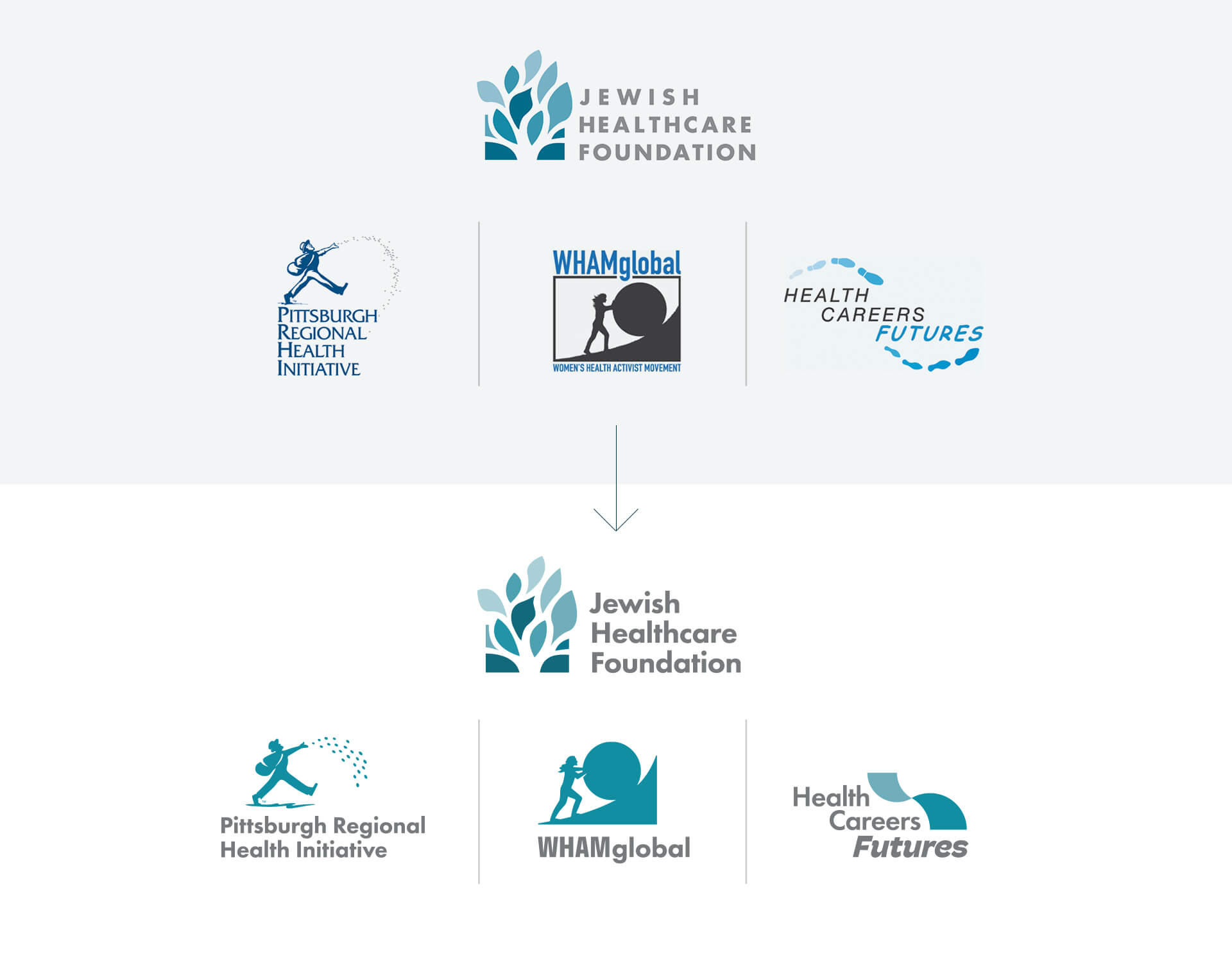
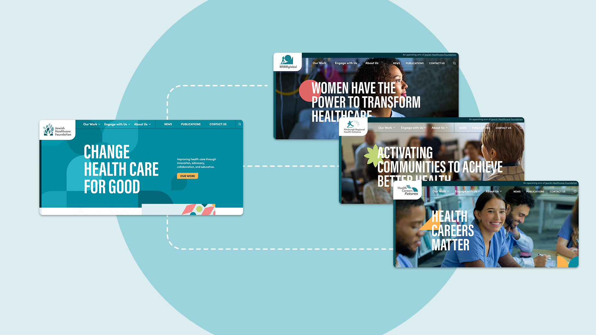
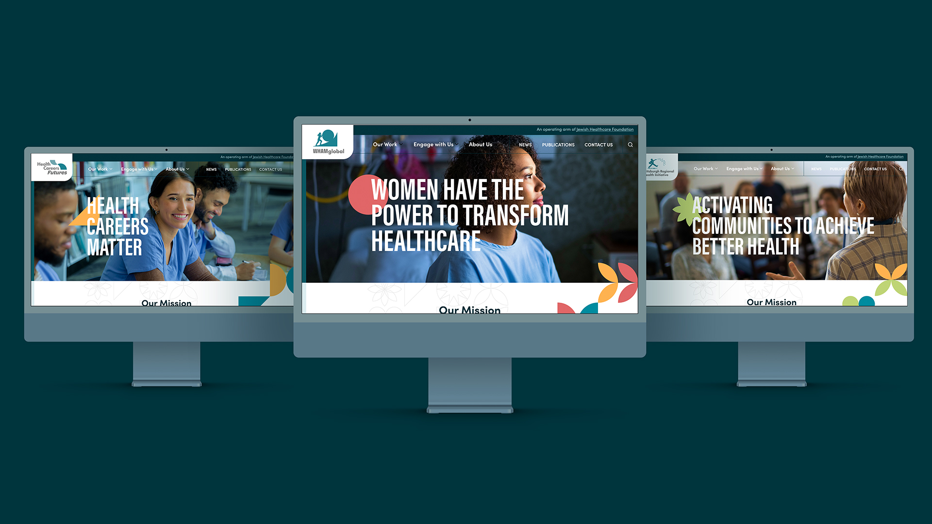
The Jewish Healthcare Foundation (JHF) and its three operating arms—the Pittsburgh Regional Health Initiative (PRHI), Health Careers Futures (HCF), and the Women's Health Activist Movement Global (WHAMglobal)- offer a unique brand of activist philanthropy to advance healthcare innovation, advocacy, collaboration, and education in the interest of better health. JHF was established in 1990 with proceeds from the sale of Montefiore Hospital, a healthcare institution financed and founded by Pittsburgh's Jewish community.
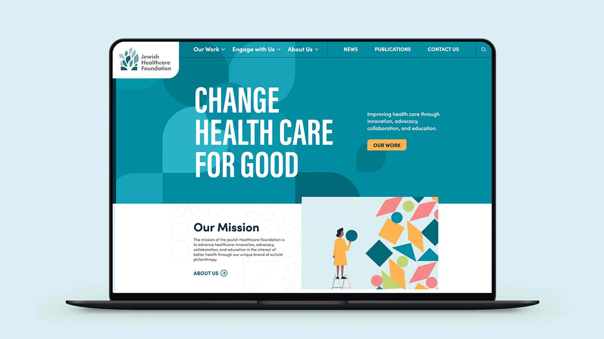
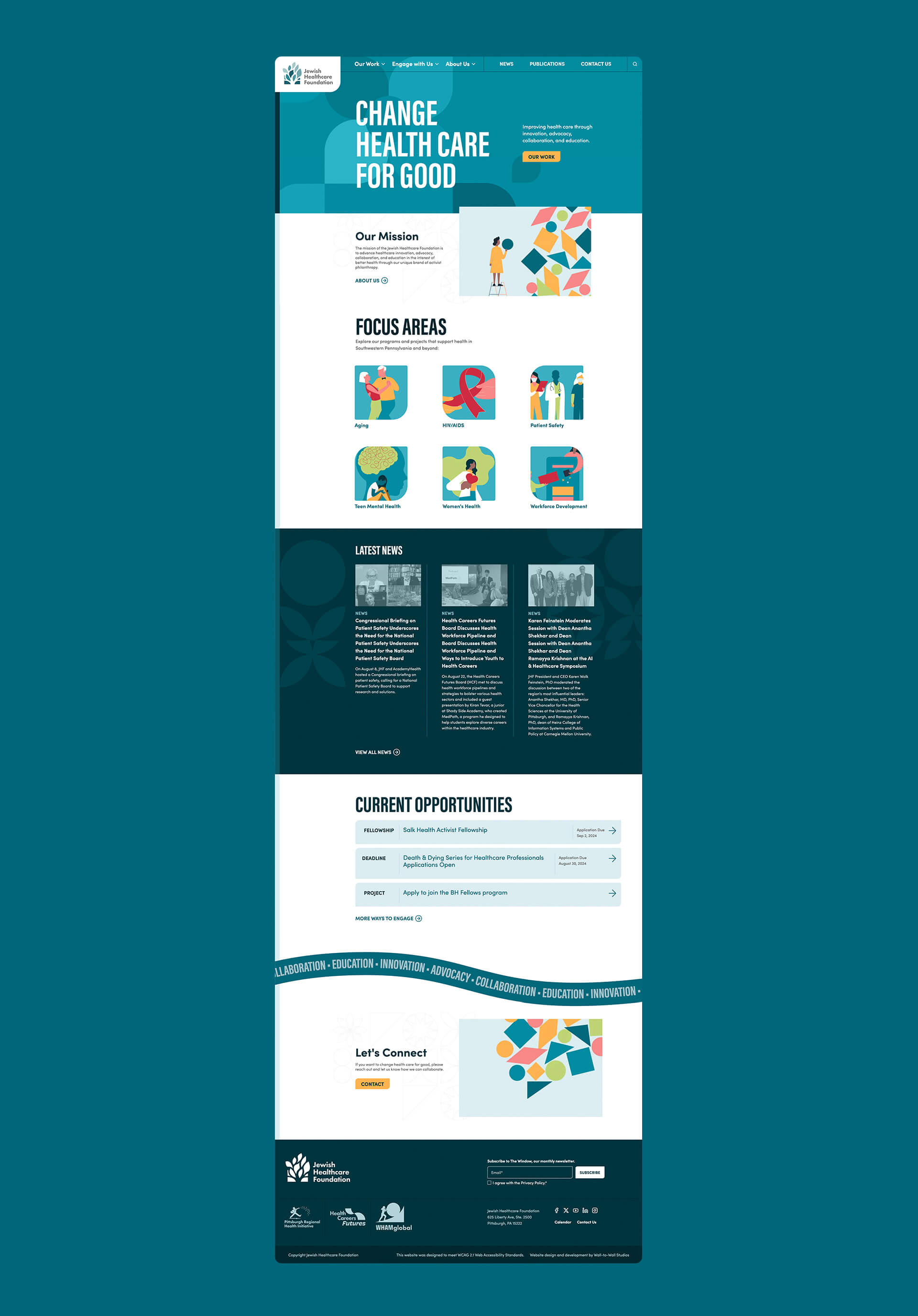
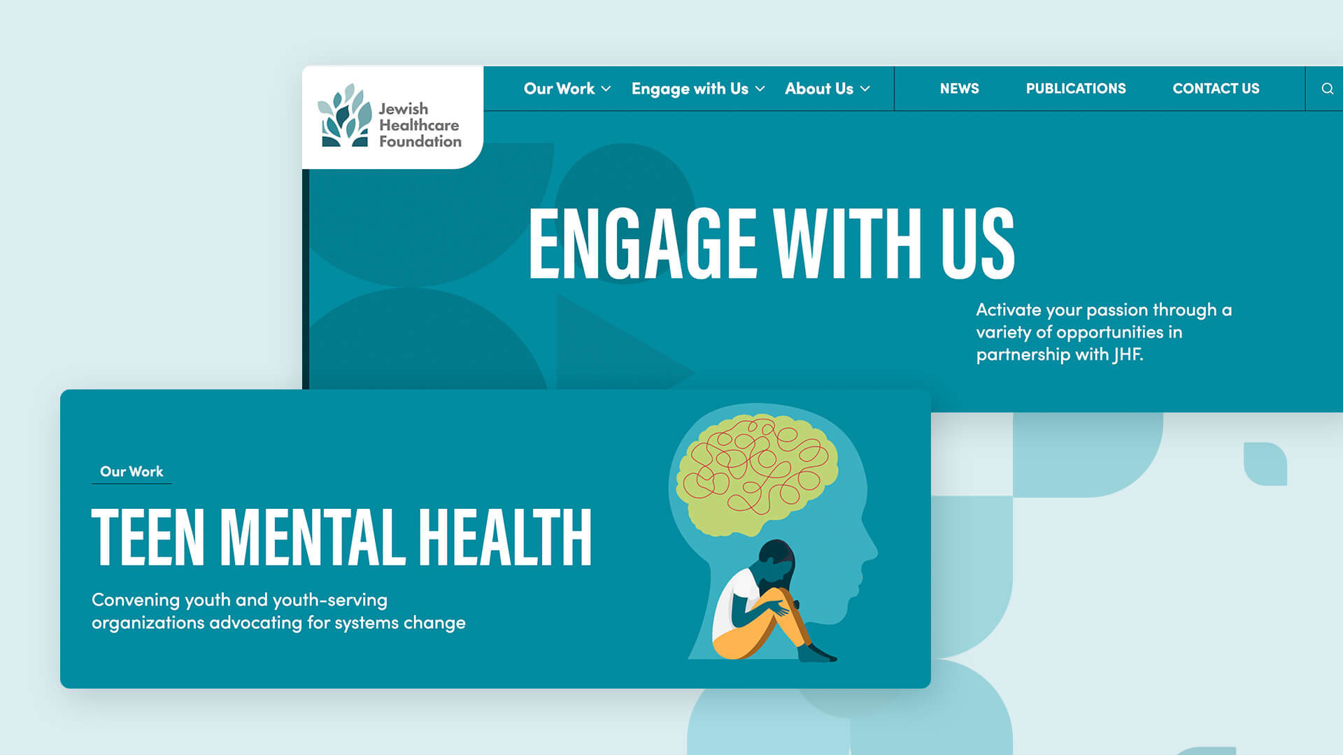
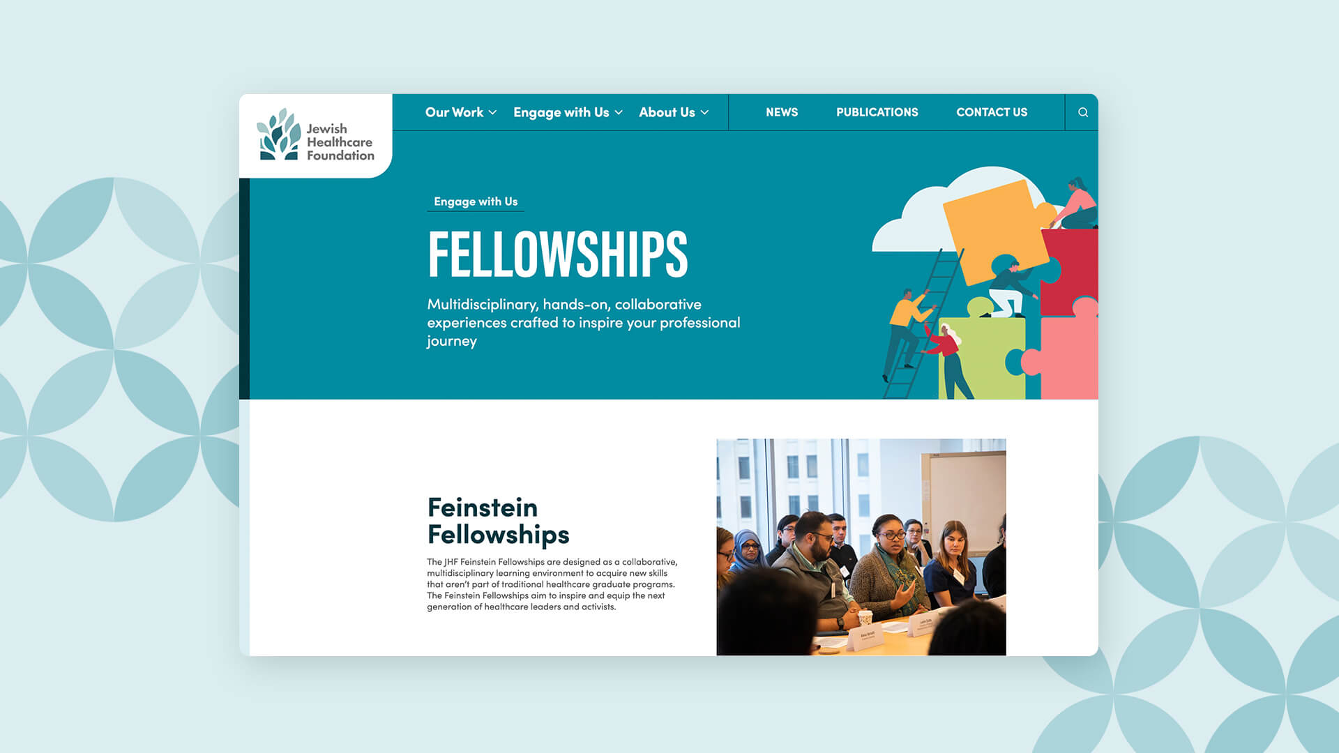
W|W executed a logo/identity refinement for JHF and its operating arms to create a more cohesive visual brand system with shared DNA. The updated identities and graphic toolkits are leveraged inside a comprehensive website redesign. Using a custom, multisite Sanity headless CMS platform, all 4 sites are managed inside one admin environment. Prior W|W collaborations with JHF have included the Patient Safety Technology Challenge and Liftoff.
MULTI-SITE DIGITAL ECOSYSTEM
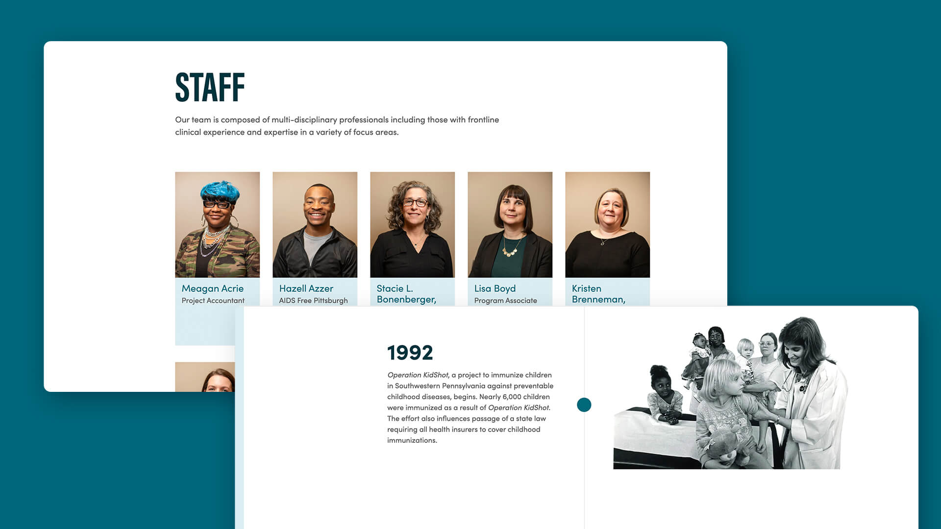
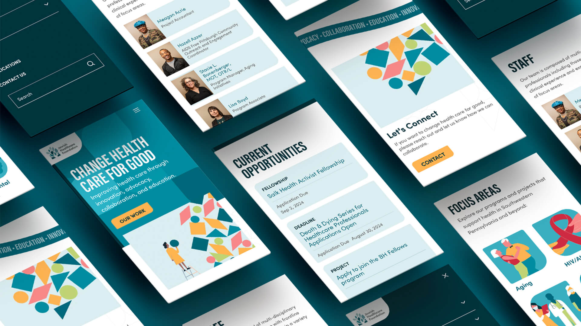
With a lean marketing and communications team, managing 4 separate websites for JHF involved a lot of redundant activities, from content updates to site maintenance. By designing and developing a multi-site digital ecosystem that houses all 4 websites (parent and 3 operating arms) inside one admin environment, W|W was able to deliver efficiency across multiple measures. Particular sets of important content such as resources, projects & programs, and news, are added to the CMS (content management system) once and tagged to the relevant website(s) and that content automatically publishes in the right spot, greatly simplifying the work of content managers.
The multi-site ecosystem is powered by Sanity, a modern headless platform that houses all 4 JHF websites, and includes some light integrations with Hubspot. The parent and child sites share a design system that connects each entity while providing a degree of autonomy.

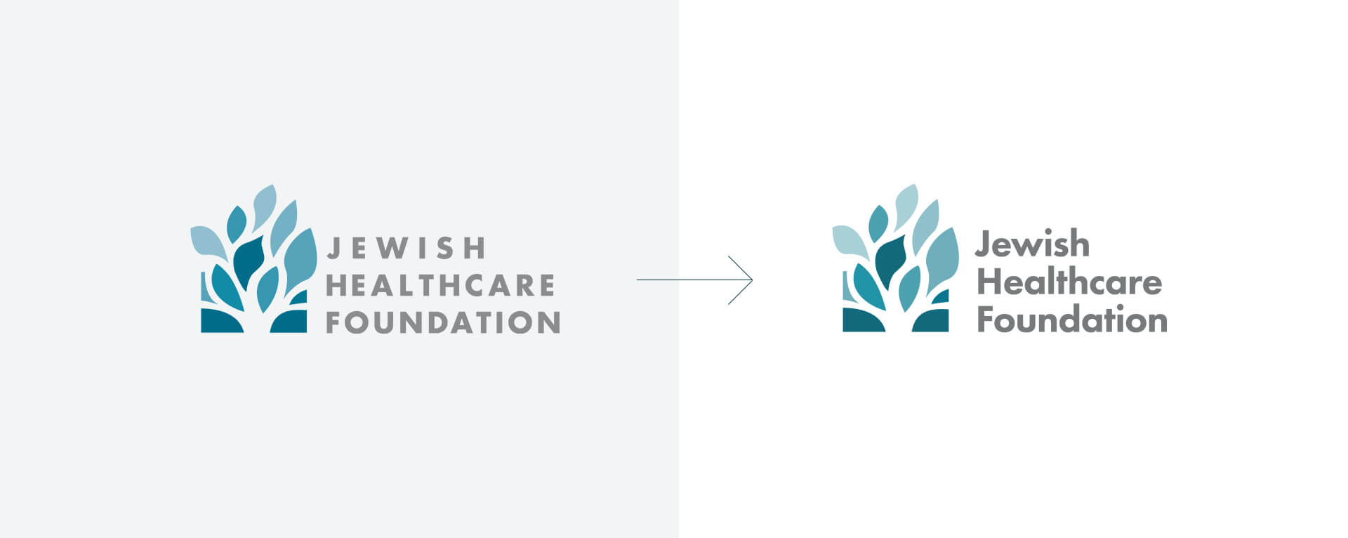
IDENTITY WITH SHARED DNA
Alongside the digital engagement, W|W completed a logo refinement for all four entities to strengthen the identity family and help elevate the JHF brand. The resulting identity system streamlined the color palette and fonts so that they all had shared graphic DNA, clearly connecting the operating arms with the parent organization. The JHF refinements were subtle and primarily focused on updates to typography and kerning. For the PRHI logo, W|W simplified the "Johnny Appleseed" illustration, removed the tagline, and changed the font & colors. Similar updates were applied to the WHAMglobal identity, with the woman Sisyphus + struggle illustration being simplified and removed from the box container. Finally, W|W designed a new logo for Health Careers Futures that is aligned with the graphic illustration style leveraged across the other brands.