Wall-to-Wall Studios Designs Rebranding for the Carnegie Museums of Art and Natural History
The Carnegie Museums of Pittsburgh, Pittsburgh's largest cultural organization and known worldwide for it's vast art, scientific collections and scientific research, recently launched a rebrand for two of their four museums, the Carnegie Museum of Art and the Carnegie Museum of Natural History.
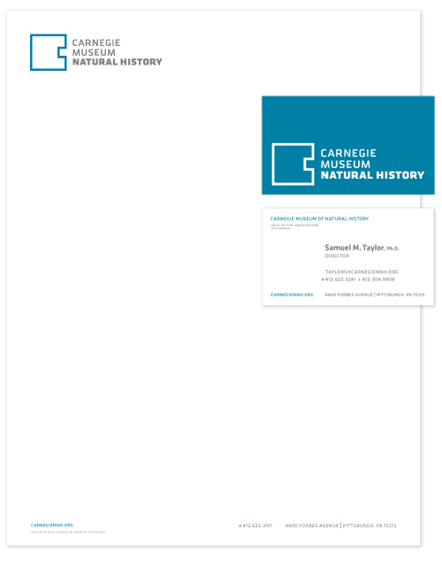
Wall-to-Wall Studios was hired by the museums to design a new identity for both, and to explore how it would support their overall marketing efforts. The rebranding collaboration included the development of positioning and personality statements, followed by the design of the logos, business system and brand guidelines.
Editor's Note: After the launch of the rebranding, new leadership at the Museum decided to scale back the depth/breadth of the brand system, as they consider an institution-wide initiative.
Working closely with the museums' leadership and marketing department, and with visitor experience data, Wall-to-Wall Studios began to explore how these two different museums communicate their mission and speak to their audiences. An important challenge, and unique to two museums with vastly different collections and exhibit space and promotions, is that they share the same building. For many visitors a trip to the museums often means visiting both sides, or at the very least walking through one space to get to the other. Visitors are as likely to see a Renoir as a Tyrannosaurus. Thus, the branding reflects this shared experience and reinforces their respective vast and varied collections, experiences and learning opportunities. And both museums' marketing collateral and messaging often live side-by-side, not just in the physical space of the building, which is important, but also through shared public marketing opportunities.
One goal was to mitigate potential visual clutter -- not only from a visitor's perspective, but how the audience would see the expression of both museums in the world, through a variety of different mediums. Wall-to-Wall Studios was challenged to create a solution that was not only simple and clean, but at the same time flexible enough for both museums. The ultimate design needed to be flexible enough to support exhibitions which often have their own marketing campaigns, but also be able to stand as a vehicle to represent and support the museums as an organization.
View the Carnegie Museum of Art case study.
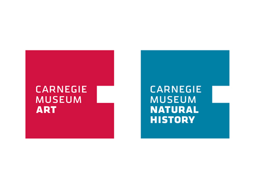
Instead of creating competing identities, Wall-to-Wall designed an identity for both museums that work together as a system, but with flexibility for unique messaging and marketing. The same, yet distinctive. And most importantly, the new identity(s) had to reflect the idea of the museums, their respectively vast and varied collections, and their important role as educators and cultural leaders.
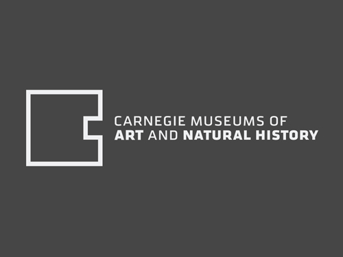
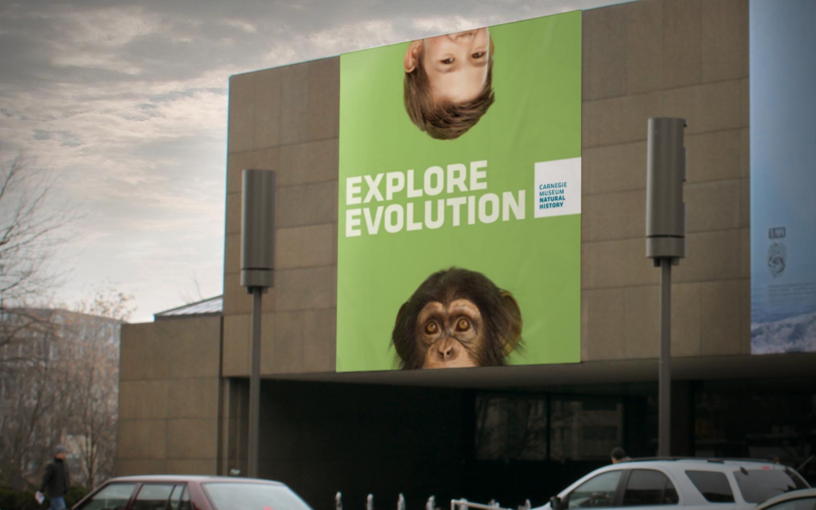
The simple geometric C shape resembles features found in the contemporary building and grand architecture, while at the same time echoes the monolithic presence, not of just the building, but of the museum's role in the community. The simplicity of the shape also ensures that it will compliment other museum marketing efforts, which often consist of predetermined graphics from traveling exhibitions.
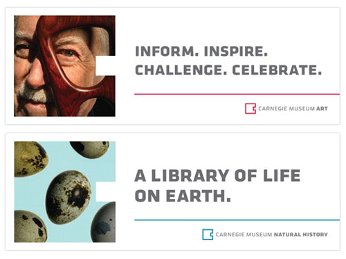
The logos are both anchored by the Carnegie C letter graphic with a modified Klavika font. In addition, to simplify the mark even more, and because many people refer to each of the museums as simply "the Carnegie", the decision was made to drop the word "of" from the mark, and to emphasize the second part of the name.
When developing the logo component of the rebrand, we wanted a mark that could capture a sense of play, of wonder, of inventiveness, of surprise, something that could express the vast variety found within the collections of the two museums, such that the logo has a way of appearing different in various occasions, or even within the same presentation. The logo itself becomes a canvas, or vessel for this expression, and a central character within the marketing collateral. The empty "C" is an invitation for the audience to imagine the possibilities of what could be there. The simplicity of the shape encourages endless and easy variations.
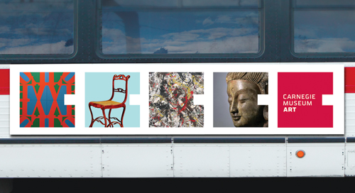
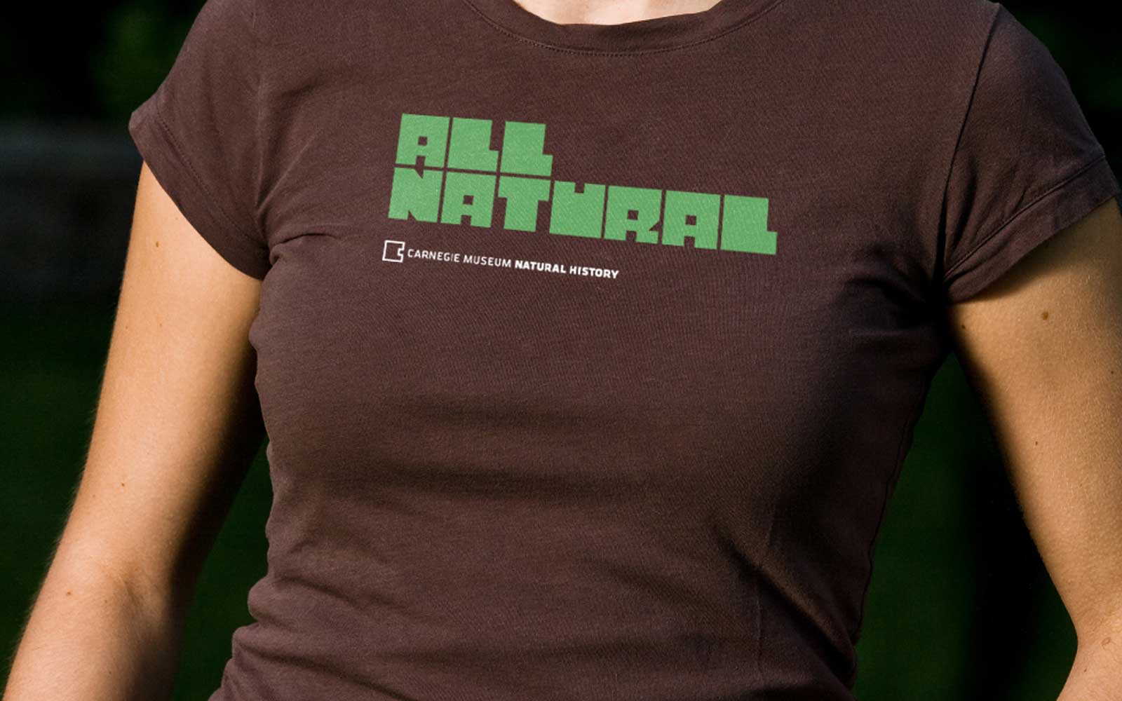
Based on the design of the Carnegie "C" a second alphabet was designed to compliment the letterform, and shall be used primarily in merchandising and selected marketing campaigns.