
Designing Lanterns
This post was originally published on August, 3 2016 on Mace Ballard.
One day I scrolled through my Instagram feed and stopped to take in one of the most beautiful photos I have seen. Open sky. Sculpted land underneath. Lighting and textures turning the landscape into a painting. Photographed black and white.
The photo was part of a Death Valley series by photographer Rob Larson. He was posting photos from a recent trip. I knew I wanted to use those photos in some way.
I’ve known Rob for a few years. We first met during a week long job in Nicaragua. I was art directing an advertising campaign that involved a team of video producers and photographers. During the trip Rob was jovial and friendly, even as we traveled in a hot van through various sketchy barrios. I found out he designed Anti-Flag’s "The Bright Lights of America" album and I was blown away. Our shared interests kept us in touch after the ad campaign wrapped up.
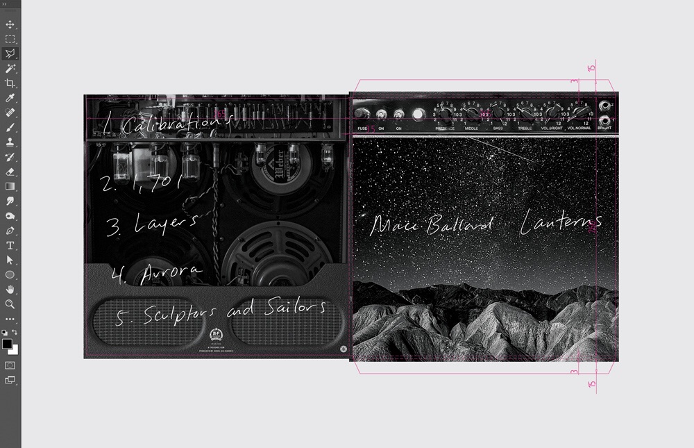
I always had the idea of a guitar amp with the visual twist of a starry sky serving as the texture of the speaker. I stored it in my back pocket for the right job. During a lunch hang with Chris 2 of Anti-Flag we talked about the new Mace Ballard record he was producing. The title would be "Lanterns" and 2 wanted me to do the art. Right away I thought of the starry amp concept. With Rob’s Death Valley series fresh in my mind, I wanted to include his photography to give the concept a surrealist feel. I hit Rob up and he was stoked to collaborate.
I alway insist on reading the lyrics to the album I’m designing. I need to know the songs inside and out so the art and music play off each other. An album cover is the first impression the audience gets when an album is announced. It sets the tone and expectations. The rest of the packing then guides the audience as they listen to the music. The art at that point serves to compliment the music.
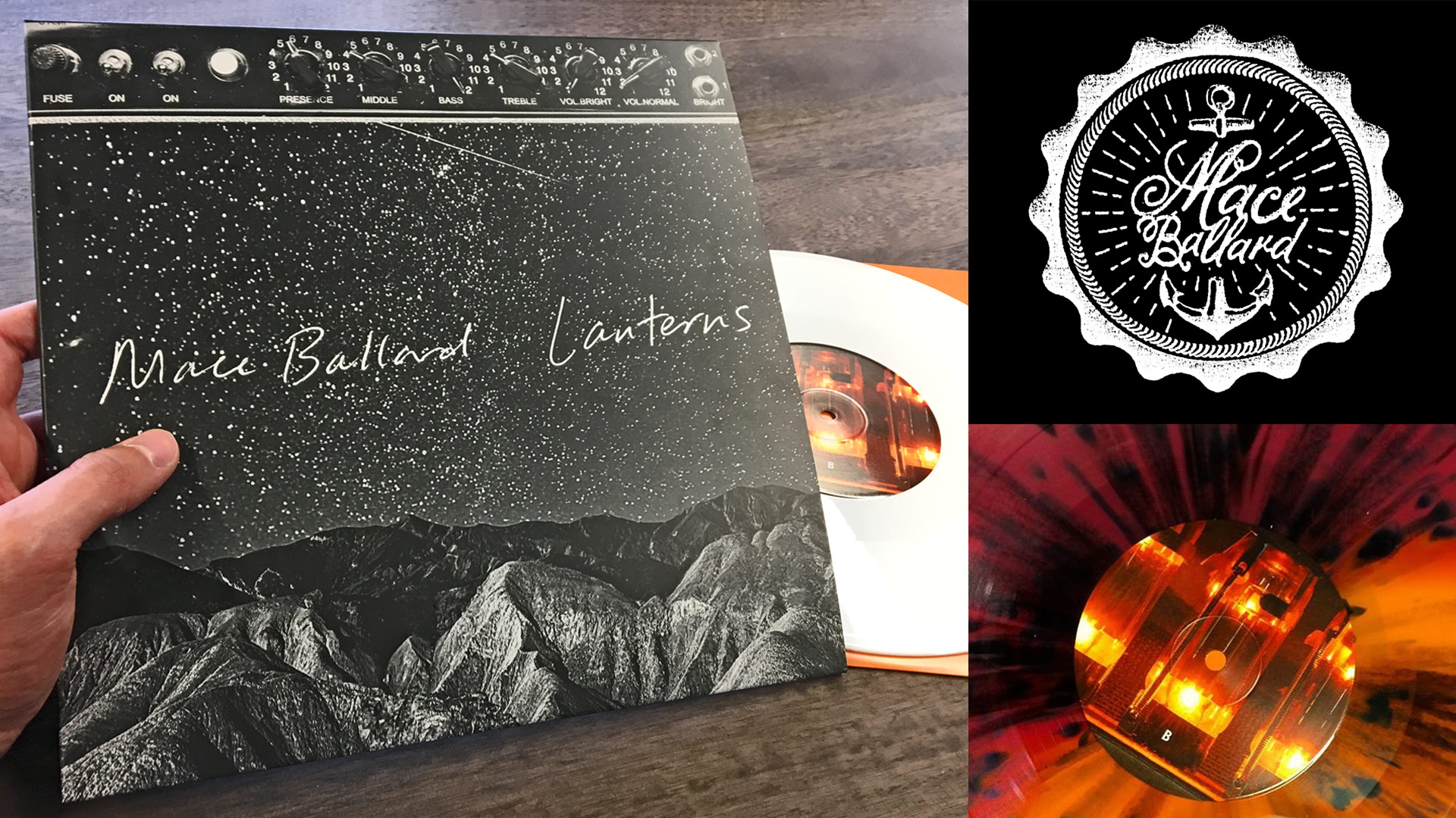
Reading the lyric’s to "Lanterns" influenced the handmade type approach, similar to a personal journal entry. I took a ball point pen and quickly scribbled "Mace Ballard Lanterns" a few times. I scanned my favorite, set it over the amp/sky visual, and sent the cover art to the band. Shortly after sending I noticed "Laterns" was written instead of "Lanterns." Oops. I sent another message saying to ignore the typo, if the band was happy with the art I’d fix it right away.
Mace Ballard loved it as is. Well, as is except for the typo.
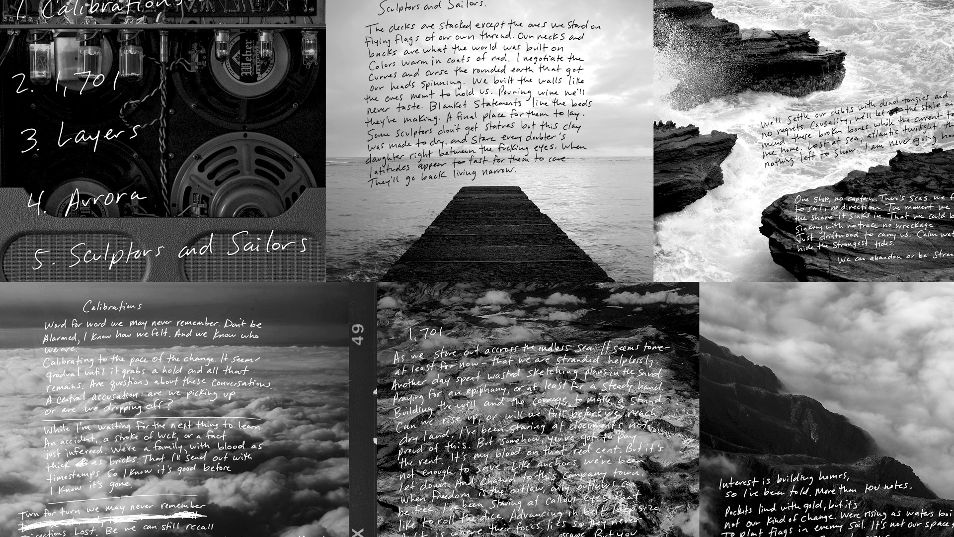
The next step was to extend the concept. We needed a back cover. Lyric book. Supporting graphics for tour posters. Merch. A good album cover is one thing, a smart integrated campaign defining the album’s visual legacy is another.
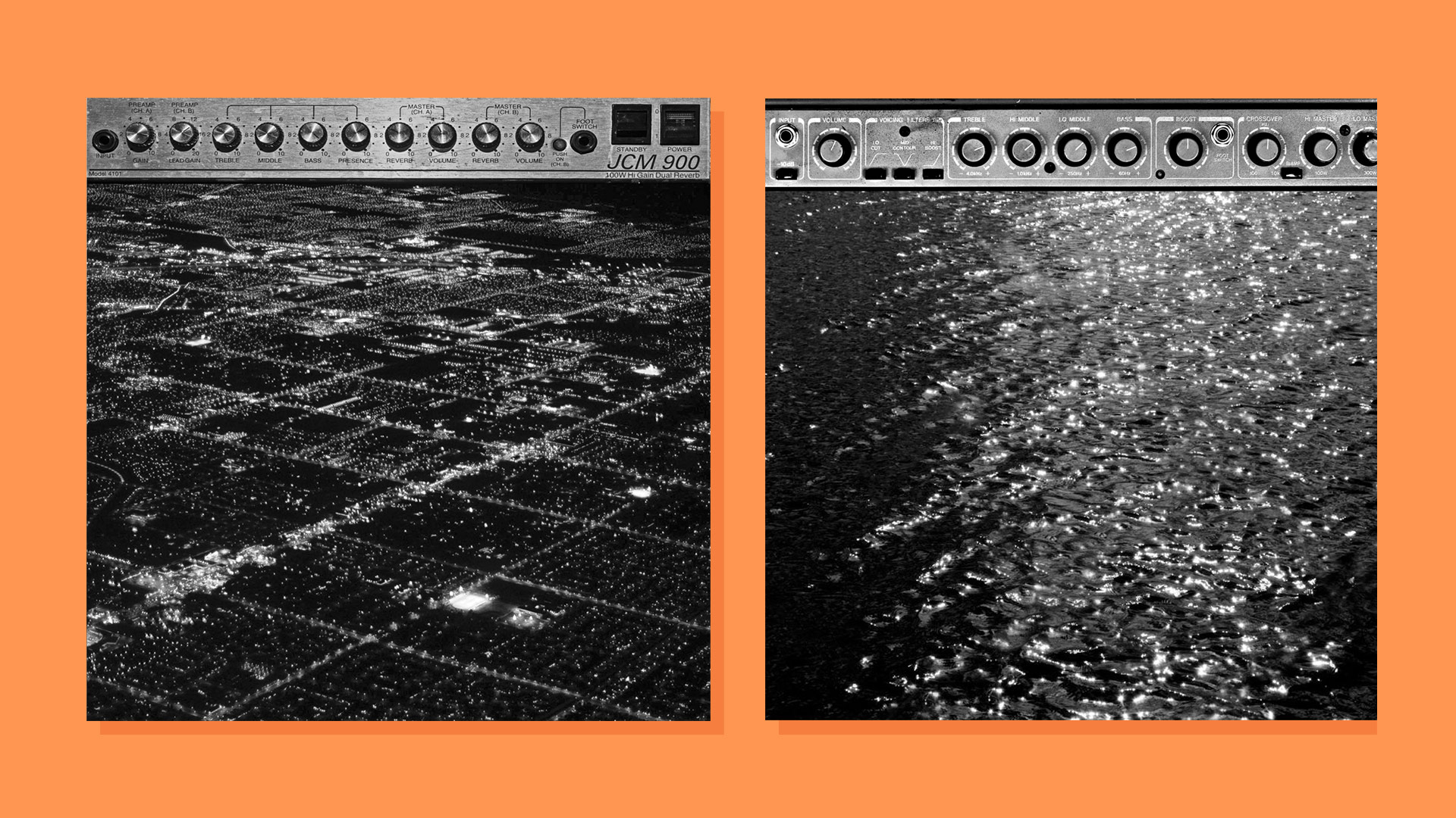
We decided a custom shoot was necessary for the additional elements. The back cover would become the back of the amp, exposing the interior workings with glowing tubes mimicking lanterns. The amp texture idea had legs. A glistening ocean and city lights served as additional textures, and thematically tied to the songs. We scheduled a photoshoot with Rob. Chris Stowe from AF-Records provided the amps and I provided the beer. We spent the evening at the studio above the Roberto Clemente Museum in Pittsburgh working and hanging out at the same time.
Lastly, I felt a logo mark would be a nice addition to the integrated design. The band name in writing looked good on the cover, but didn’t hold up on its own without context. Inspired by the themes in the songs, a seal was created with nautical elements and radiating lights. The logo was a mix of digital compositions and hand illustrated type, finally scanned together with a copier.
The "Lanterns" album art was a result of collaboration, open mindedness, and friendships. I’m listening to it as I write this. While the art served a good purpose, the hero is the music within the package.
Thanks for reading. To see the artwork in all of its glory, check out the Lanterns EP.

