Communication Arts Features Tarka Indian Kitchen In Typography Annual 8
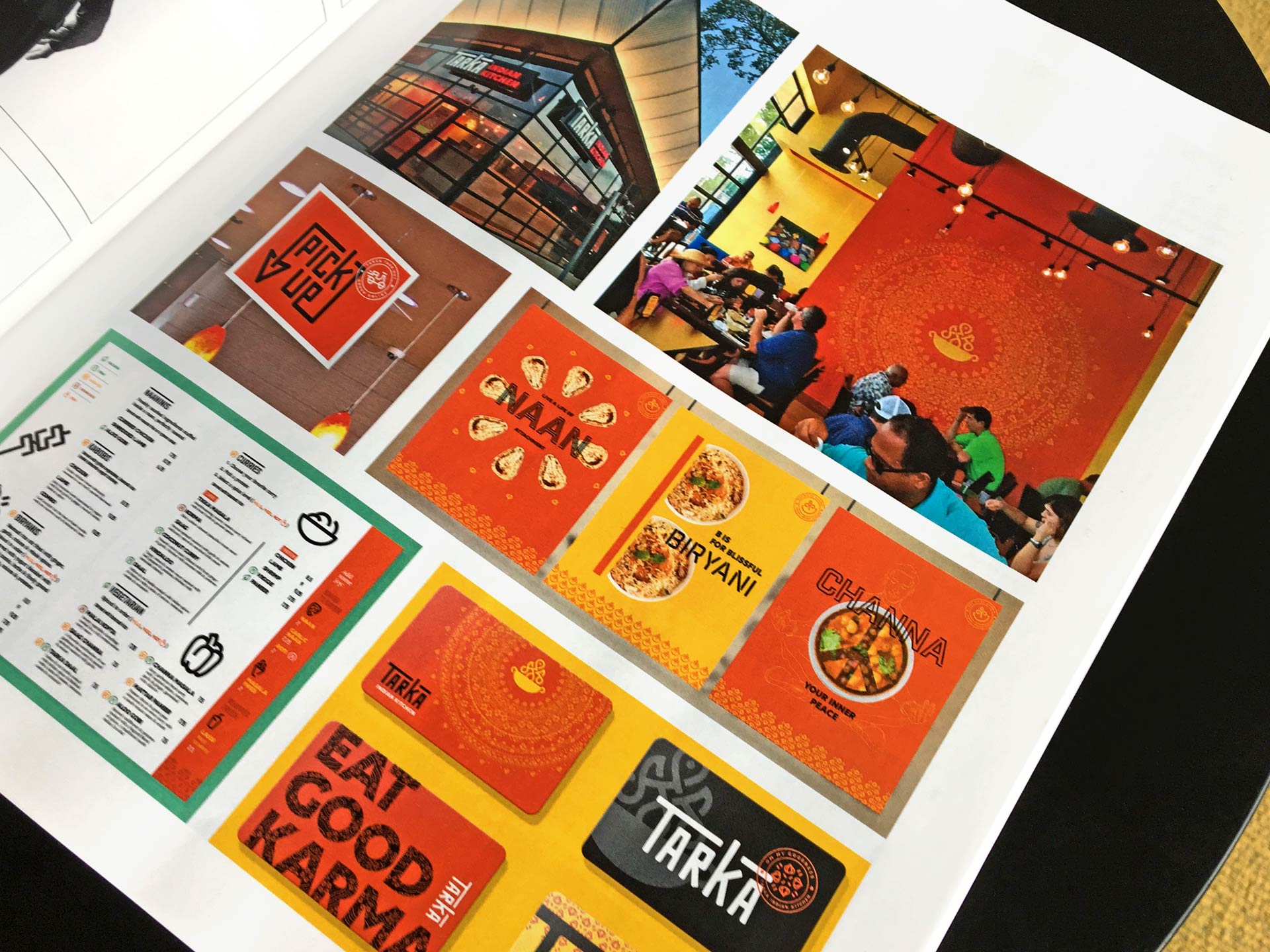
Communication Arts, the premier source of inspiration for graphic designers, art directors, design firms, corporate design departments, advertising agencies, interactive designers, illustrators and photographers—everyone involved in visual communication, featured the integrated branding work by Wall-to-Wall Studios for Tarka Indian Kitchen as an Exhibit in its Typography Annual 8.
According to Communication Arts, W|W "translated the welcoming sounds and aromas of Tarka into a vibrant brand identity." And continues, "With seven locations throughout Texas, Tarka Indian Kitchen has been recognized as one of the hottest upscale fast-casual restaurant concepts in the country. The name Tarka translates into the sizzle and pop of spices when they hit a hot pan, a sound and aroma that welcome diners. On the heels of its expansion, Tarka asked Pittsburgh, Pennsylvania–based brand design agency Wall-to-Wall Studios to help it initiate a comprehensive rebrand in order to realign all of its touchpoints with the quality of its food and experience. W|W first created a bold logotype that was partially inspired by the Sanskrit alphabet. A secondary brand mark represents the concept behind the name Tarka with line work influenced by the Indian rangoli, a symbol of welcome. To take advantage of all of the branded touchpoints throughout the restaurant experience, W|W also designed a set of graphic seals to augment the visual library, as well as a set of custom icons and related pattern work. The seals and the icons help everyone, from first-time visitors to Tarka devotees, navigate the menu."
View the Tarka Indian Kitchen case study.