THE MIDWIFE CENTER
MY MOM IS AWESOME
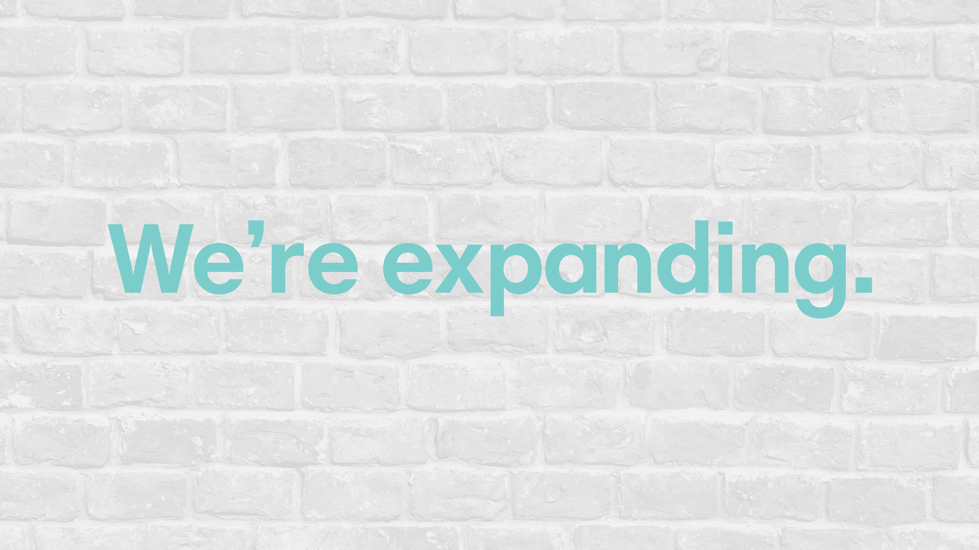
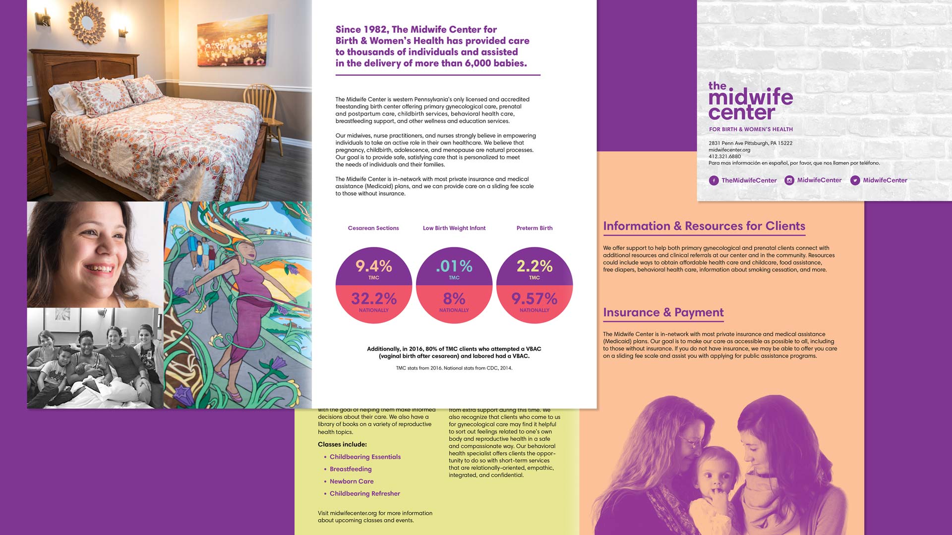
Since 1982, the certified nurse-midwives, nurse practitioners, and nurses of The Midwife Center for Birth & Women’s Health have cared for thousands of clients and their families. The Midwife Center provides exceptional, personalized, client-centered care while focusing outreach efforts on communities who experience poor health outcomes in order to have a more significant impact on improving the health of people in the region. As The Midwife Center expanded its physical space in 2017 to become the nation’s largest birth center, it also launched an integrated rebranding that was designed by W|W. The rebranded Midwife Center better reflects the organization’s commitment to keeping high-quality care accessible and affordable to its diverse clientele, positions it as one of the leading birth centers in the nation, and as a model for safe, personalized care both locally and nationally.
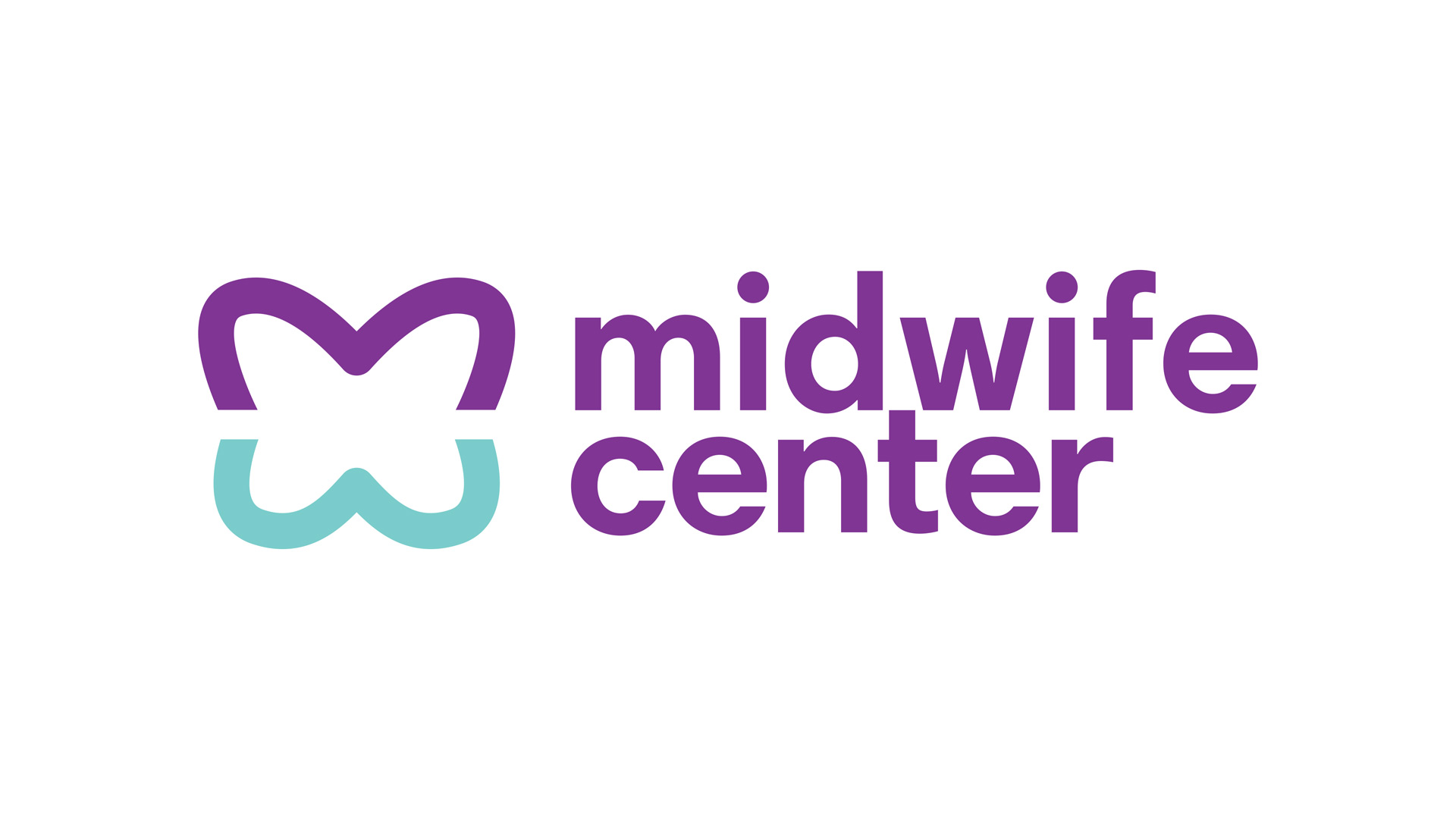
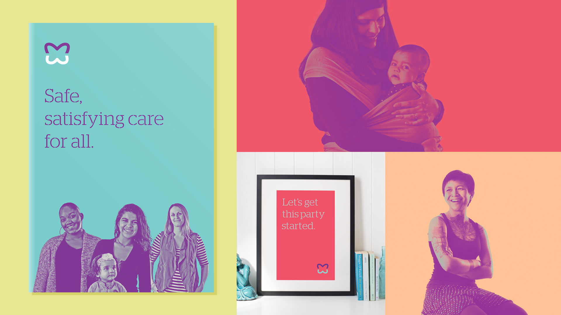
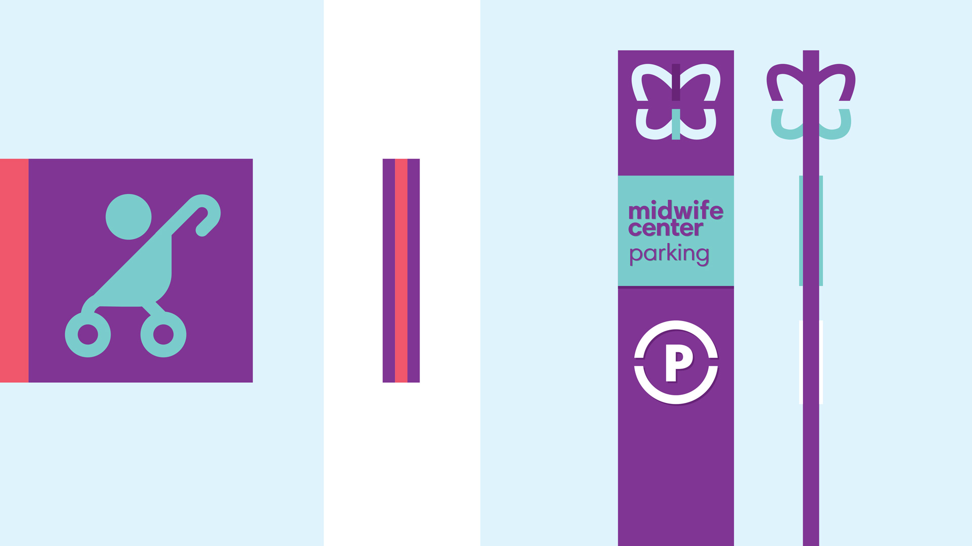
The comprehensive rebranding included the design of a new visual identity & logo, seal, stationery system, marketing collateral, narrative, brand style guide, advertising, merchandising & apparel, environment/decor, art direction of photography, website, social media templates and more. The Midwife Center’s new look is positive, warm, welcoming, versatile, and modern.

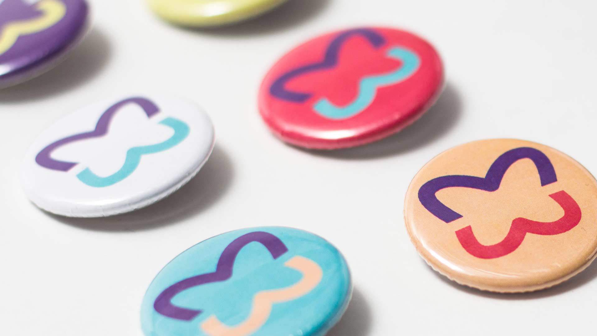
BRAND PALETTE
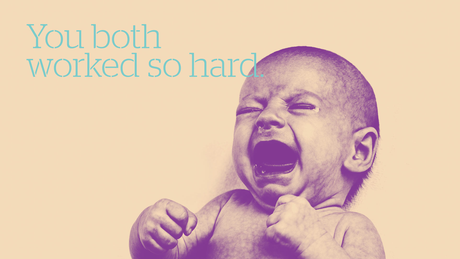
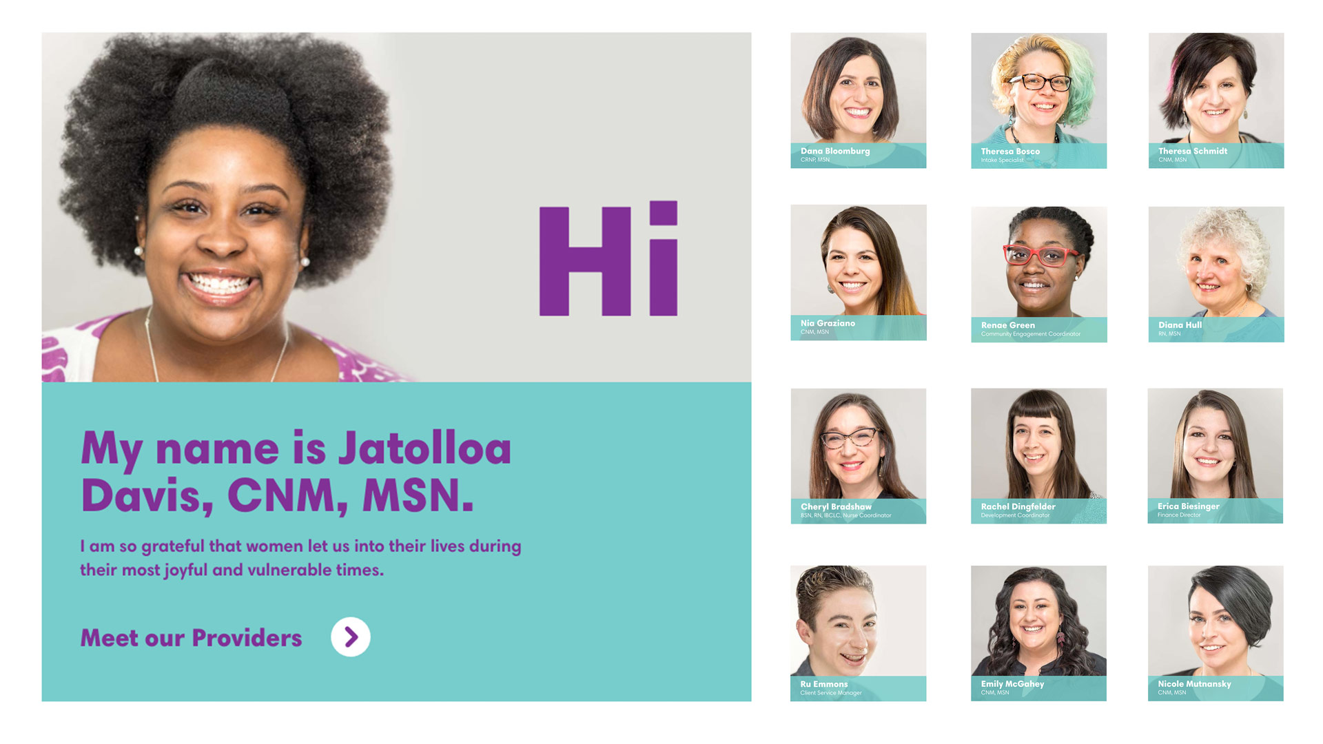
The Midwife Center's visual branding system includes several important components that all work harmoniously with the logo to create a unique identity. A flexible and powerful canvass was designed by integrating a strong, vibrant color palette with typography and images. Custom photography with Midwife Center clients and their families helped ensure authenticity across branded signals.

COLLATERAL
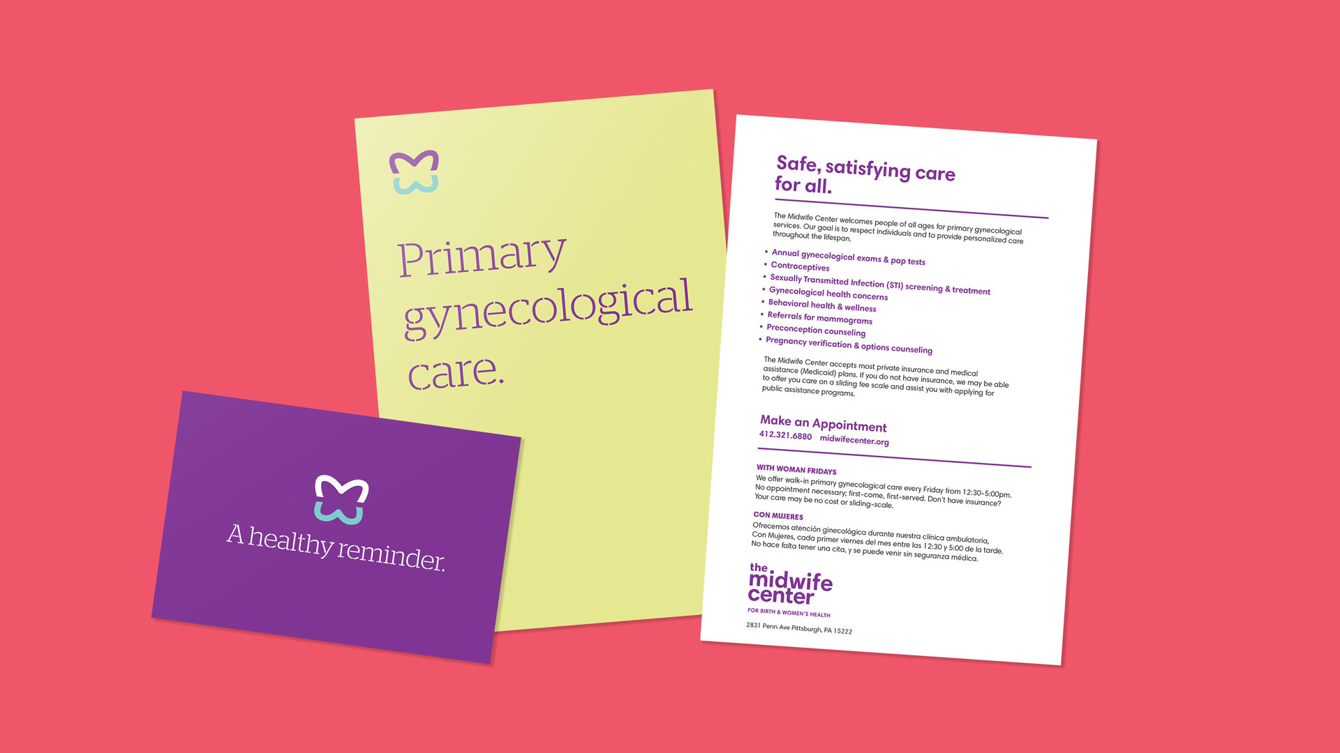
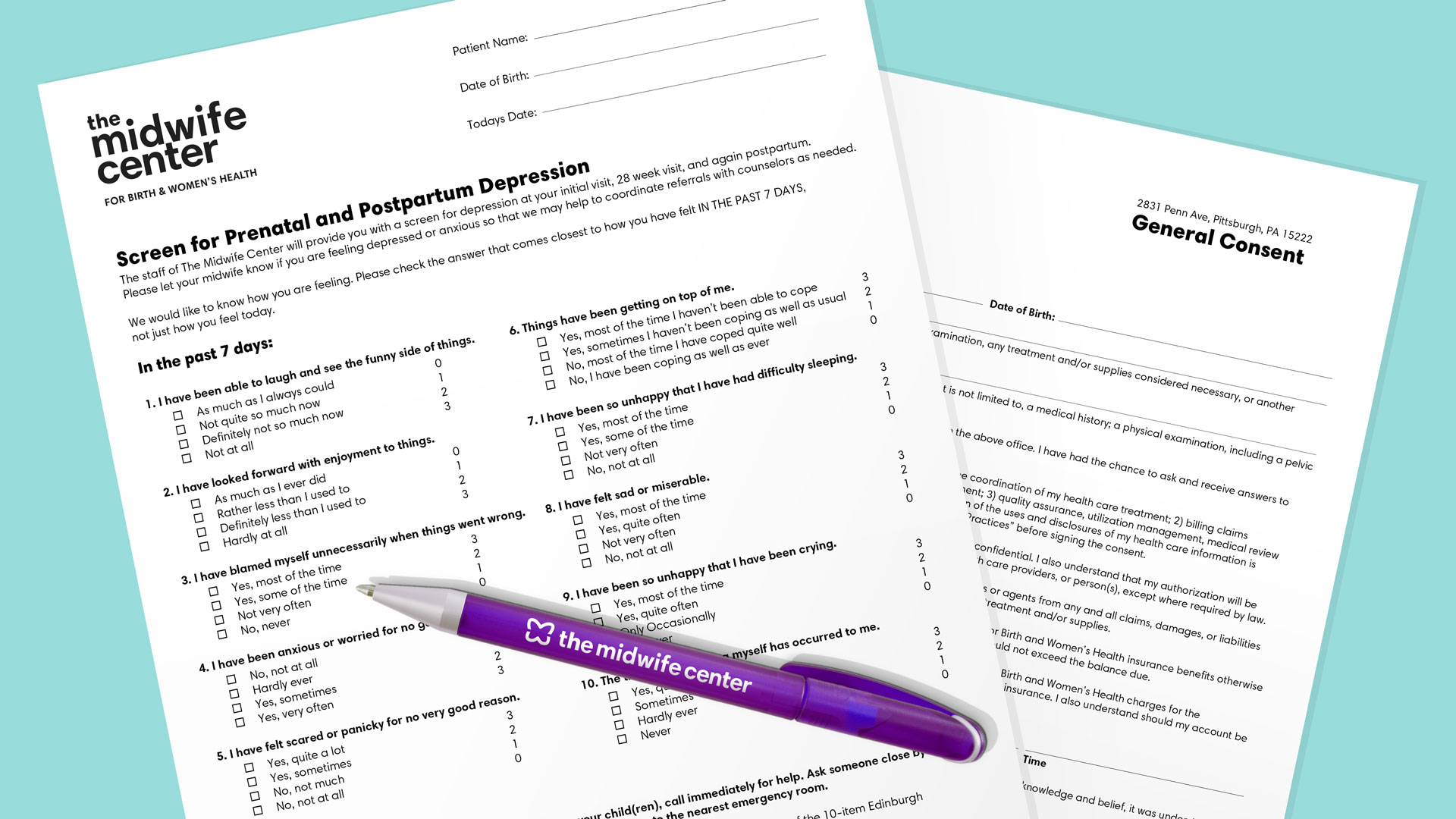
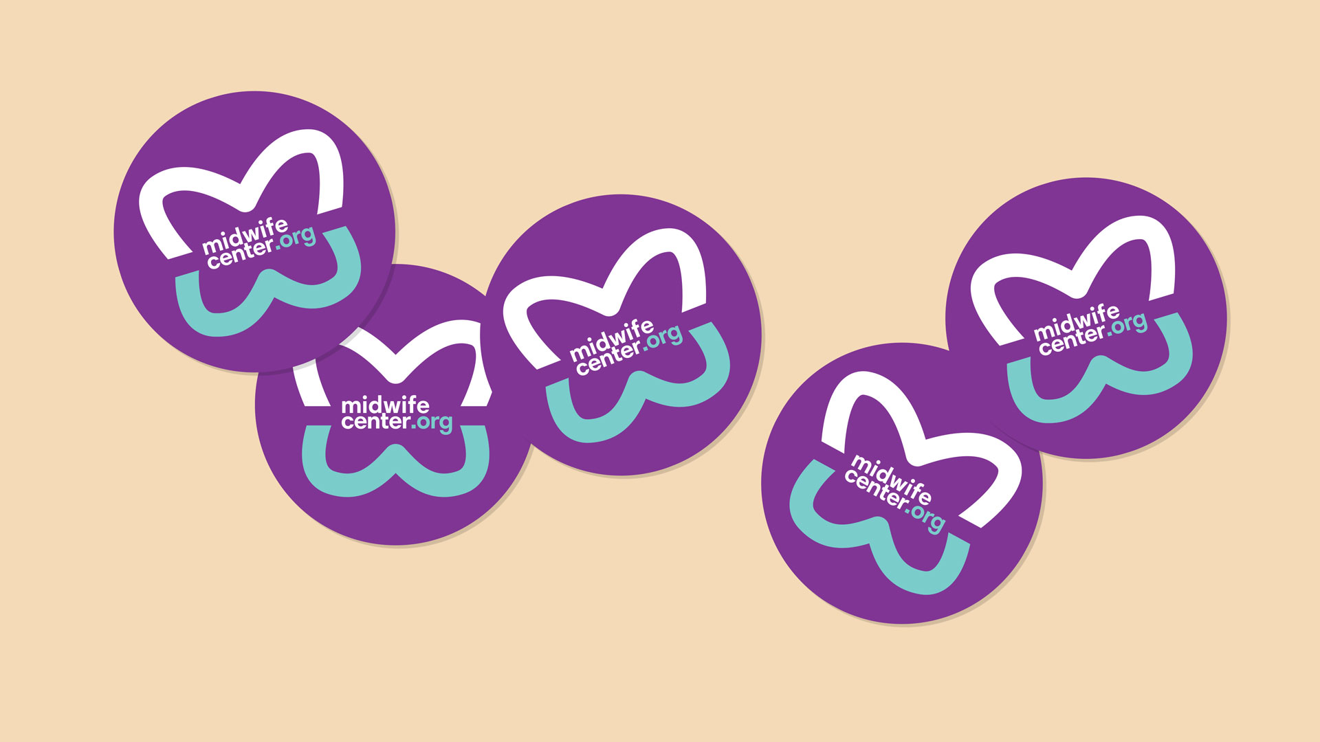
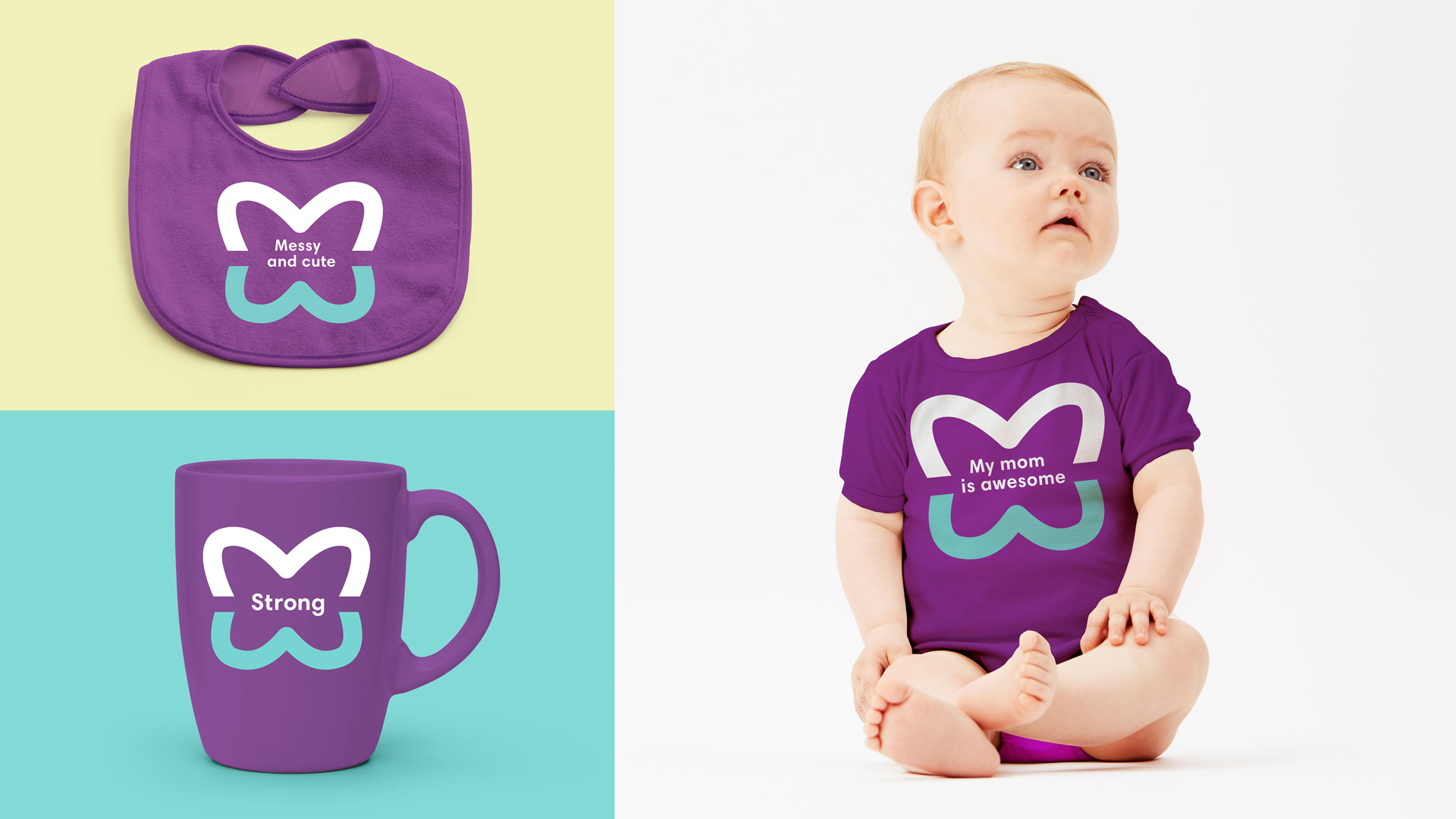
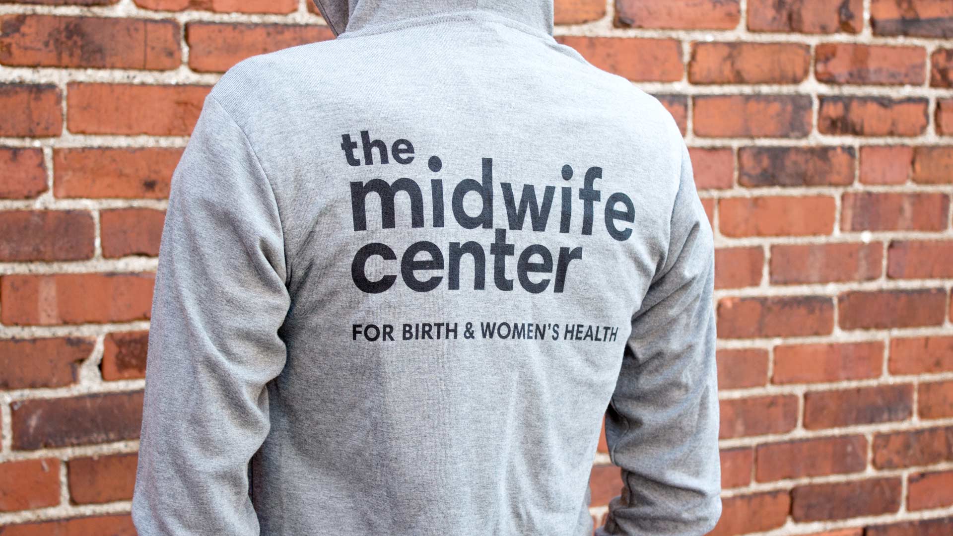
The brand system was deployed across all touch-points including marketing brochures, stationery & business cards, office forms, reminder post-cards, apparel, buttons, totes and more.


DIGITAL
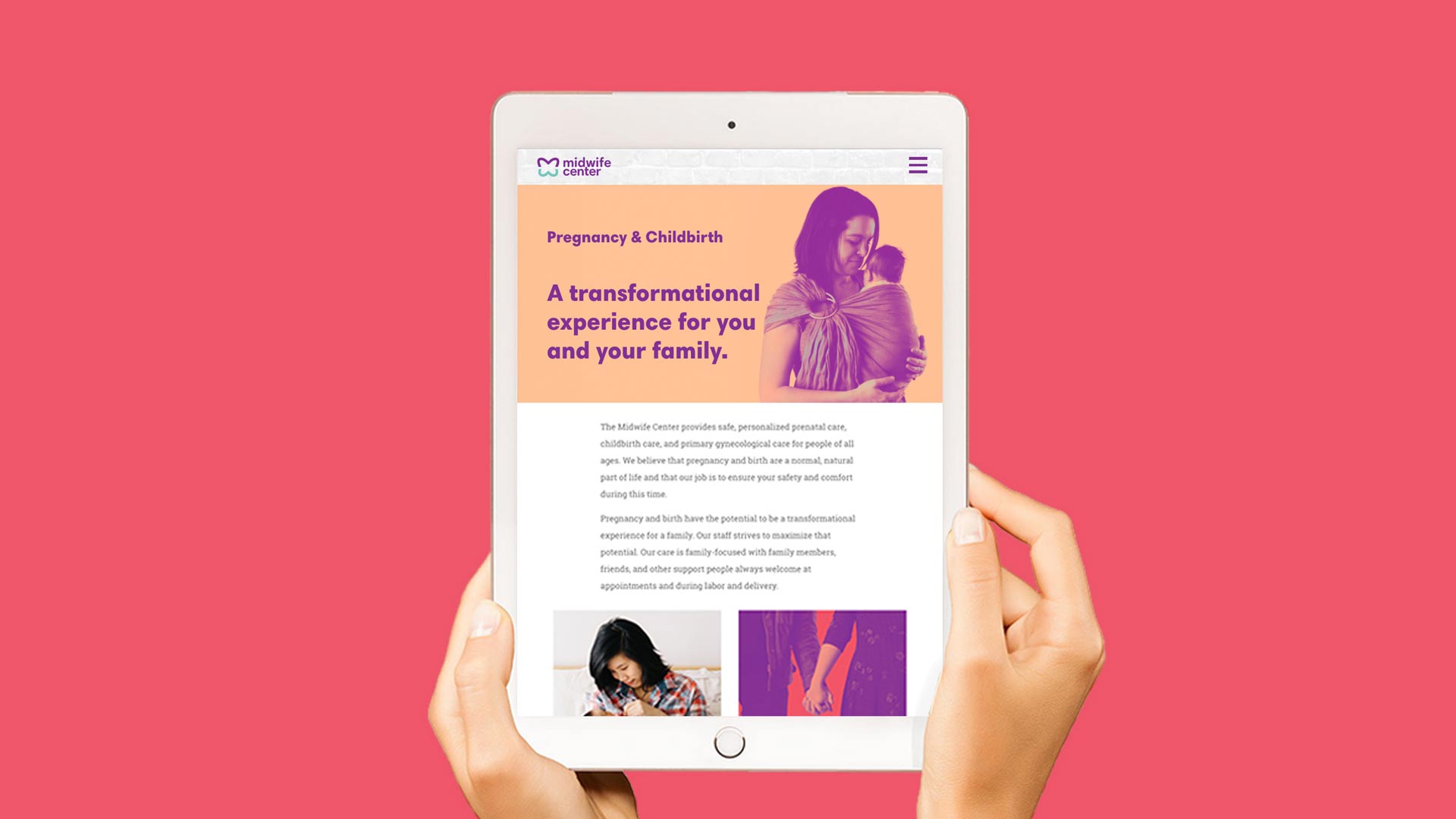
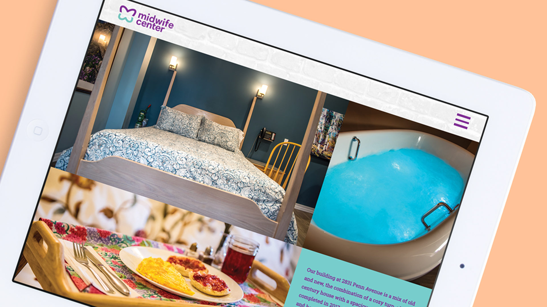
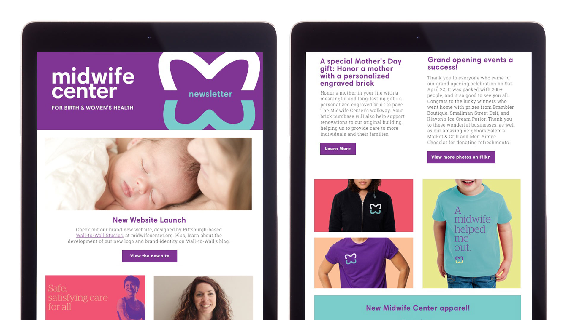
While it is hard to beat an in-person experience at The Midwife Center, its digital connections with clients and other stakeholder groups are critical. W|W helped the organization implement the rebranding across the primary digital channels, including the website, social media (landing pages and templates) and Mailchimp e-newsletter. The responsively designed website is powered by BlokBlok CMS, a Ruby on Rails + Javascript content management system.
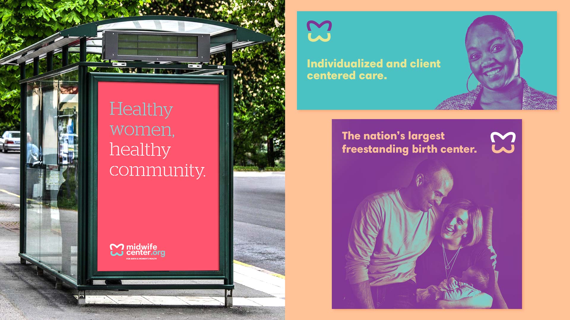
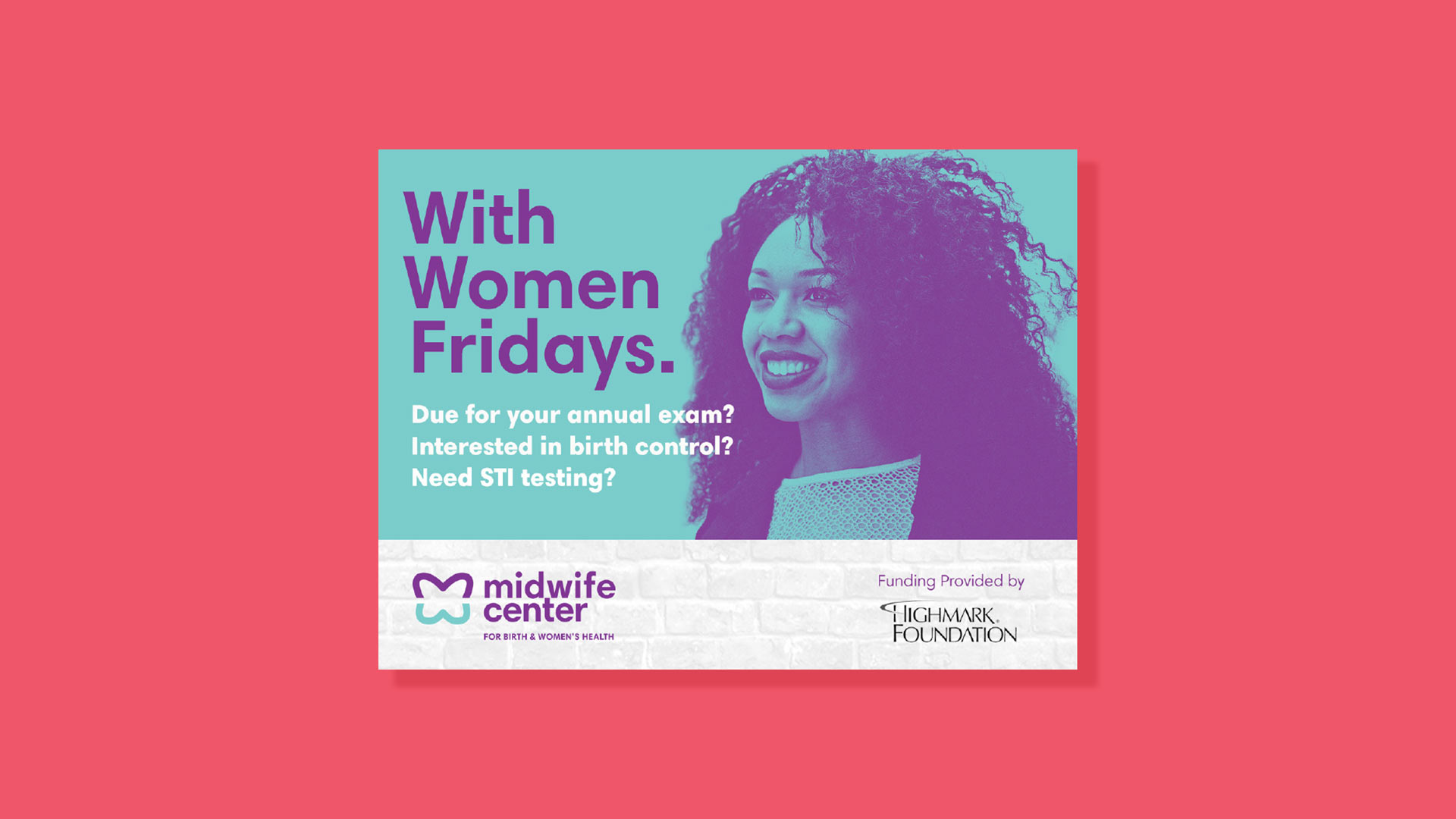
ADVERTISING
As part of the rebranding, W|W designed a set of advertisement templates that can carry a variety of messages across multiple media and mediums. The templates leverage the brand toolkit and deliver impactful creative in traditional, non-traditional and digital formats.