SPRAGUE
WE'VE GOT THAT
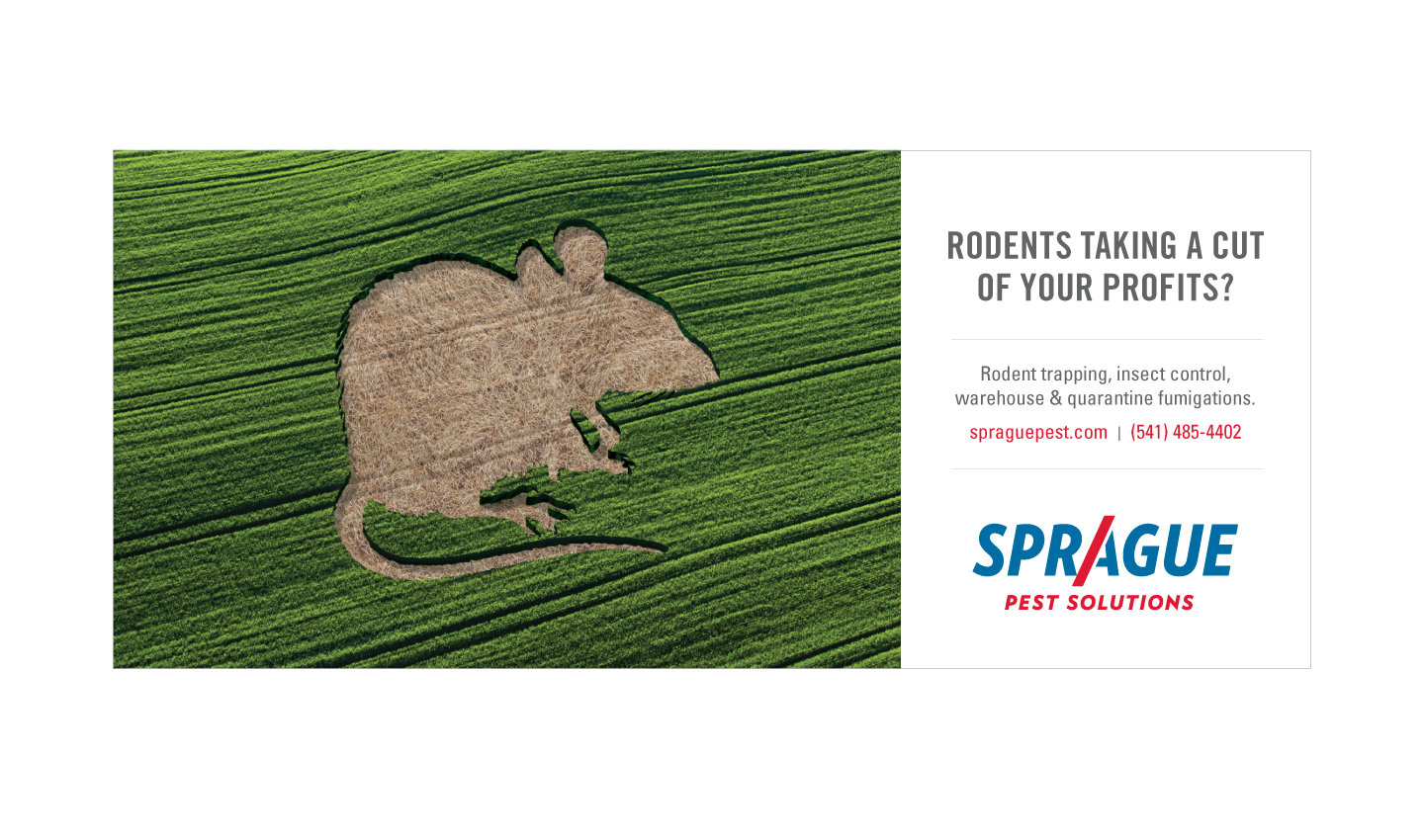
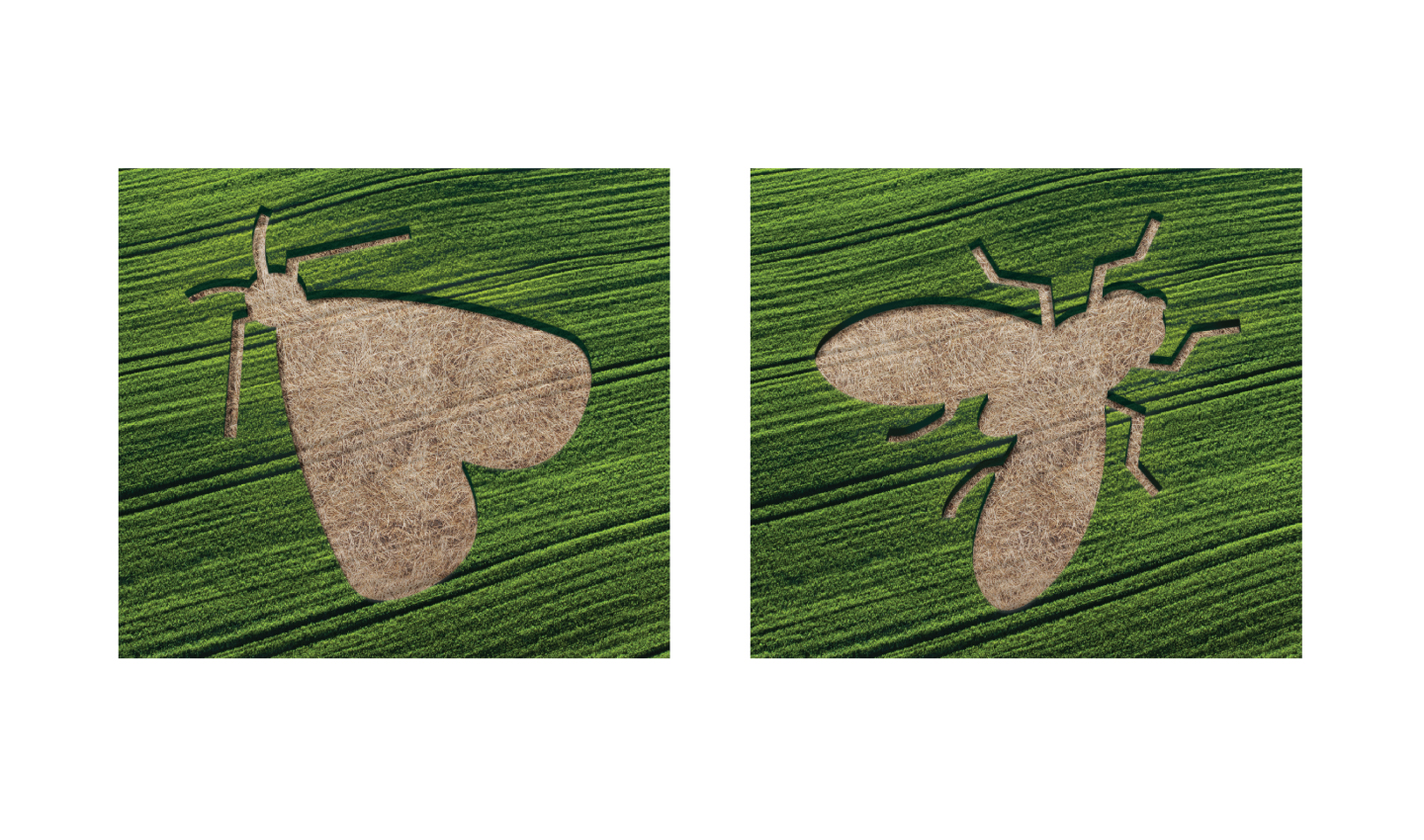
Family owned and operated since 1926, Sprague is a new breed of pest company - one that is redefining the domain of pest control. Covering Washington, Oregon, Idaho, California, Utah and Colorado, Sprague is an organization that is fanatically curious about its customers, their environments, their business and their end-customer’s experience. When it comes to the management of unexpected guests, Sprague’s team are ninjas. Sprague hired W|W and project partner Quicksilver Foundry to help the company navigate a comprehensive rebranding initiative. The strategic phase developed a framework that rallied around a brand promise of Going Deep that was aligned with the whole picture solution embraced by Sprague. Proactive, tailored, preventative and innovative, Sprague is more than a pest control company; they protect the clients' brand, their end customers, their employees and the environment in which they conduct business. W|W designed the integrated rebranding that successfully brought this brand promise to life.
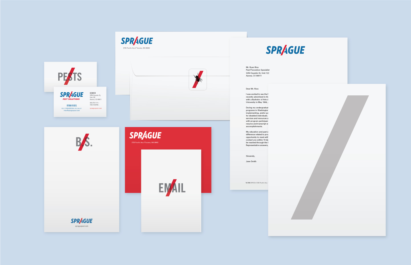
VISUAL IDENTITY & PRINT
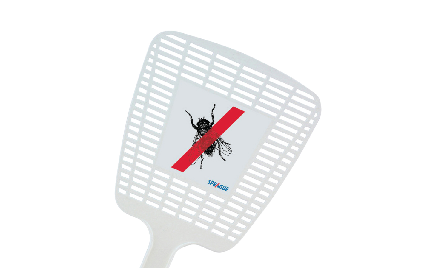
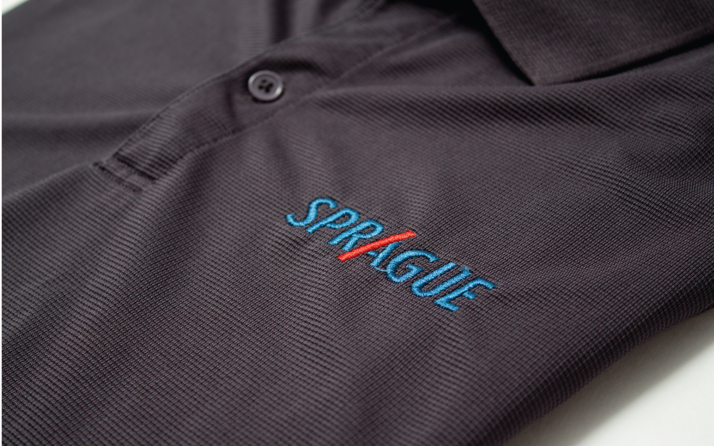
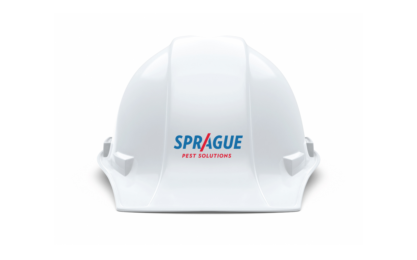
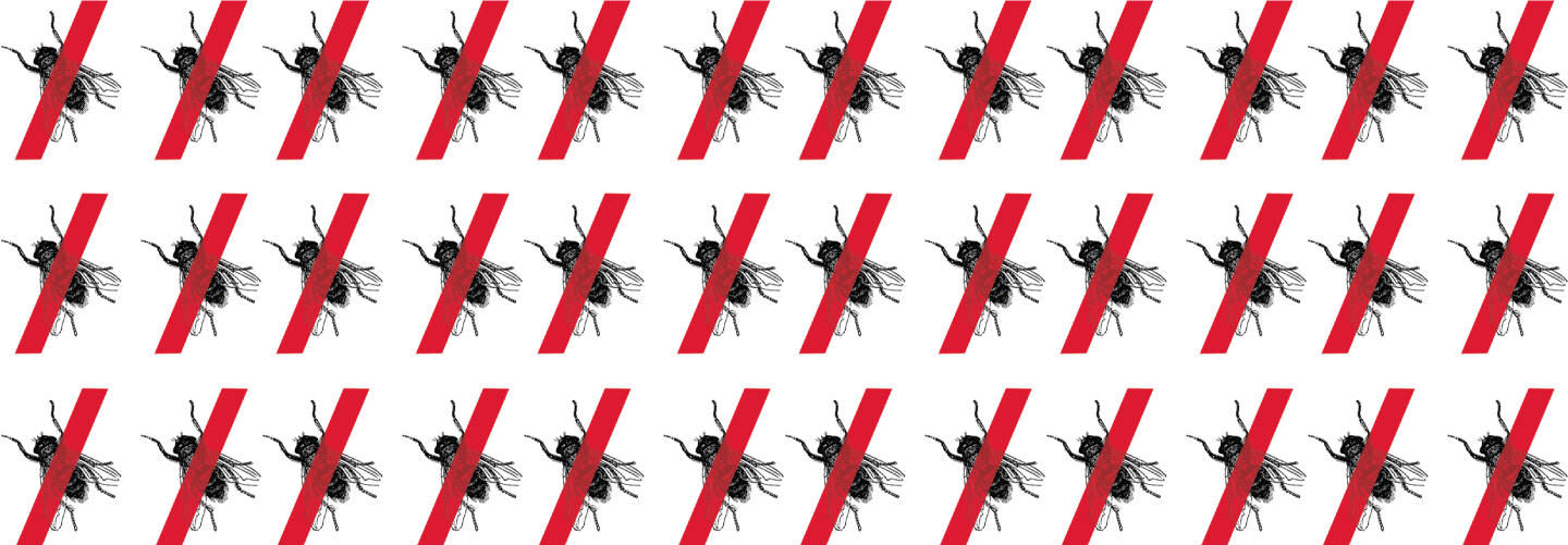
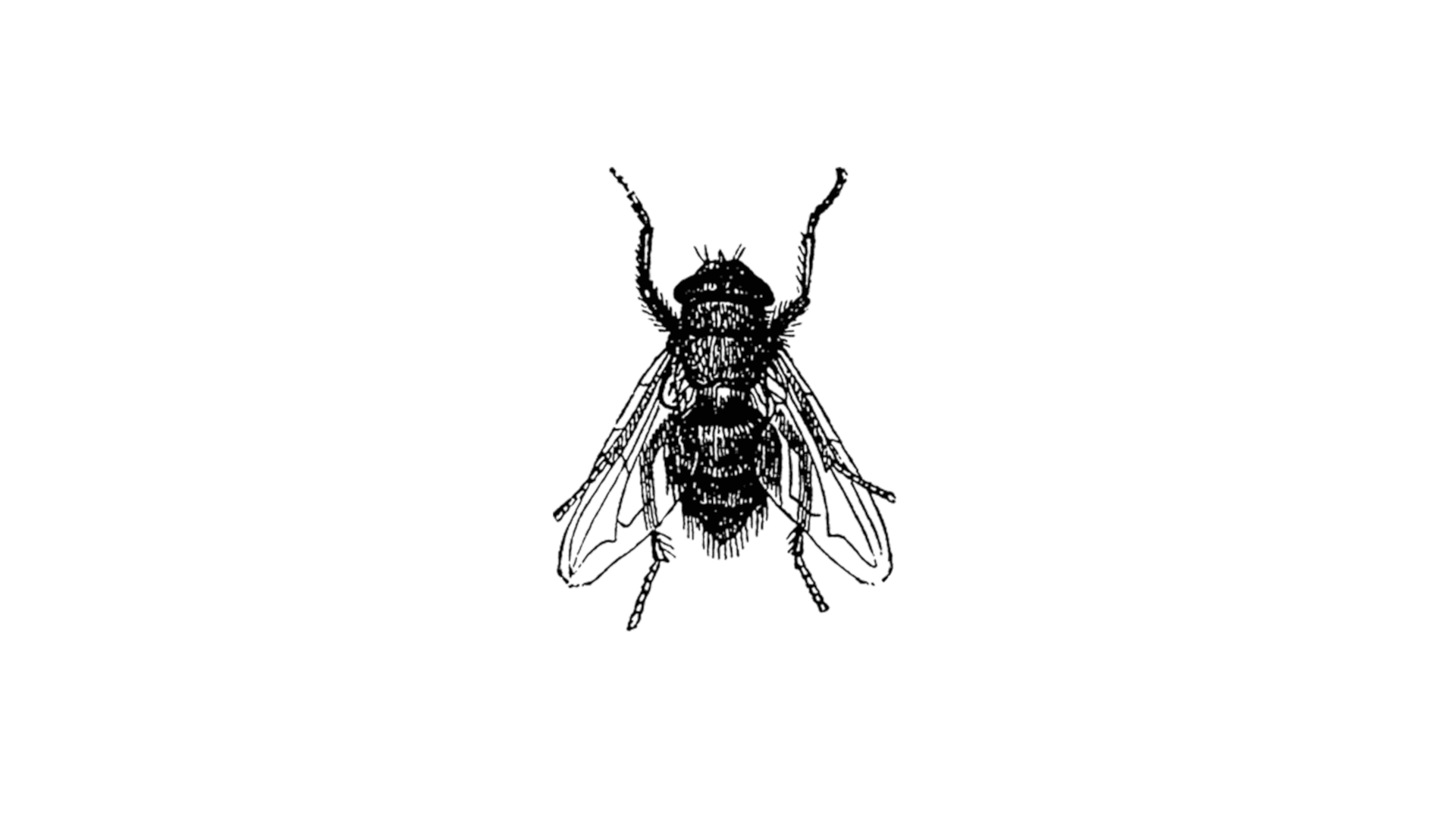
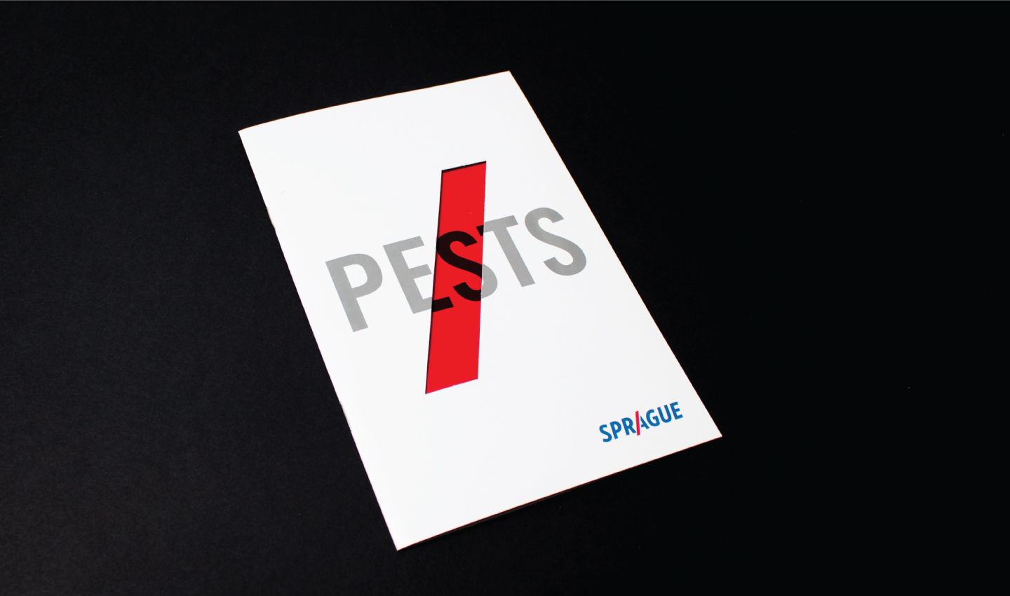
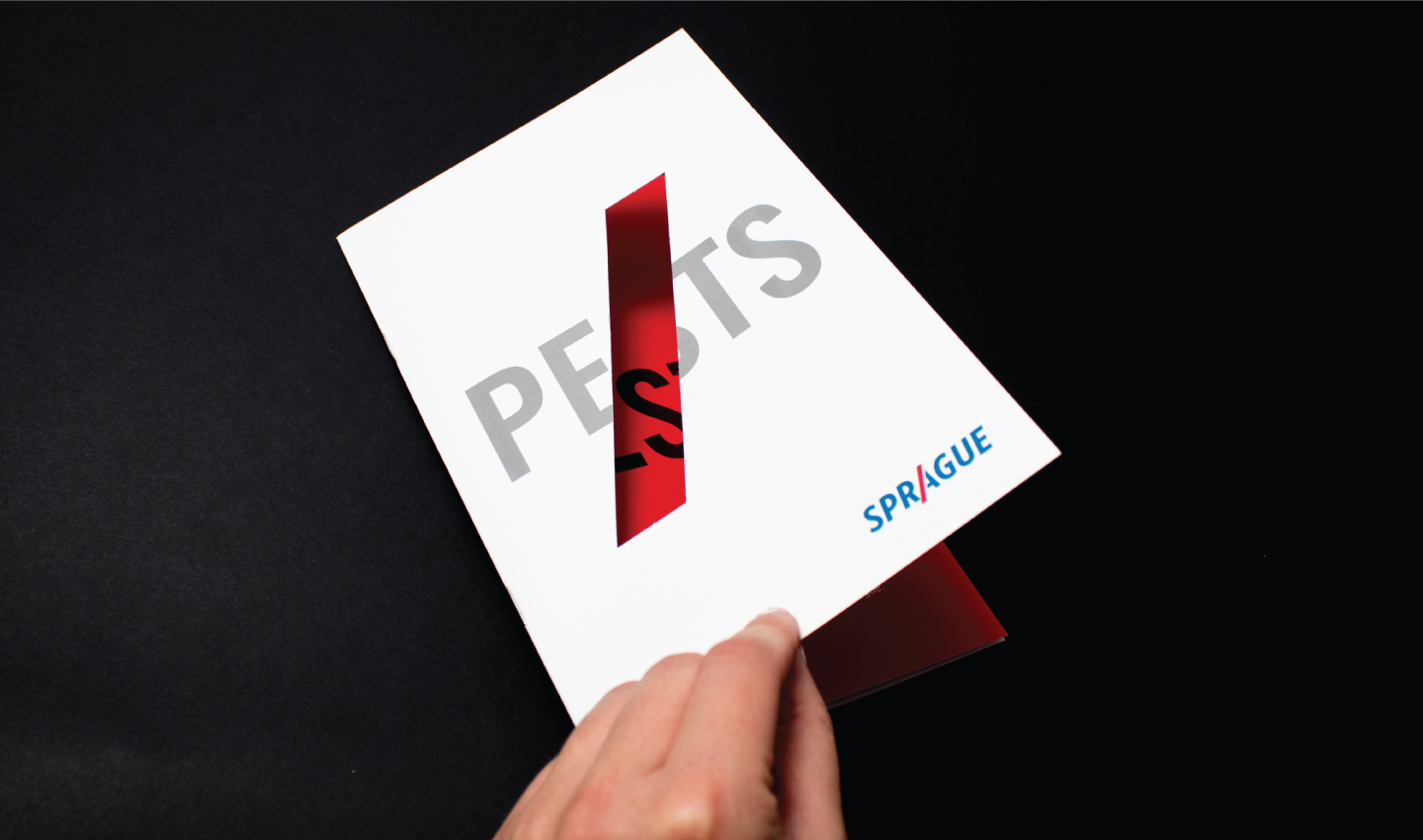
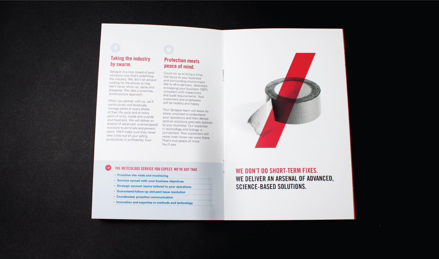
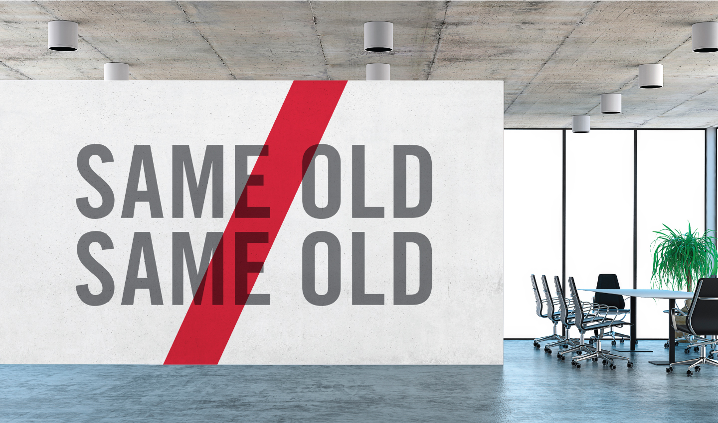
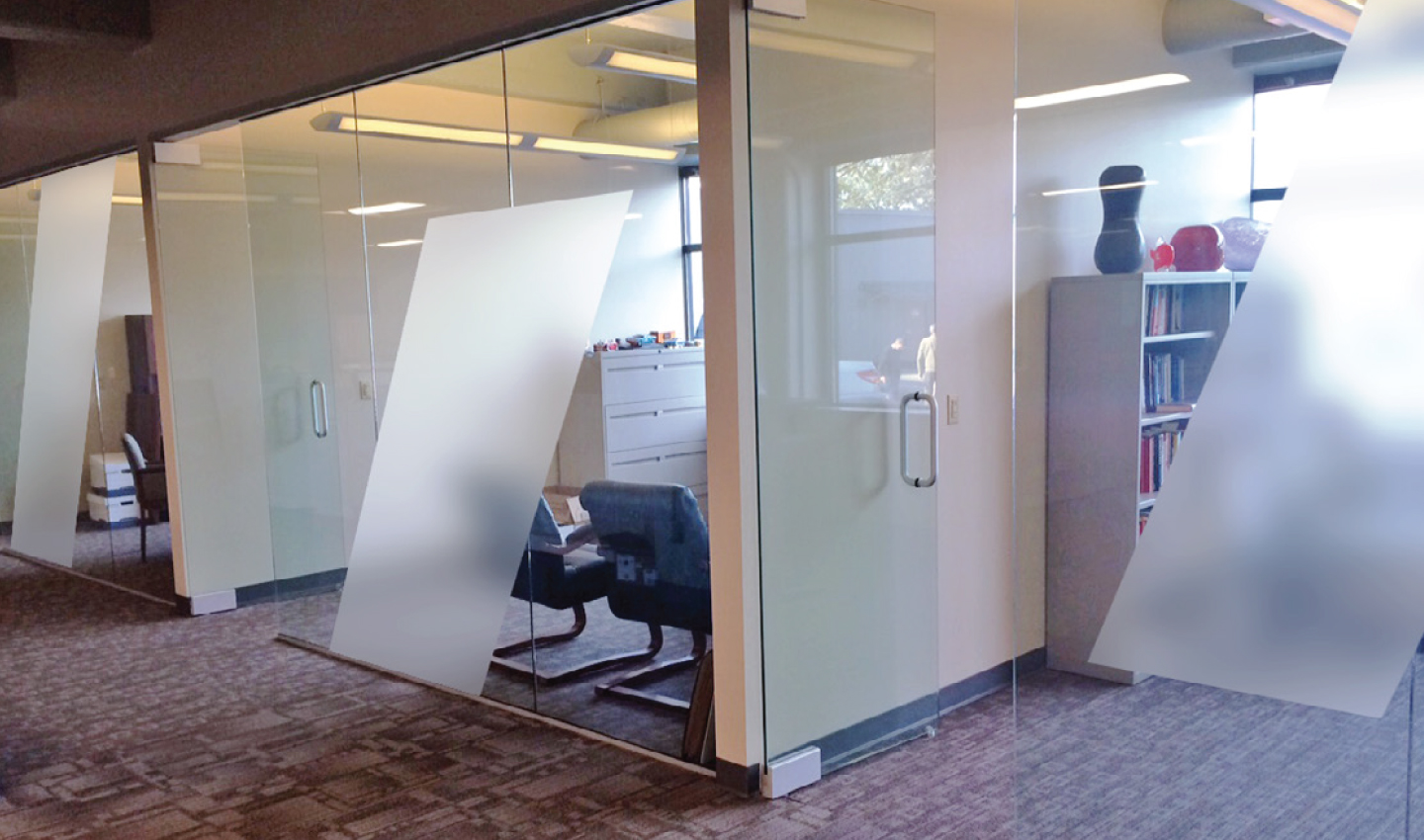
As the foundation of the Sprague identity, the organization’s logo serves as the most concise visual expression of the brand. Incorporated into the wordmark is "The Slash", a symbol for solving problems and for not delivering the same old, same old. Simple, energetic and smart, the logo is an essential element for all branded communications. The overarching graphic style for Sprague is minimal and straightforward, with room for wit and humor where appropriate. As the graphic identifier for Sprague, The Slash is a device that can be used in a variety of applications from supergraphic to supporting graphic to housing container.
BECOMING BRAND DRIVEN
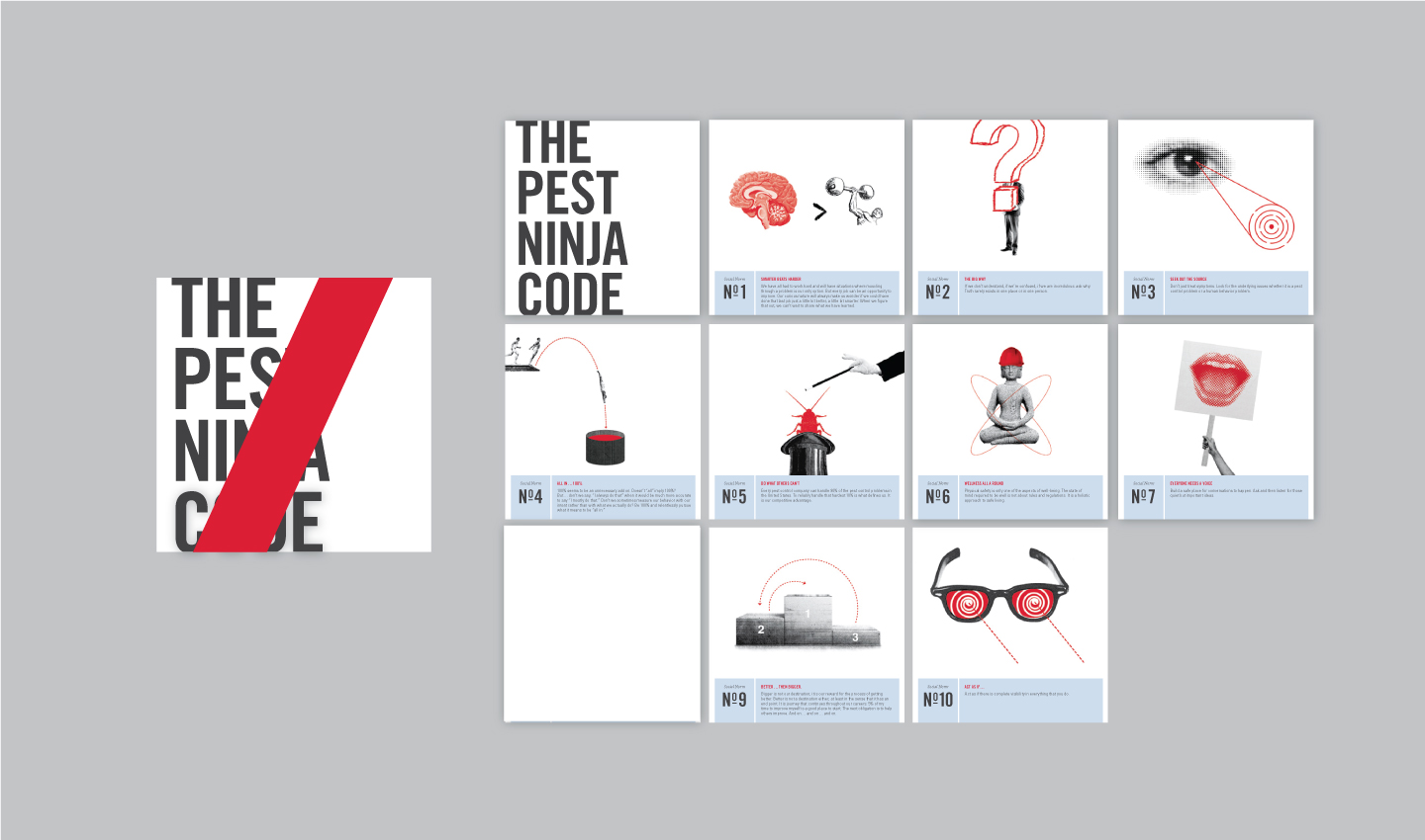
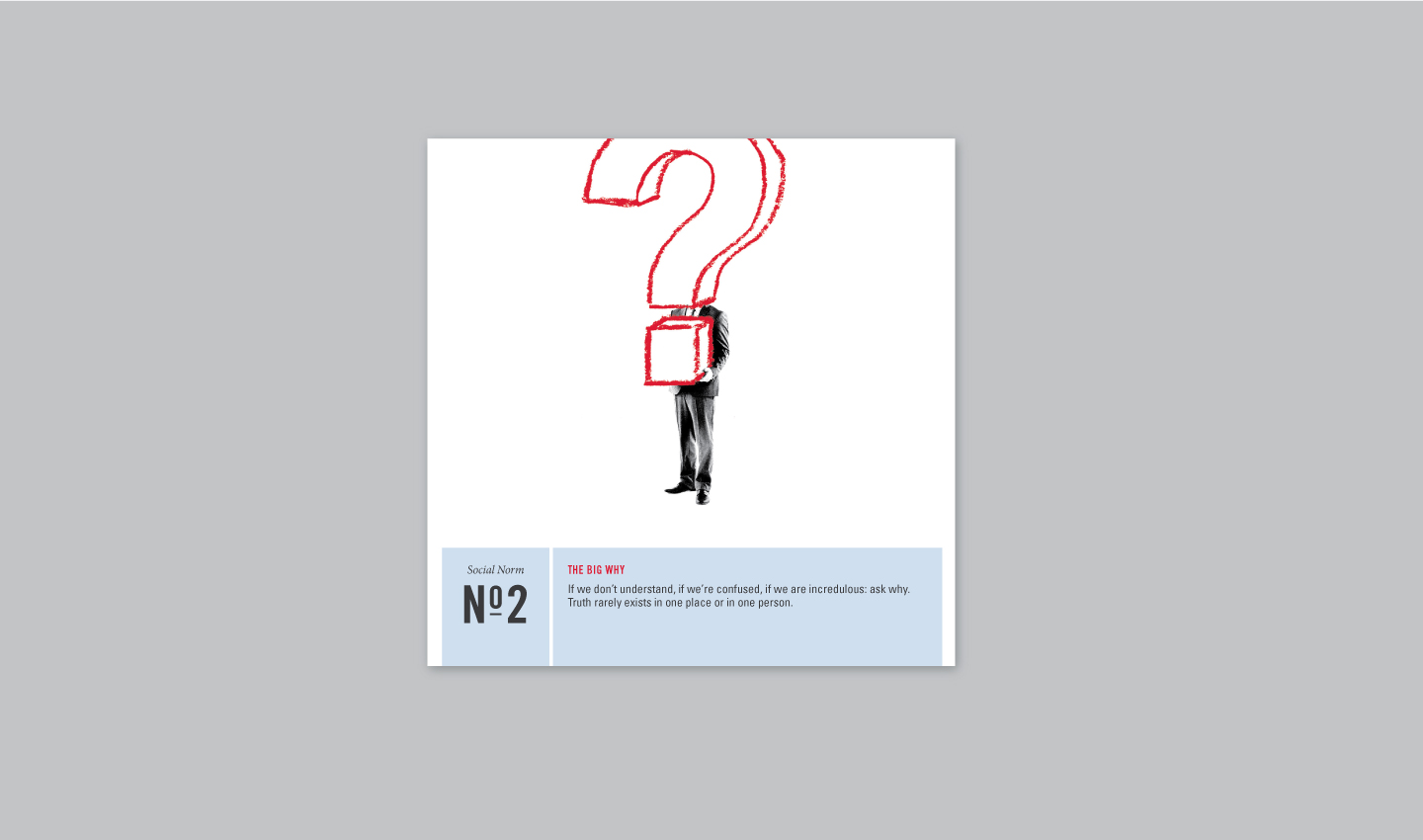
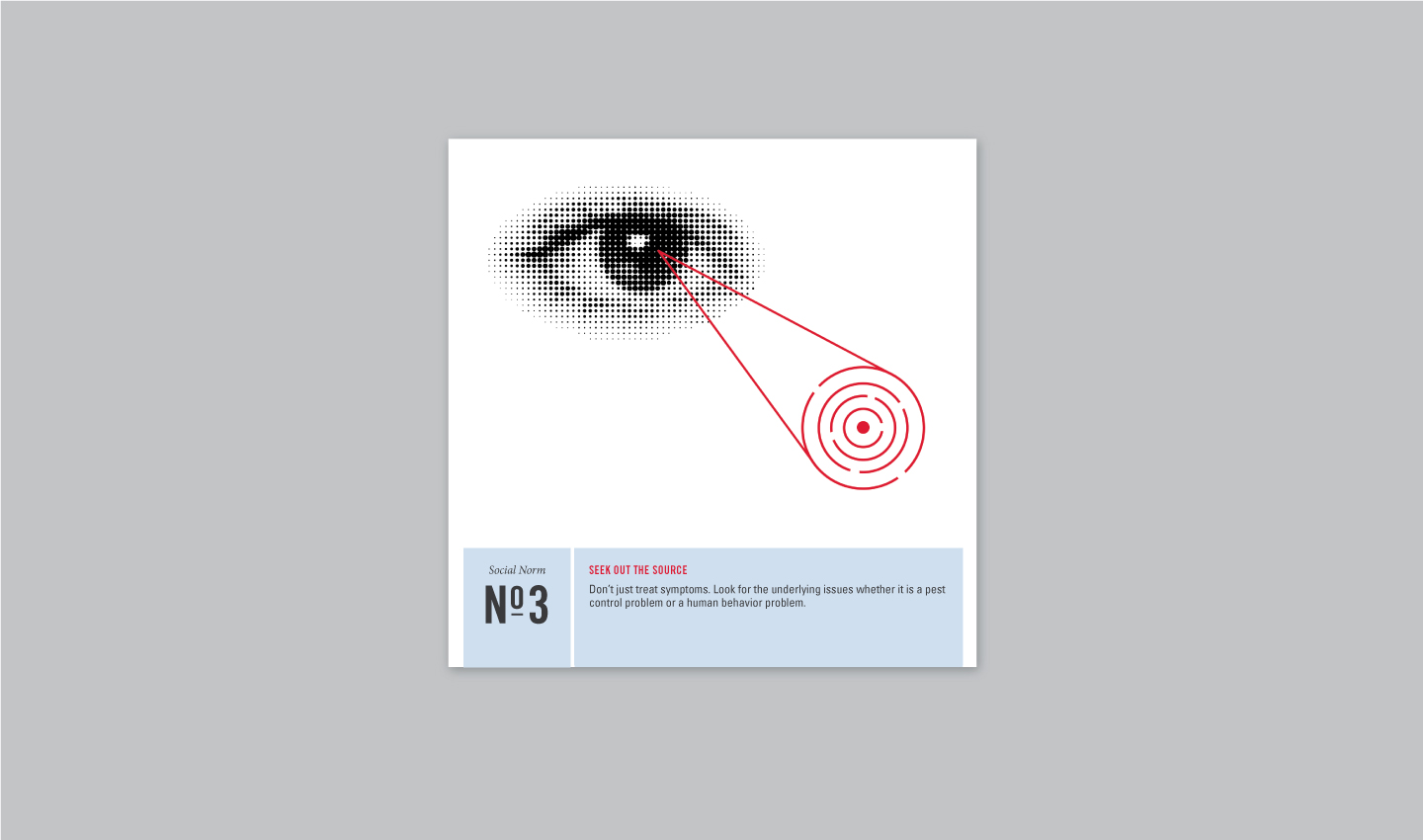
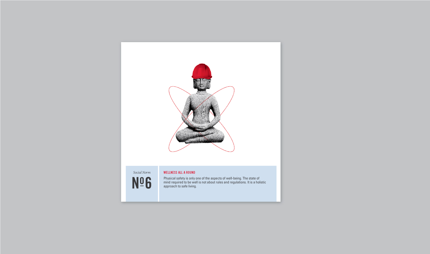
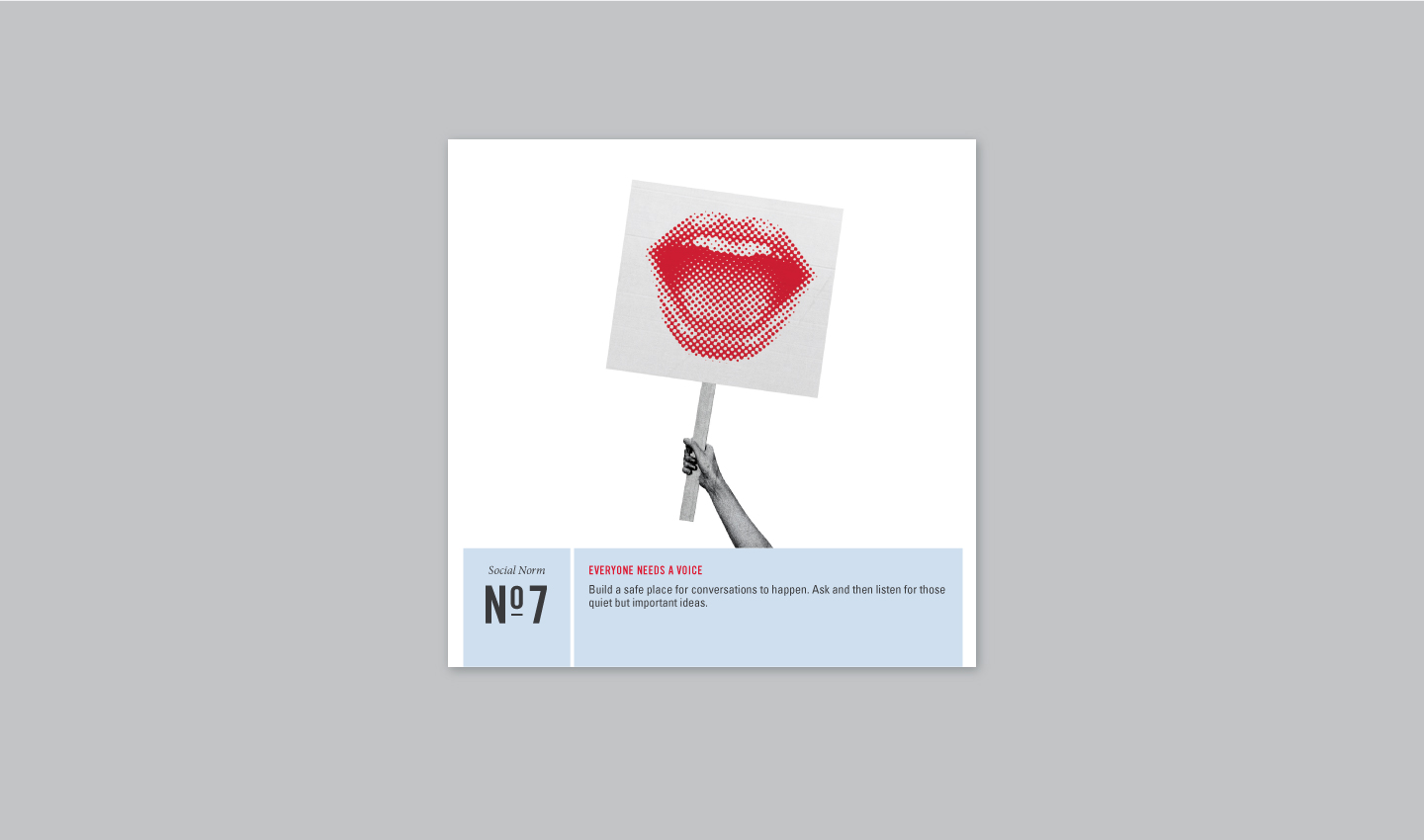
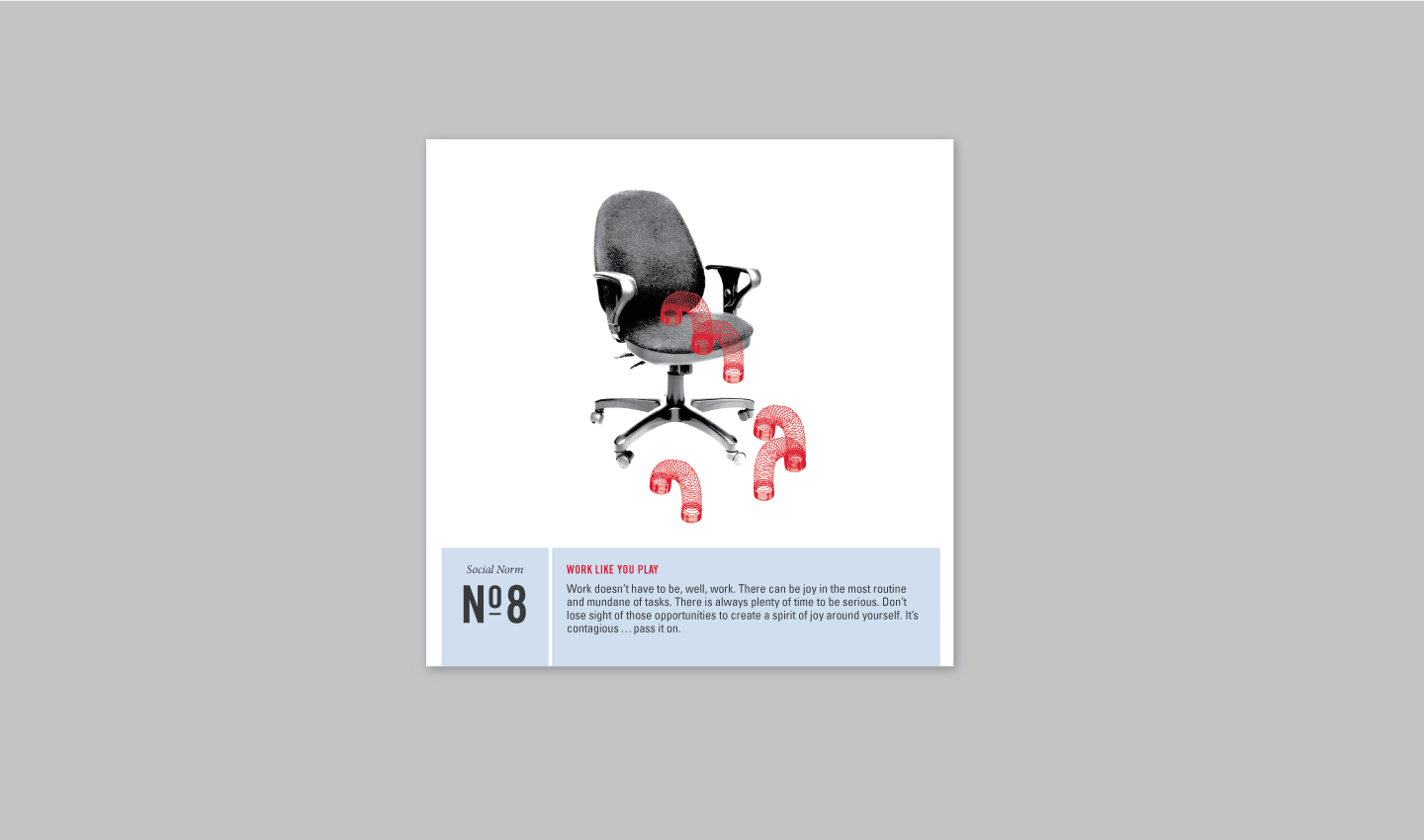
Recognizing that organizational alignment around a common purpose is a hallmark of successful brand-driven companies, W|W worked with Sprague to design a set of tools to assist with the cultural evolution. The Pest Ninja Code, for example, reinforces Sprague’s social norms - the basic pillars of the organizational culture - in an accessible context with personality.
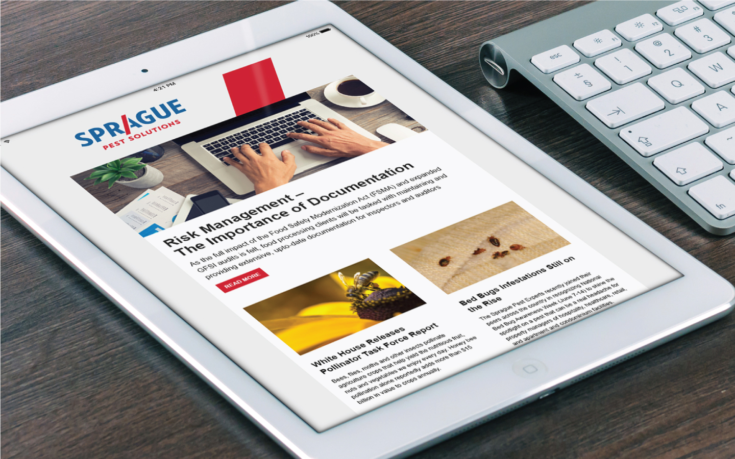
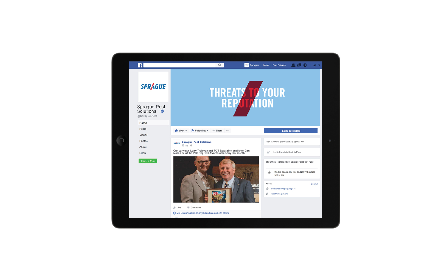
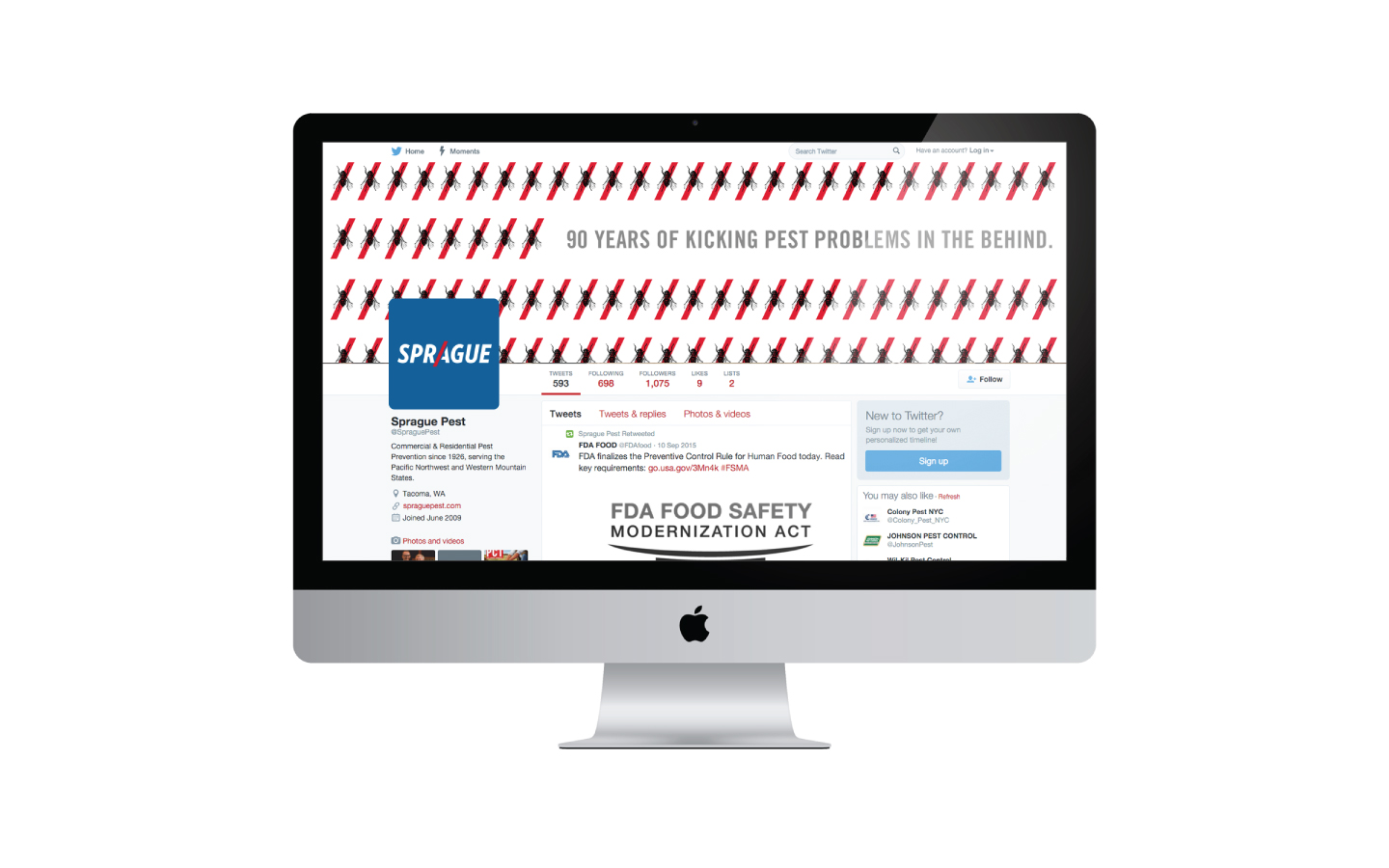
DIGITAL MARKETING
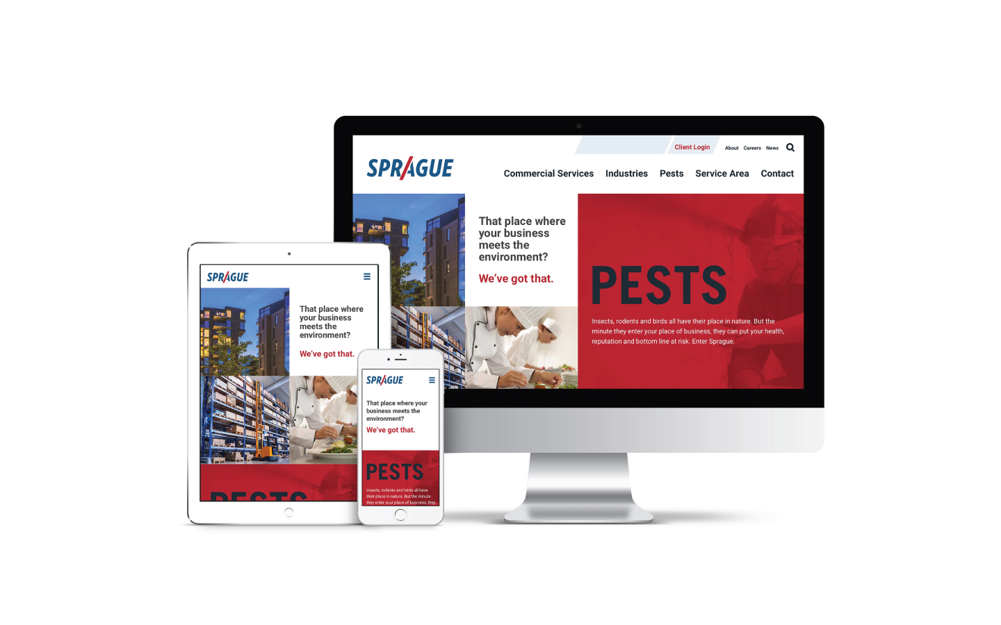
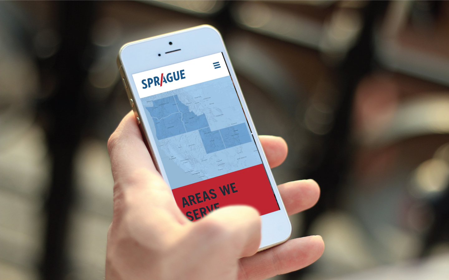
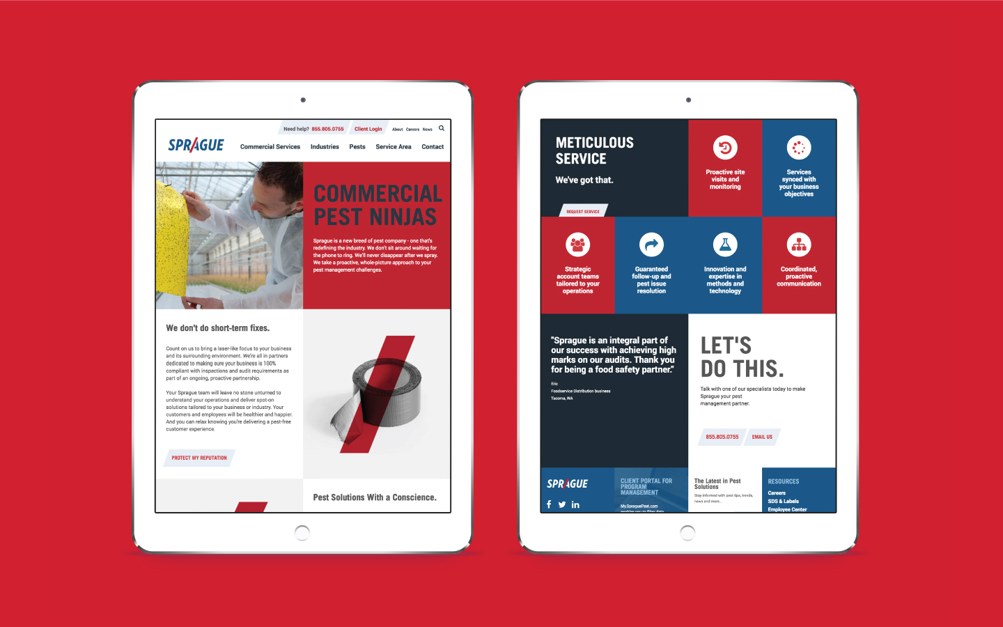
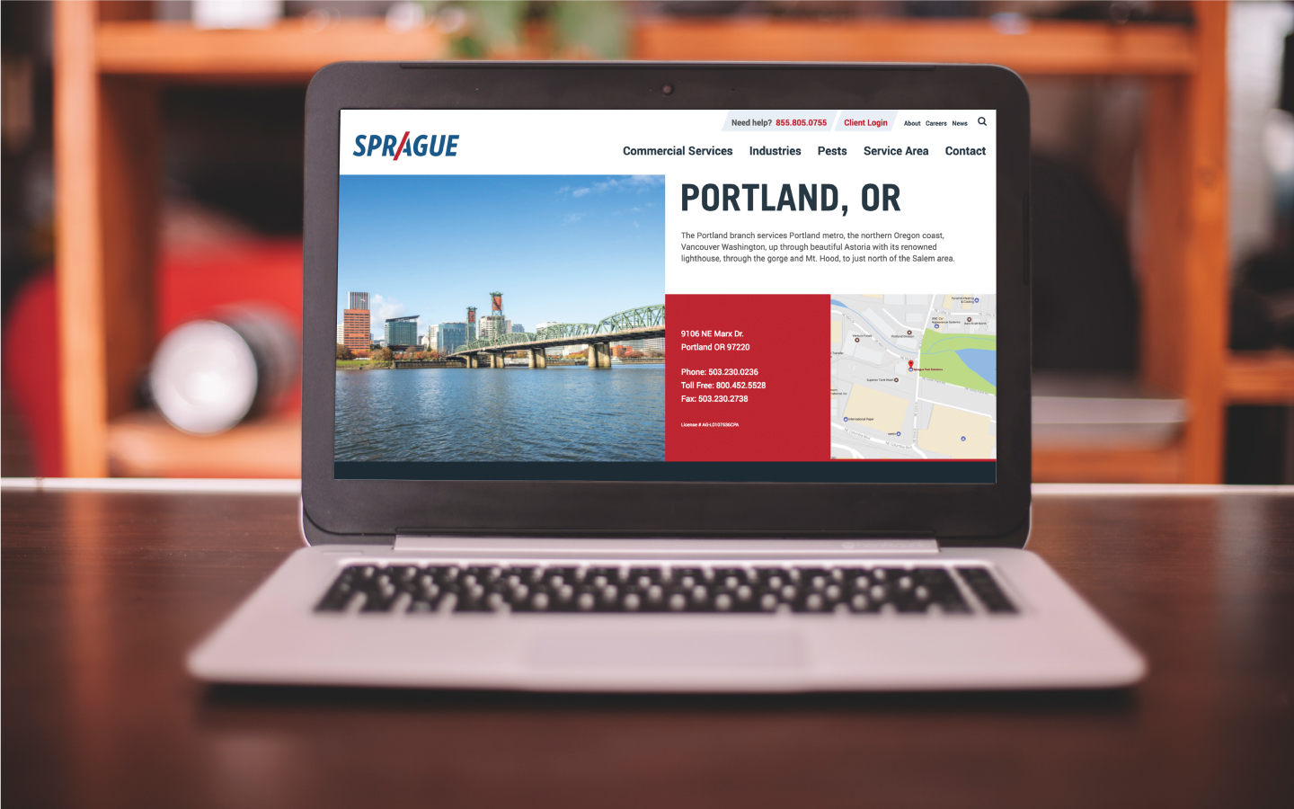
As part of the comprehensive, integrated rebranding, W|W redesigned the Sprague Pest Solutions website and supporting digital environments. W|W was able to deliver a true sense of the company’s unique value proposition and culture through a custom Drupal design that leverages unique page layouts, texture and compelling graphic assets. As a primary brand signal, the website reinforces Sprague’s defining of the category, where they radically reimagine the place where your business meets the environment.
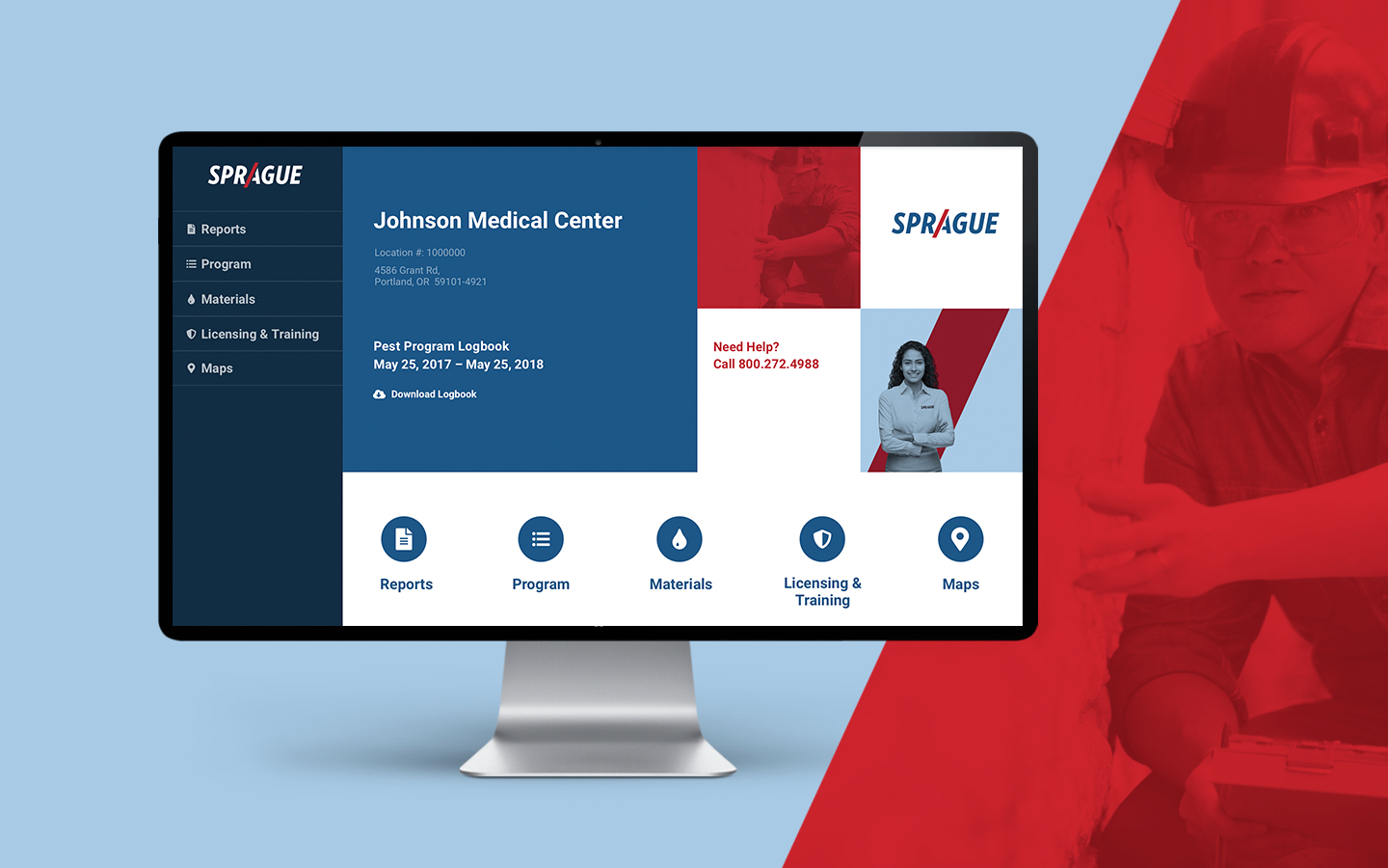
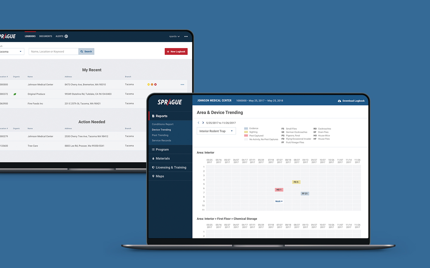
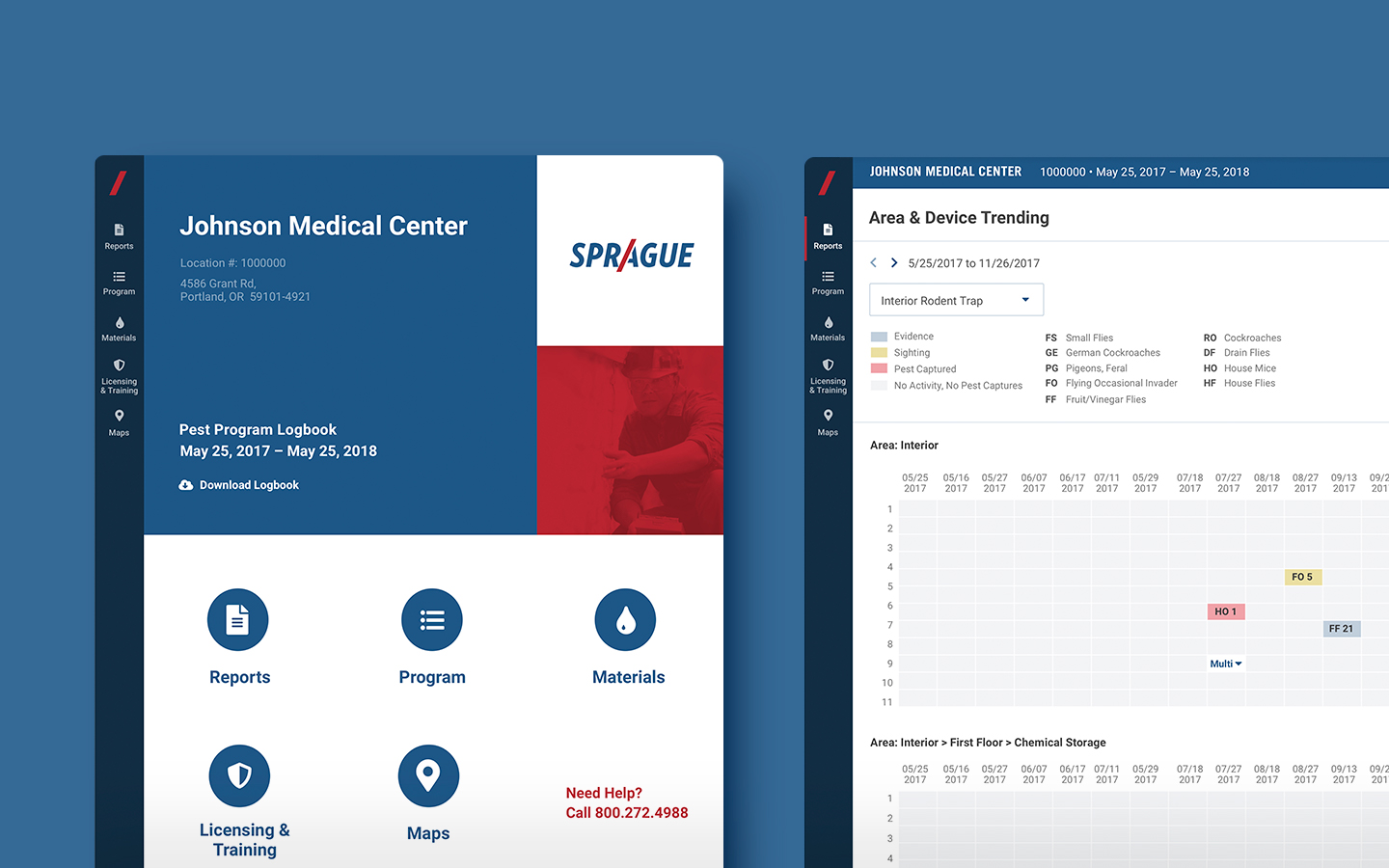
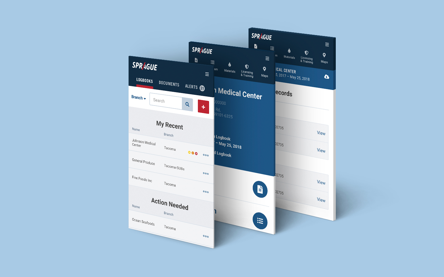
DIGITAL LOGBOOK
W|W also helped Sprague rethink the UX/UI and design of its Pest Program Logbook, a robust online system that manages and tracks each customer’s pest activity, and is used for 3rd party auditing and reporting. W|W facilitated interactive user-sessions with Logbook administrators from Sprague and customers to better understand how they used the tool in their daily activity to surface opportunities for innovation and improvement.

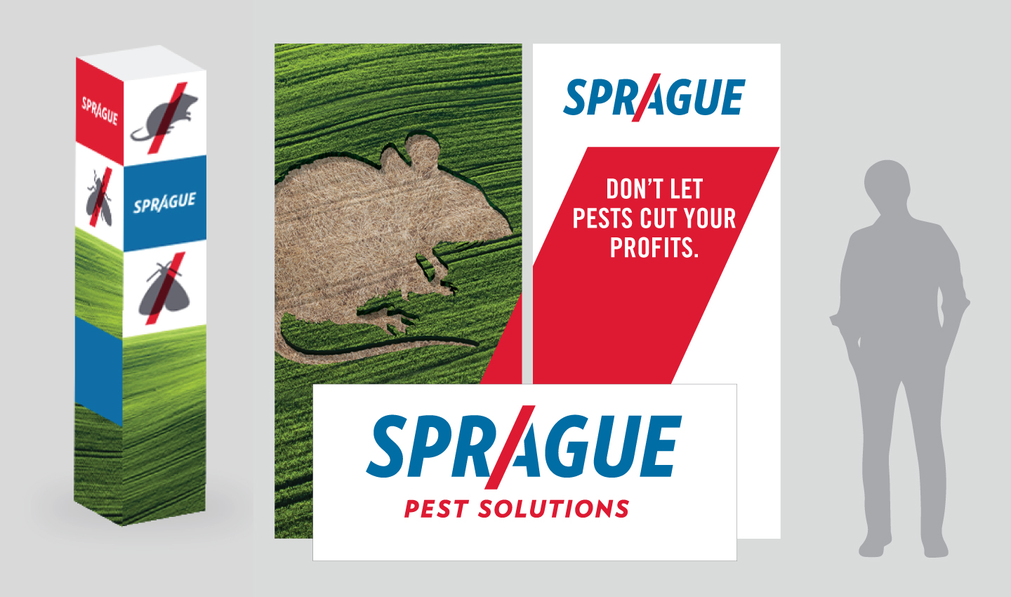
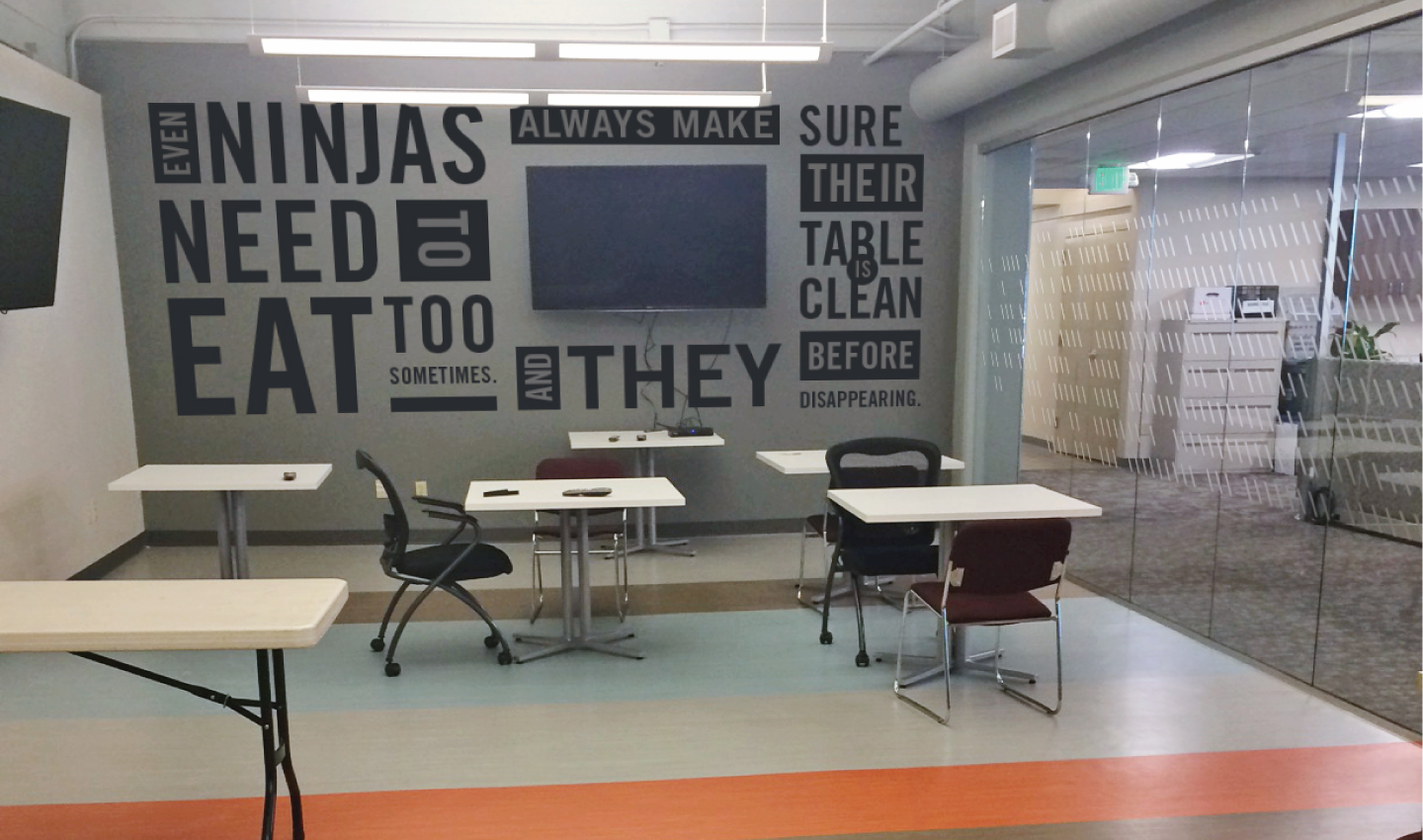
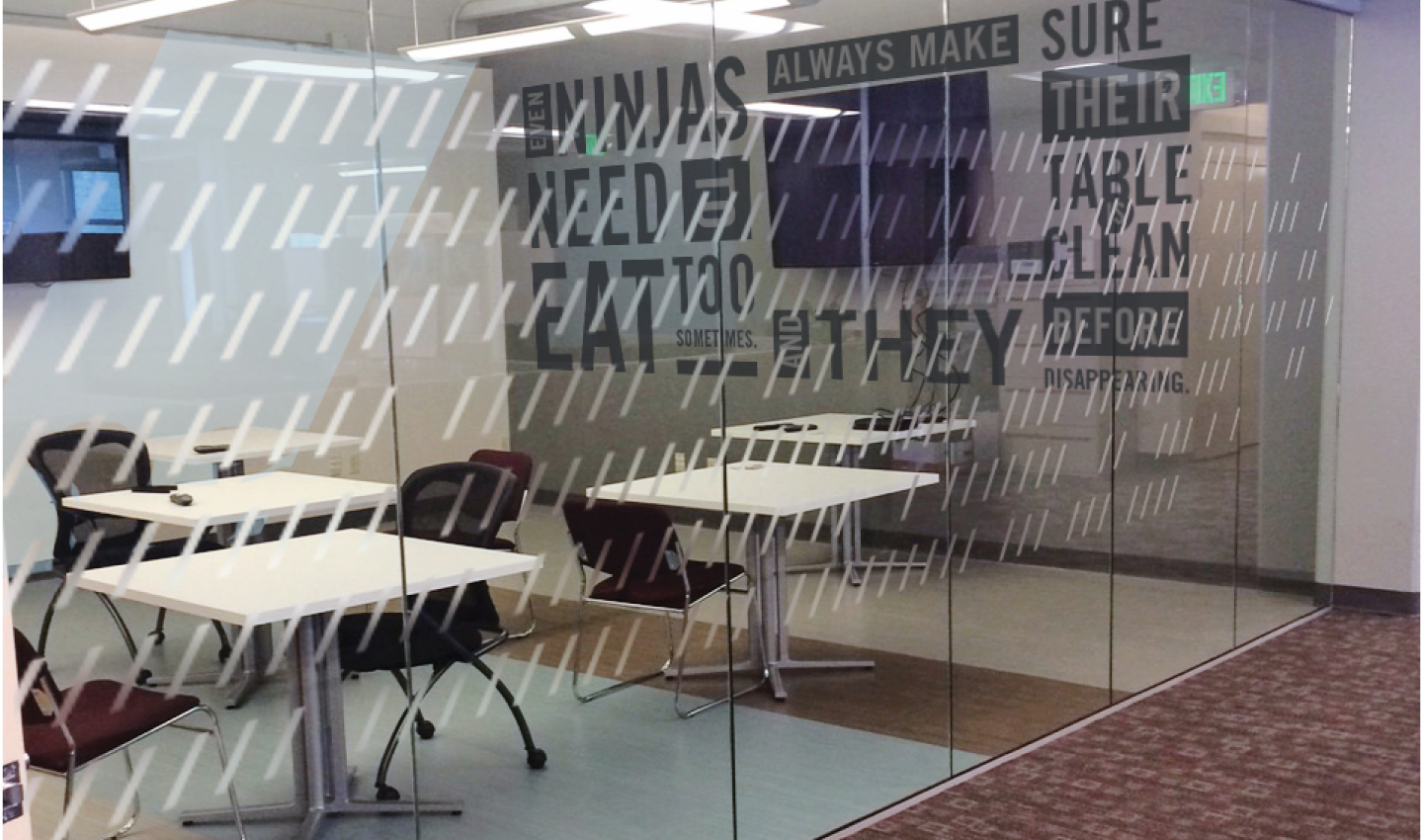
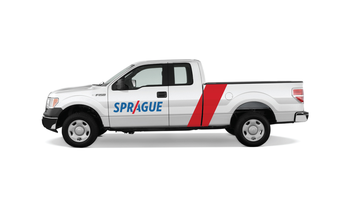
ENVIRONMENT
In addition to designing the signage and branded decor elements for the headquarters, W|W worked closely with Sprague to ensure a seamless, integrated experience at all touch-points including its fleet of vehicles and trade show booths.
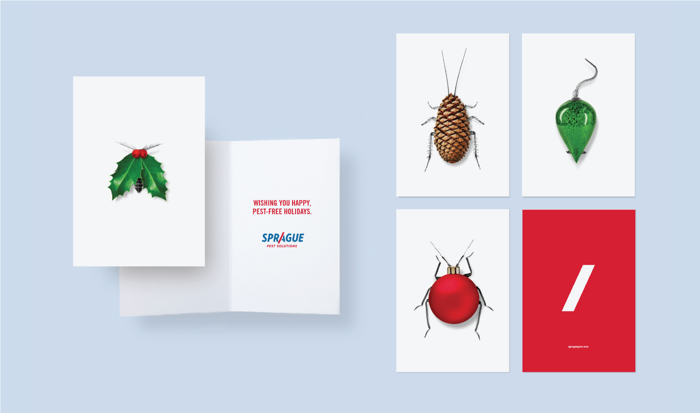
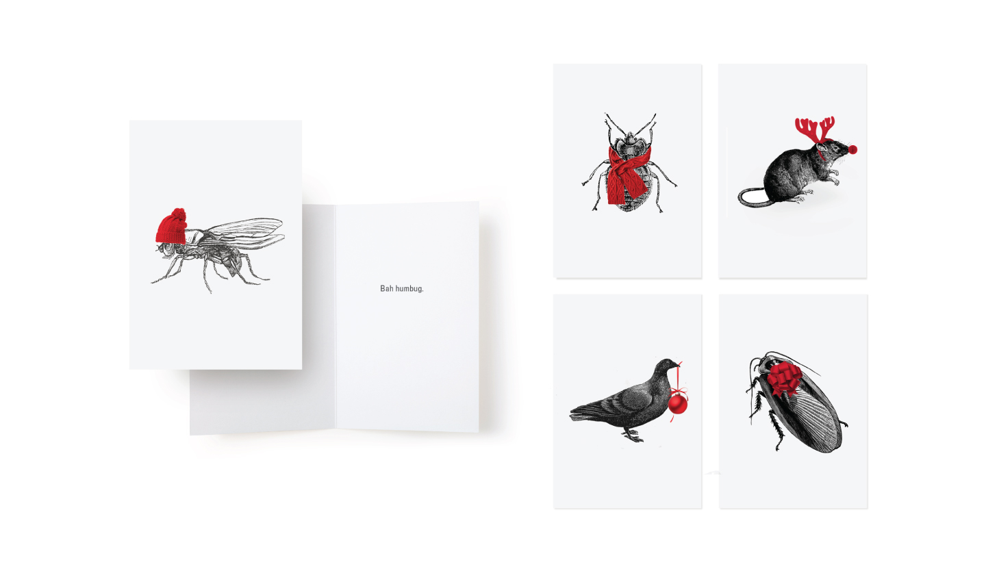
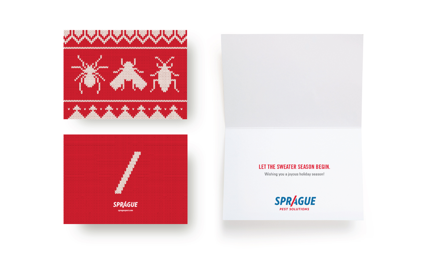
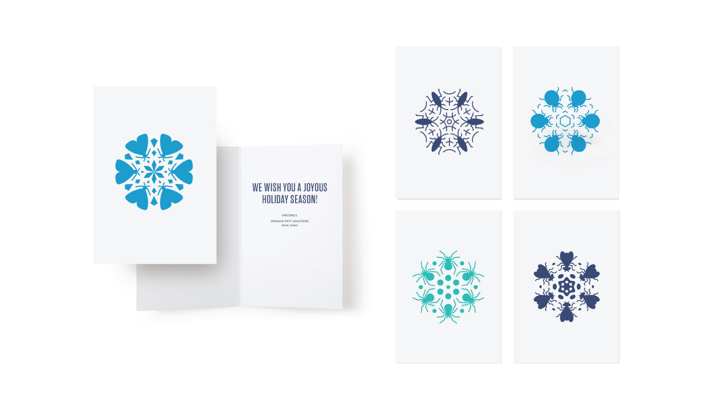
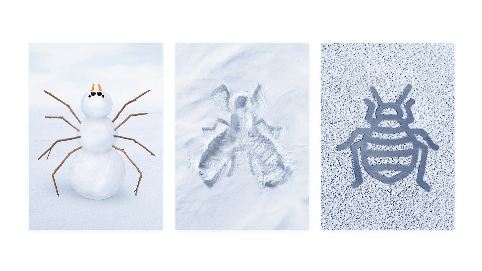
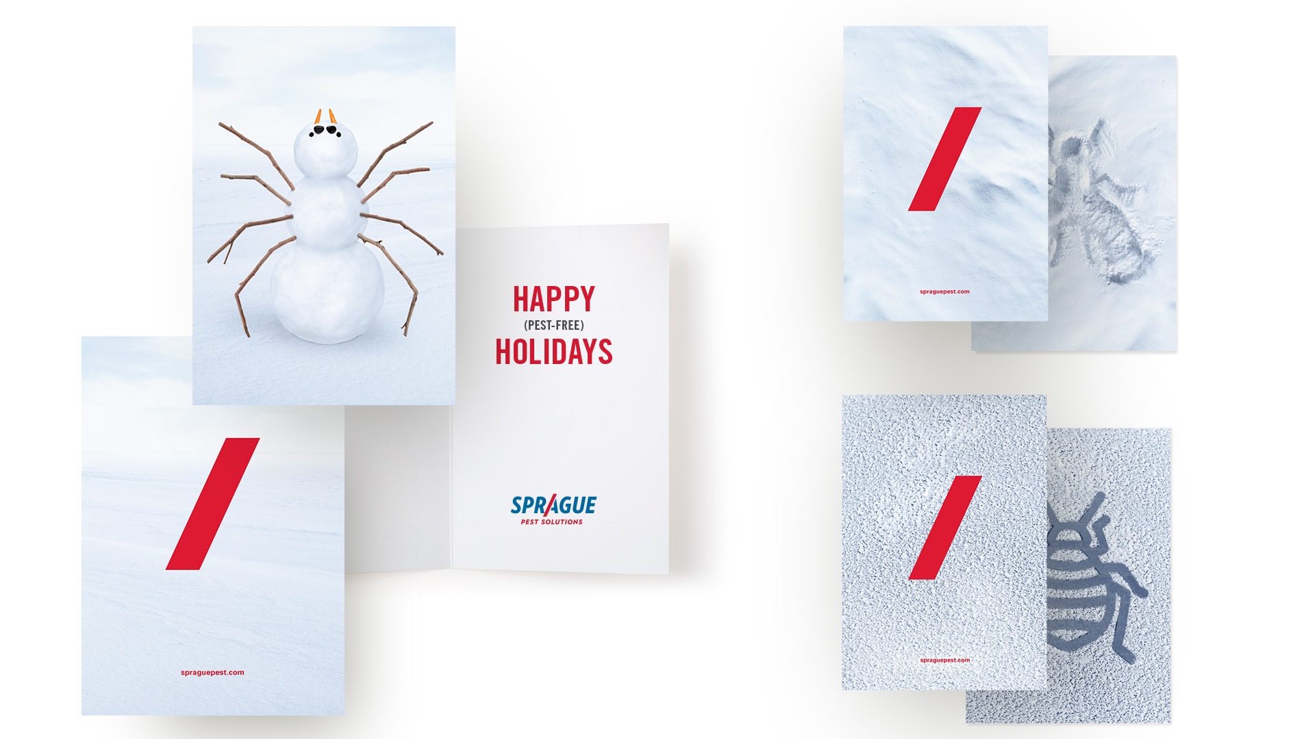
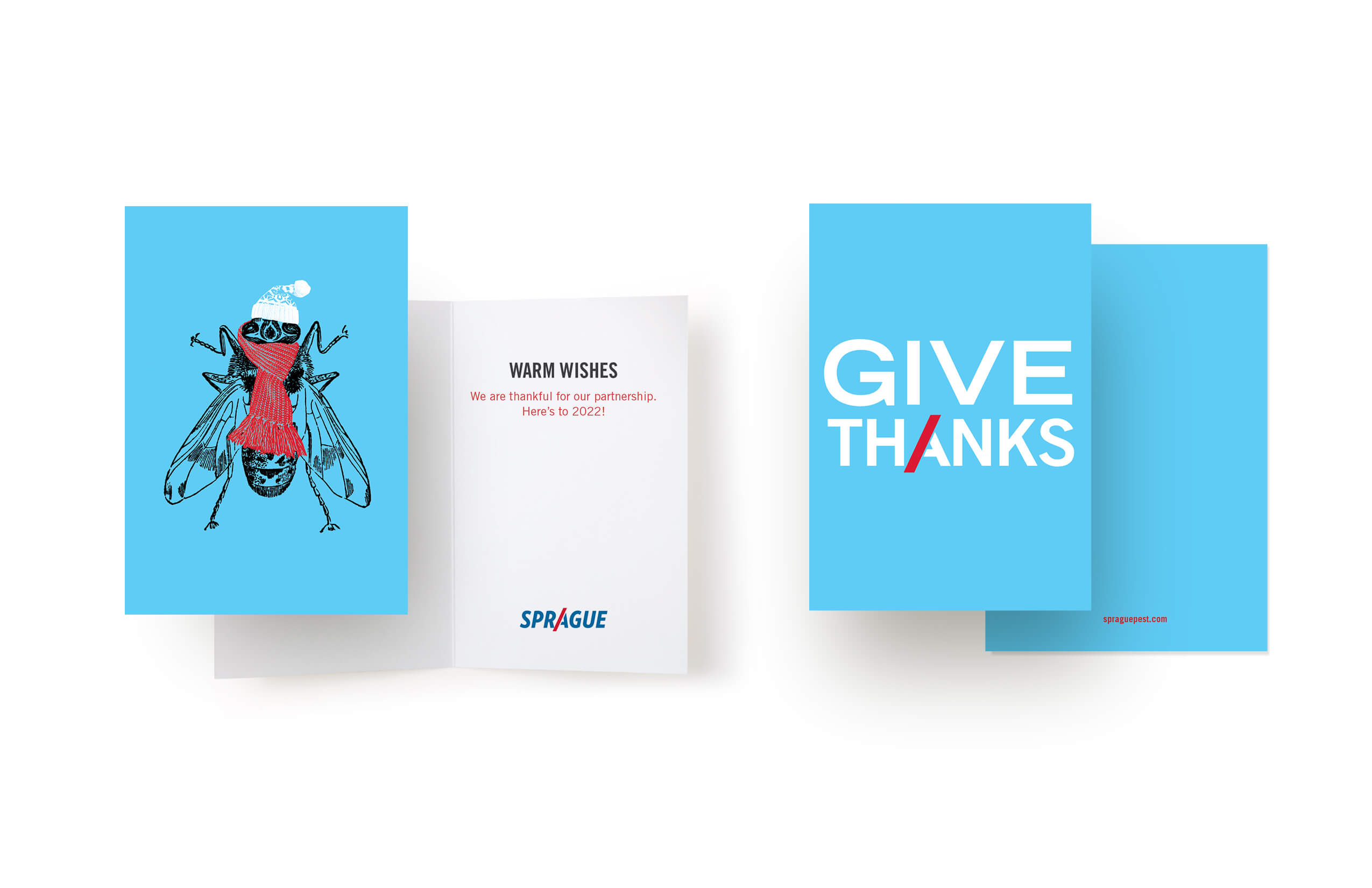
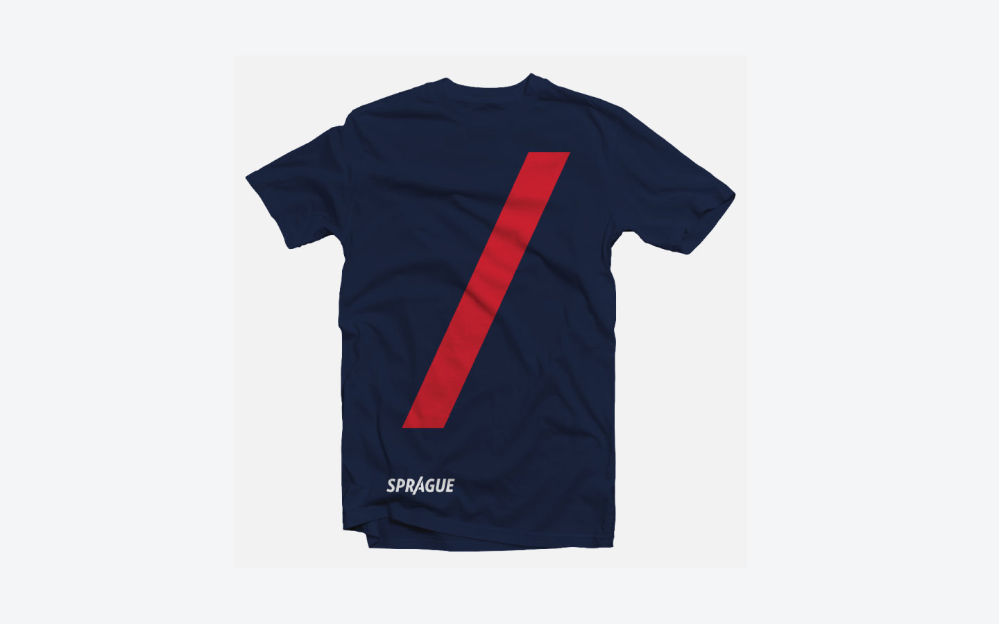
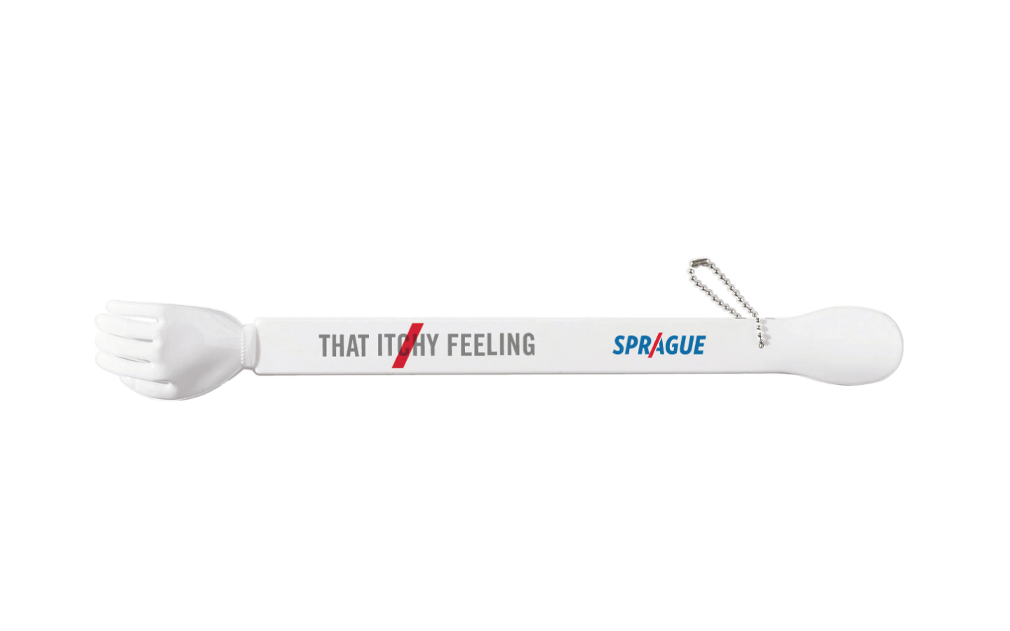
HOLIDAY CARDS & MERCH
Is a pest really a pest or something else entirely? W|W took this challenge to heart in designing Sprague’s annual holiday cards which present an opportunity to deliver some seasonal humor to customers and partners. The holiday cards have been regularly honored with top accolades at design and advertising competitions.