PENNSYLVANIA CREDIT UNION ASSOCIATION
MOVING YOUR CREDIT UNION FORWARD
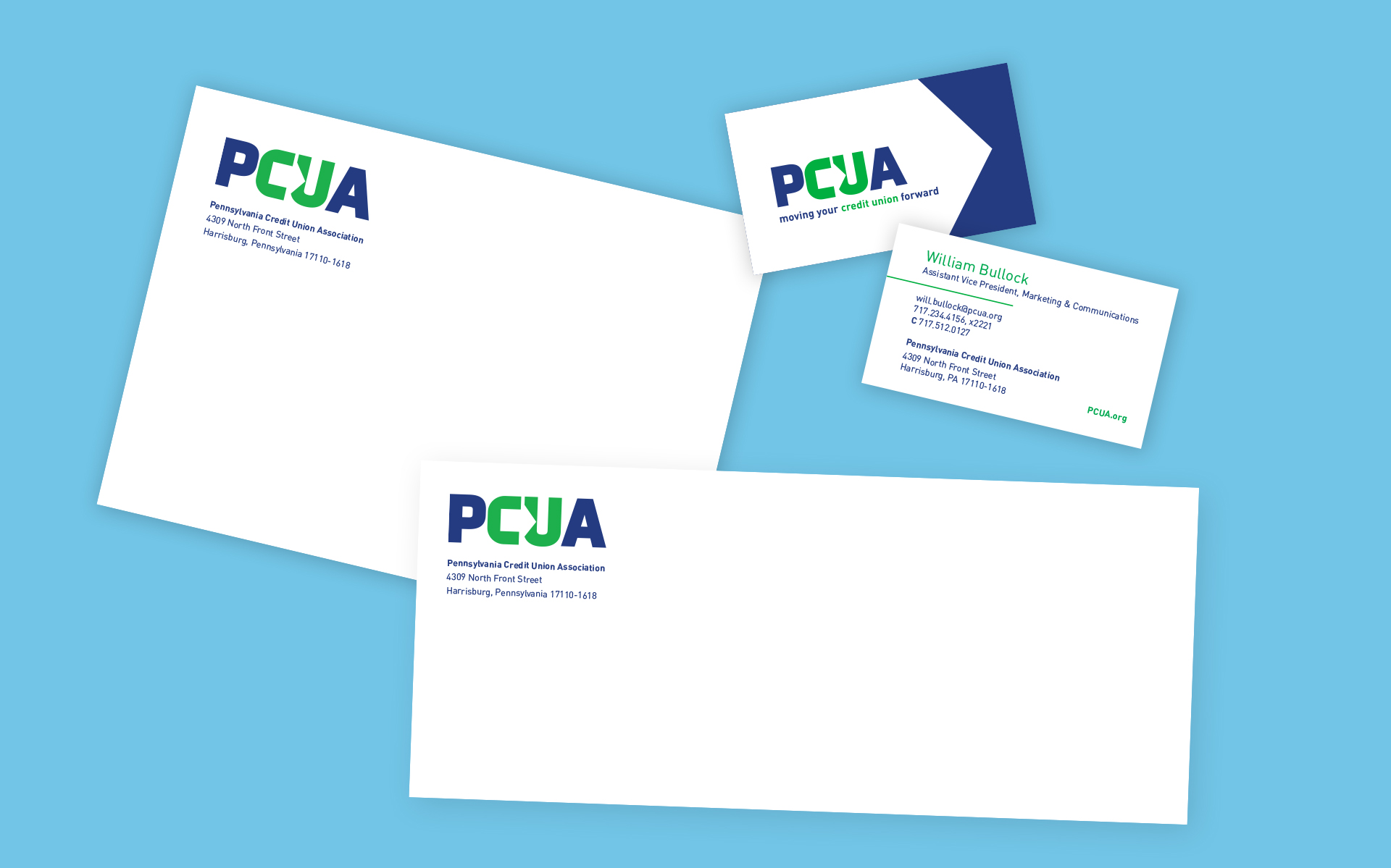
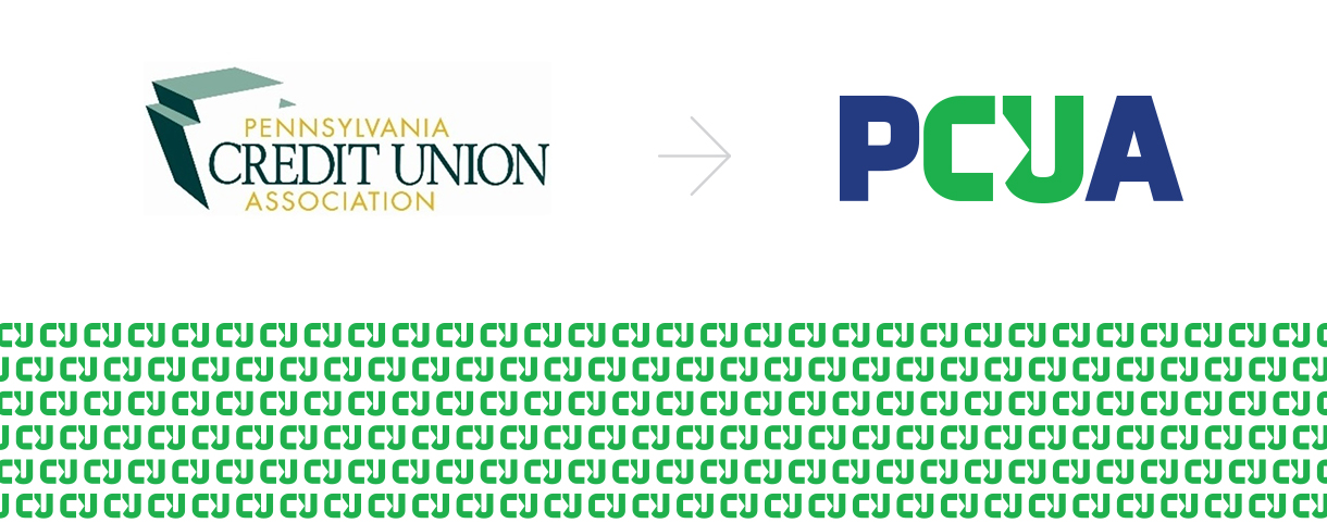
Founded in 1934, the Pennsylvania Credit Union Association (PCUA) is the advocacy organization that offers essential products and services to help every Pennsylvania credit union thrive. In light of changing times coupled with a 15-year span since critically reviewing its own identity, PCUA hired W|W to deliver a comprehensive organizational rebranding. The assignment’s initial deliverable was a research-driven brand platform that provided a fact-based foundation from which to inform the design of the strategy, identity, creative, marketing, communications and other member touch-points and experiences. The research phase included immersion exercises, peer audit, secondary research and primary research via in-depth interviews of internal & external stakeholders and on-line survey. A key ingredient of the brand platform were audience personas which combine demographics, attitudinal and behavioral data with an understanding of the perceptions, wants and needs of members and partners. The integrated rebranding designed by W|W included the new PCUA logo, visual identity system, tagline, messaging & narrative and brand standards that address all touch-points.
BRAND PLATFORM
In order to develop a strong foundation from which to base the initiative, W|W executed a research-driven brand strategy. Working with longstanding partner Ideas in Focus, a consumer insights advisory agency, W|W evaluated the competitive landscape, audited existing marketing materials, conducted in-depth interviews with internal and external stakeholders and deployed an on-line survey. The insights that emerged from the research and audit informed the PCUA Brand Platform (brand promise, positioning, personas, messaging, tagline, themes and overall narrative). Now, armed with understanding behind the behavior and attitudinal motivations of primary personas, clarity of intent and organizational alignment beyond a common purpose, PCUA was poised to bring this refreshed brand to life.

BRAND SYSTEM
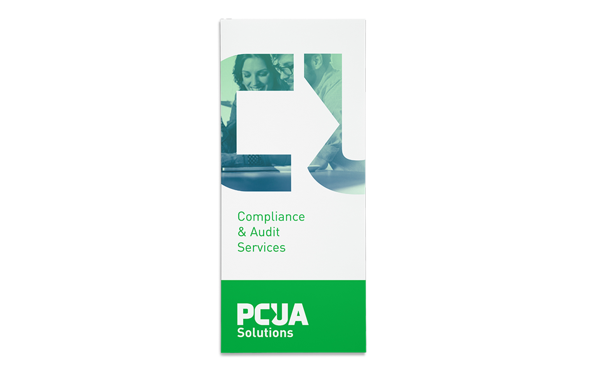
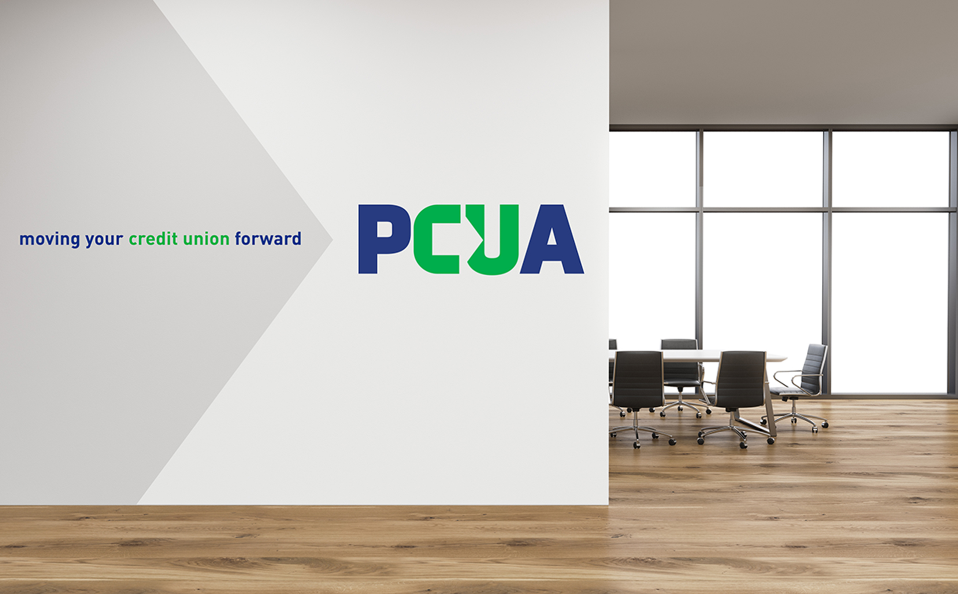
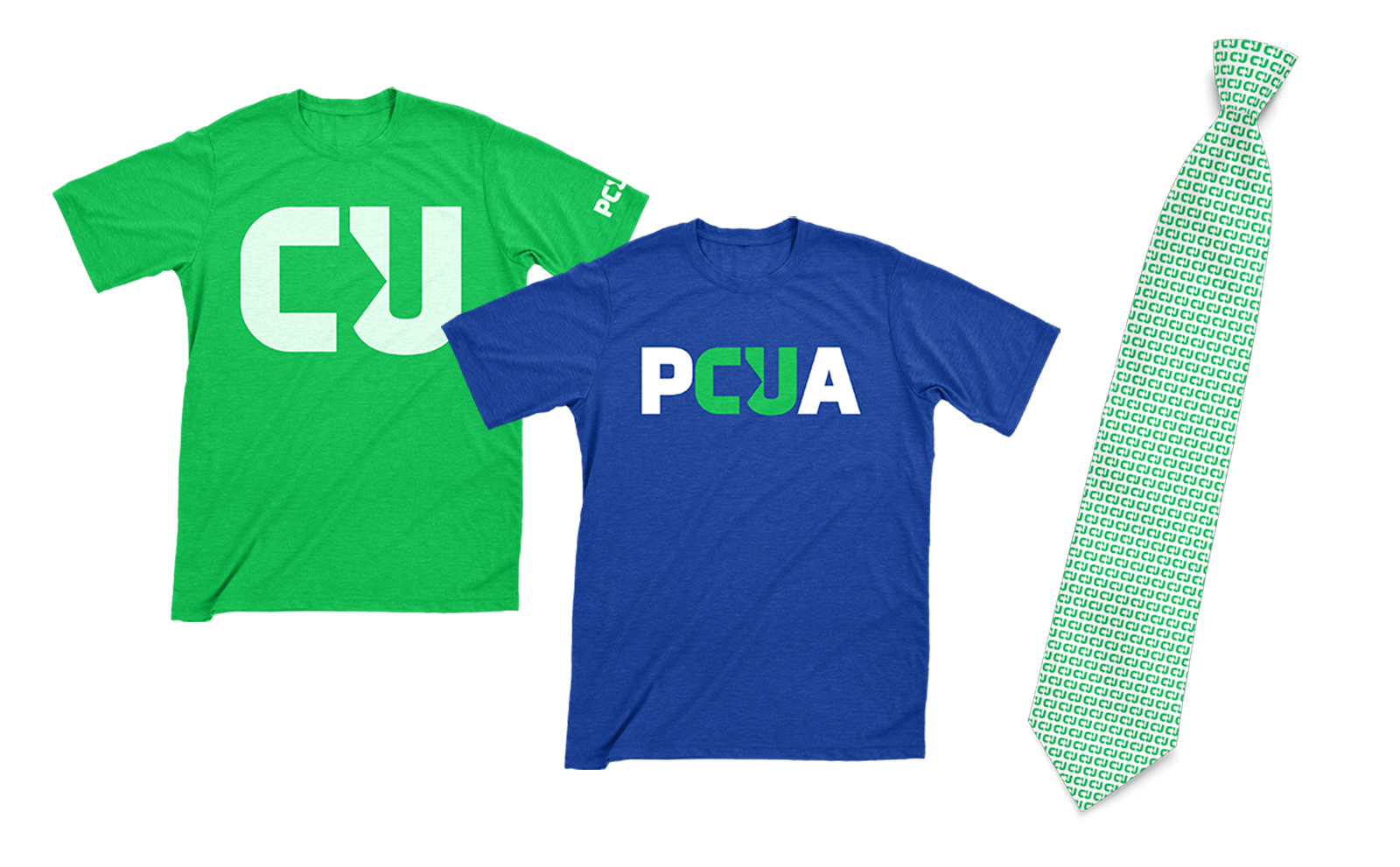
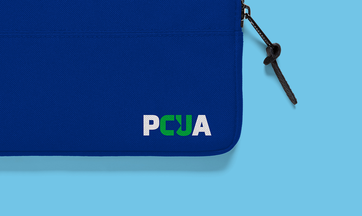
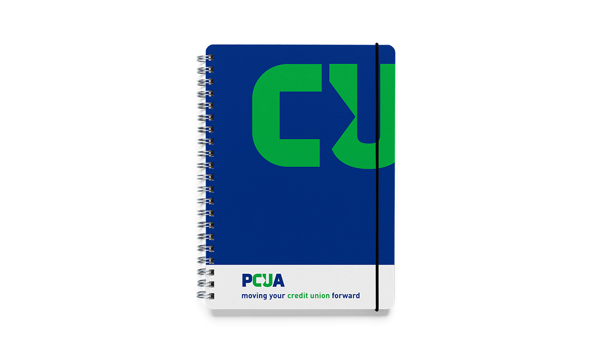
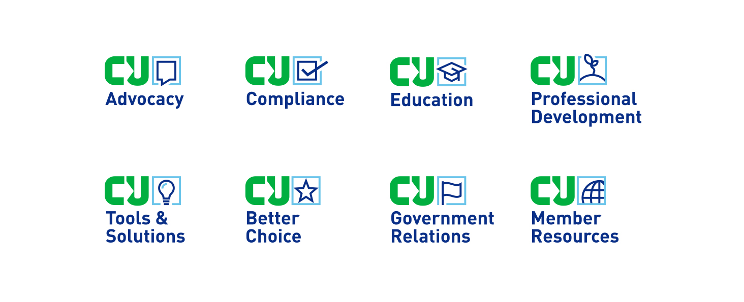
With the new PCUA logo as the starting point, W|W created a set of graphic assets to help build the visual story of the refreshed brand. Those items included a logo pattern that could be used as a background texture and the CU arrow that is leveraged as a super graphic. For the color palette, W|W utilized a more vibrant green that is better aligned with the organization’s personality and added a bold shade of blue, the official color of the commonwealth, that compliments the new green. The brand toolkit was rounded-out with a robust set of custom icons and affinity marks that address PCUA’s extensive services and programming. Recognizing that there was an opportunity to more strongly connect the products and services of Pacul Services Inc. aka PSI to PCUA, W|W renamed PSI to PCUA Solutions, repositioning PSI as a member benefit while leveraging PCUA equity in promoting the for-profit side of the business across state lines.