PAUBOX
SECURE EMAIL for modern healthcare
Paubox is a fast-growing, San Francisco-based tech company with Hawai'i roots, providing a variety of HIPAA-compliant email encryption solutions. In light of their recent expansion and increased funding, W|W was tasked with helping to evolve the Paubox brand look and feel, make recommendations for the brand's growing structure, and develop messaging in line with Paubox's top-level industry certifications and place as a leader in the email security space.
FRESH OUT OF THE BOX
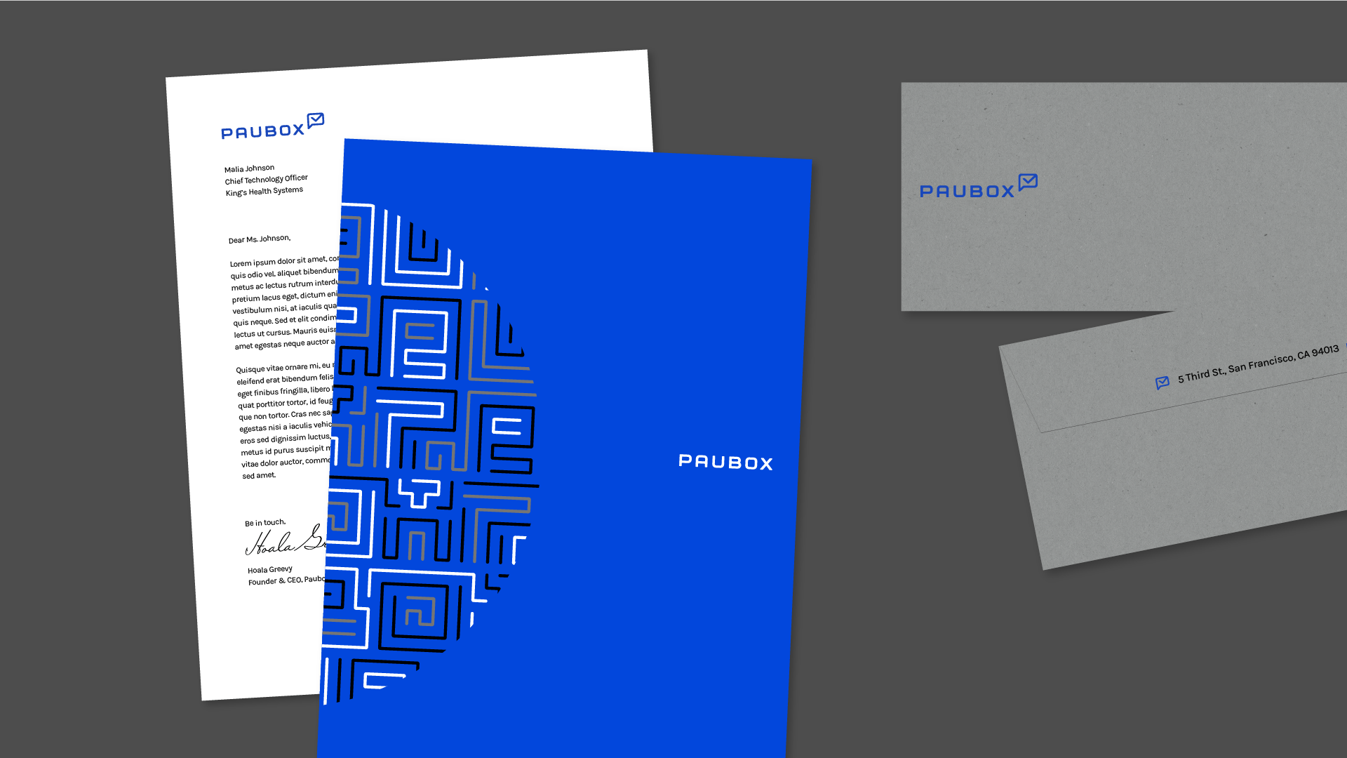
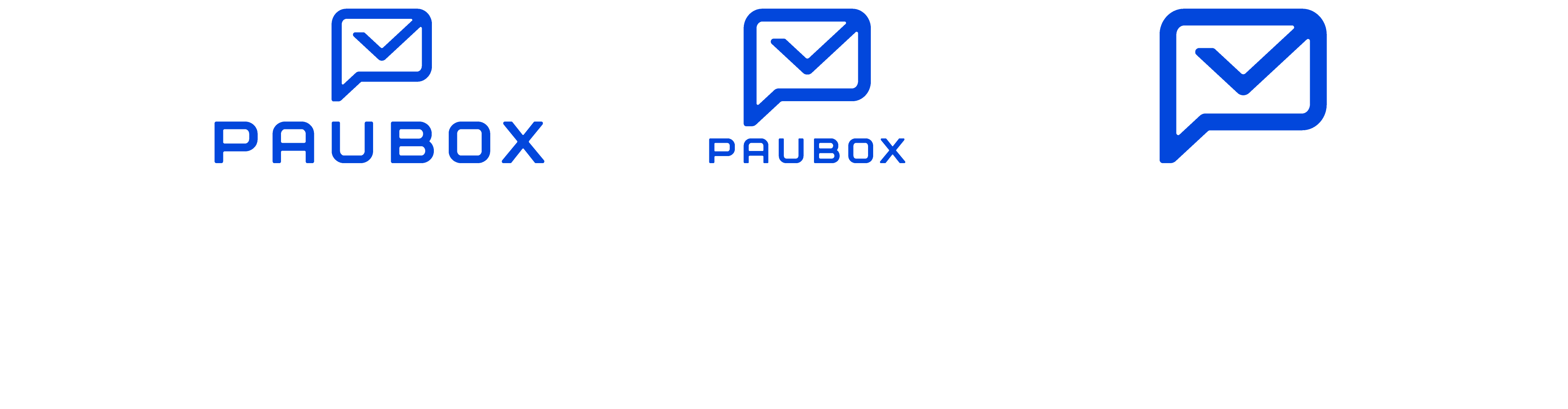
W|W developed an updated logo that preserves the boxy letterforms of the original, but with a more approachable and polished personality. The P icon is a reference to email communication, the core of Paubox's products, and their simplicity of use.
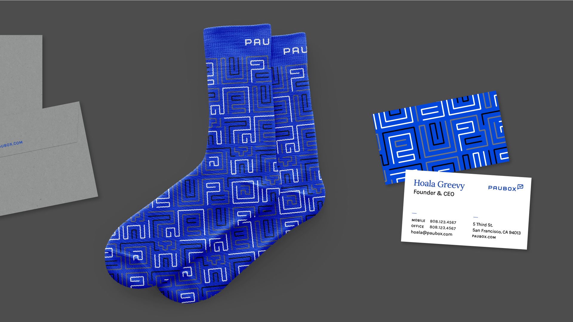
BRAND BLUE
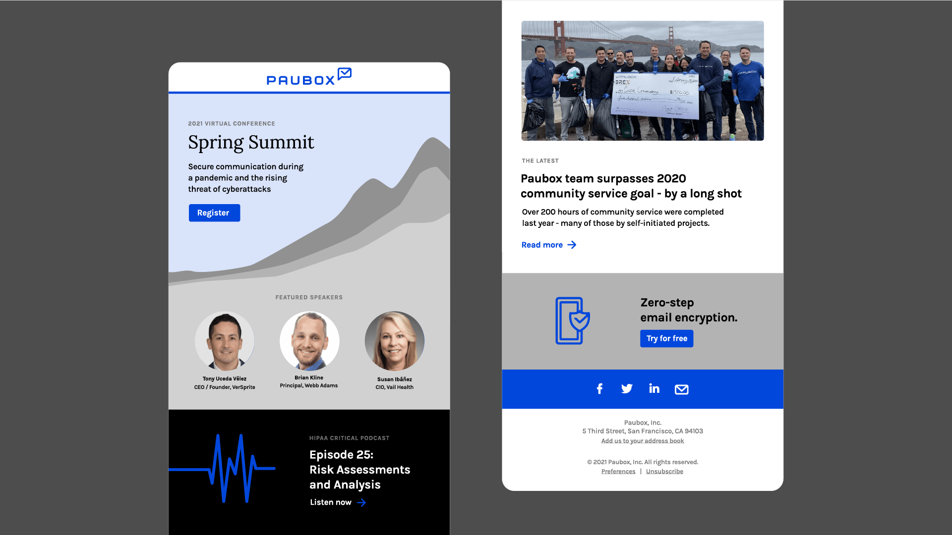
Paubox's signature blue anchors a refreshed corporate identity system that features an expanded color palette and maze pattern. Open-source brand fonts were selected intentionally and reflect Paubox's passion for people-first technology. Finally, W|W developed templates for various brand touchpoints including the website homepage, email newsletter, banner ads, stationery system, and more.