LAWRENCEVILLE TOGETHER
BUILDING OPPORTUNITY AND COMMUNITY
Lawrenceville Together was formed through the merger of Lawrenceville Corporation and Lawrenceville United, bringing together two organizations with deep roots in the neighborhood. W|W worked with the new organization to create a shared name, identity, and digital experience that could carry that history forward while making its purpose clearer to the community. LC and LU brought substantial history, relationships, and community knowledge into the new organization, Lawrenceville Together. A core challenge for W|W to navigate was the creation of something that could honor that history while establishing a clear identity for the organization moving forward.


STRATEGY & NAMING
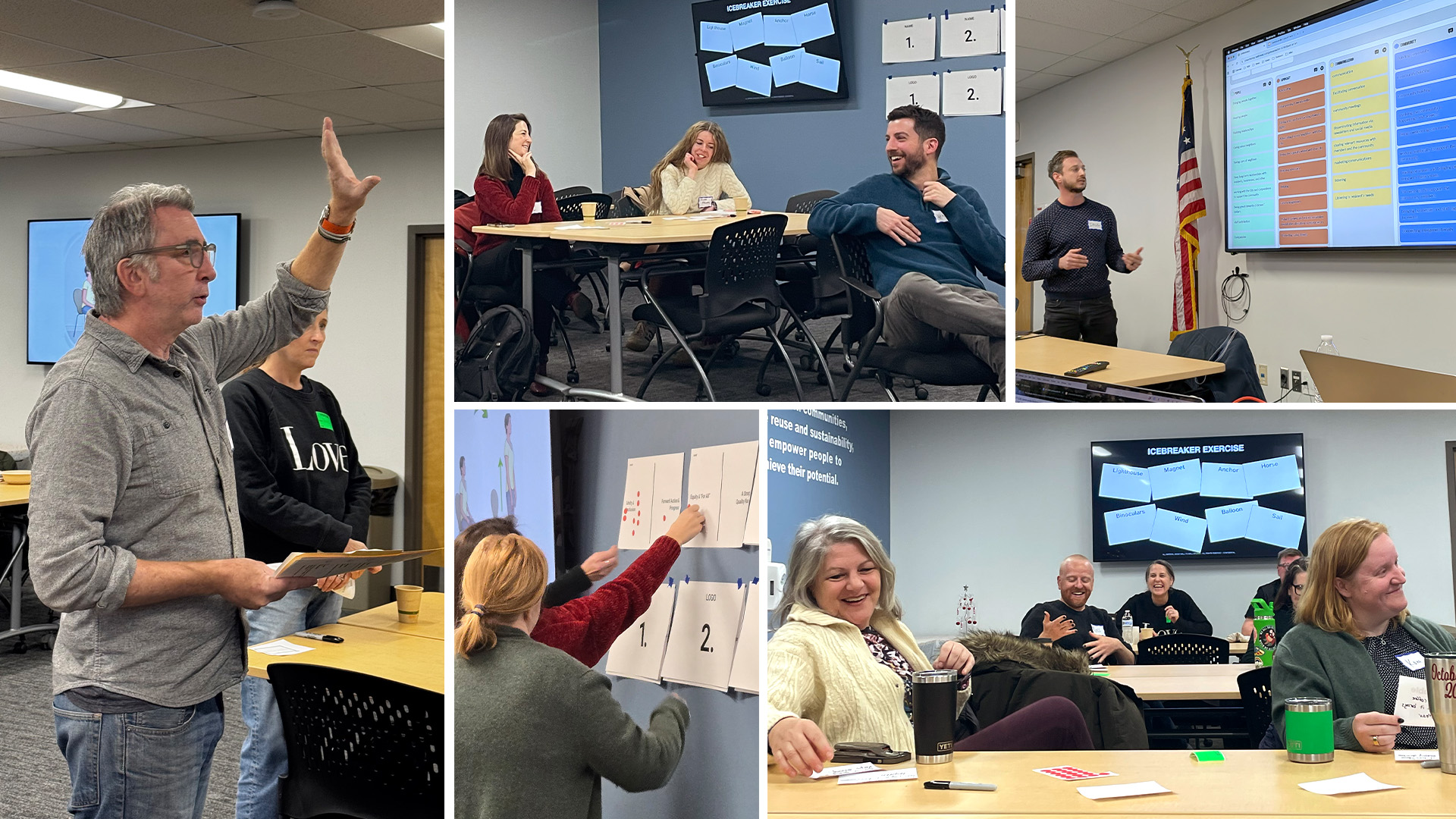
To start the engagement, W|W facilitated a 1/2 day Brand UnWorkshop experience that brought together leadership & staff, board members, residents, and business owners. As LC and LU came together, W|W helped clarify what they shared, defined what the new organization needed to communicate, and turned that thinking into a unified brand. The Brand UnWorkshop helped surface the strategic space for the new organization, with participants describing it as a connector and hub for residents, businesses, and partners, with a desire for an organization that was approachable, modern, grassroots, and forward-looking while remaining rooted in Lawrenceville.
Ultimately, the new name, Lawrenceville Together, was already in the room. W|W's naming process and exploration tested that assumption, rather than simply accepting it. The workshop and subsequent immersion work helped W|W establish the key principles that informed the visual identity and website.
BRAND IDENTITY
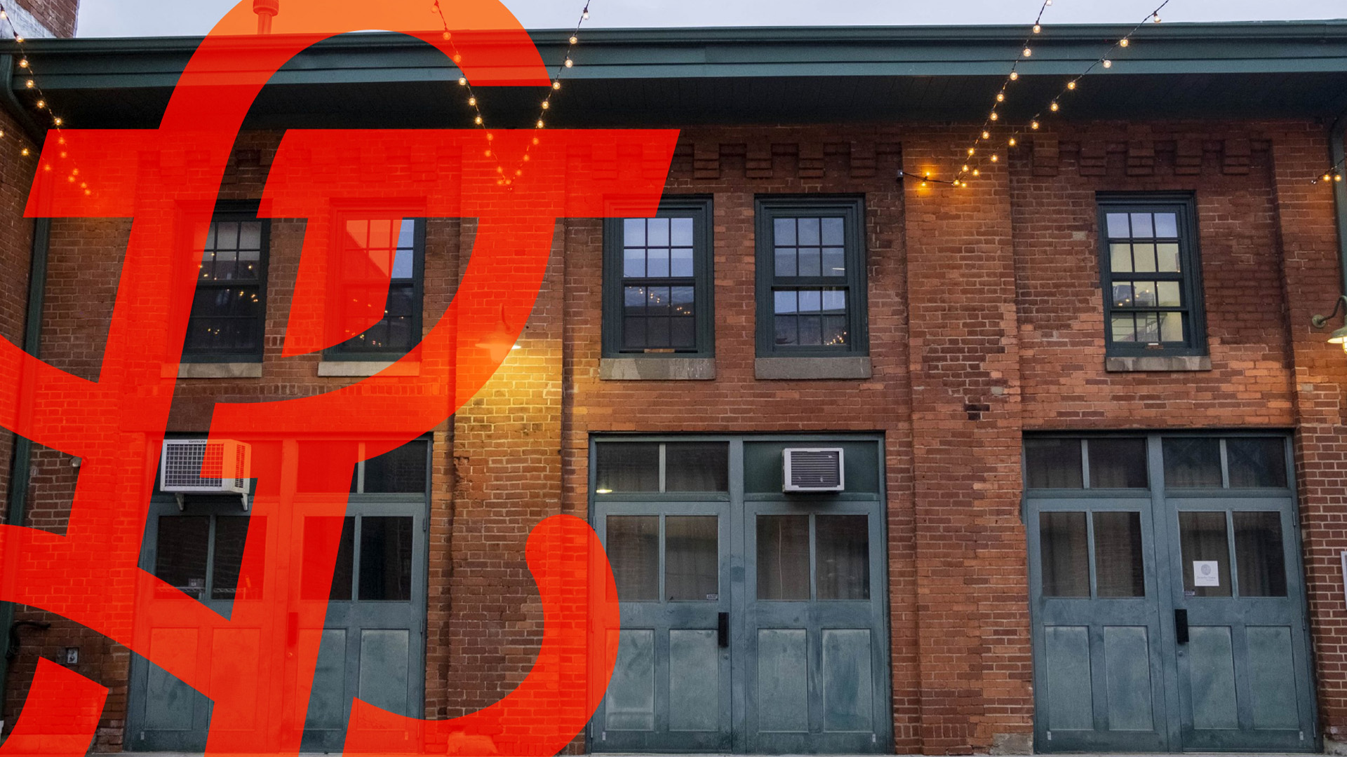
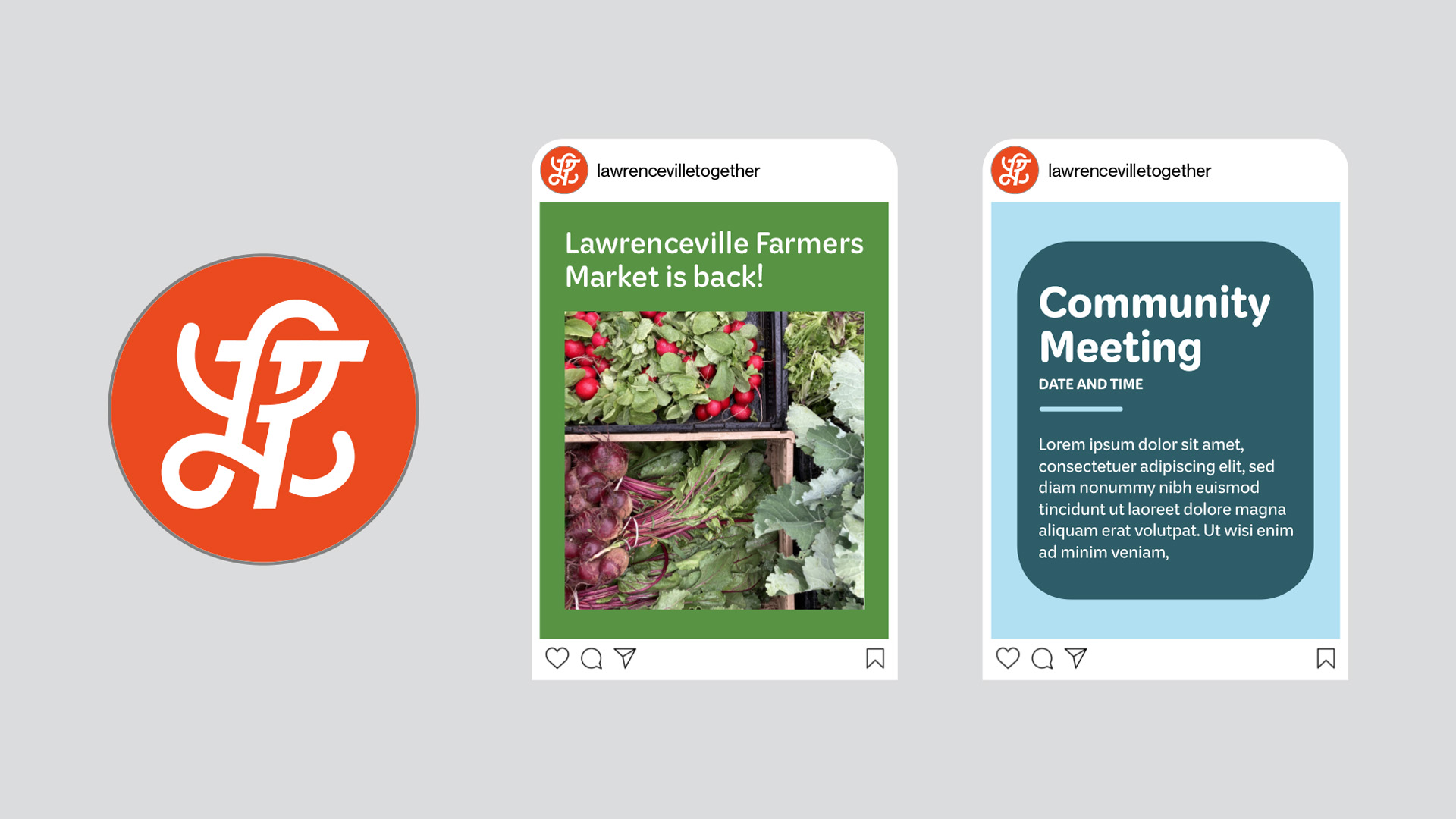
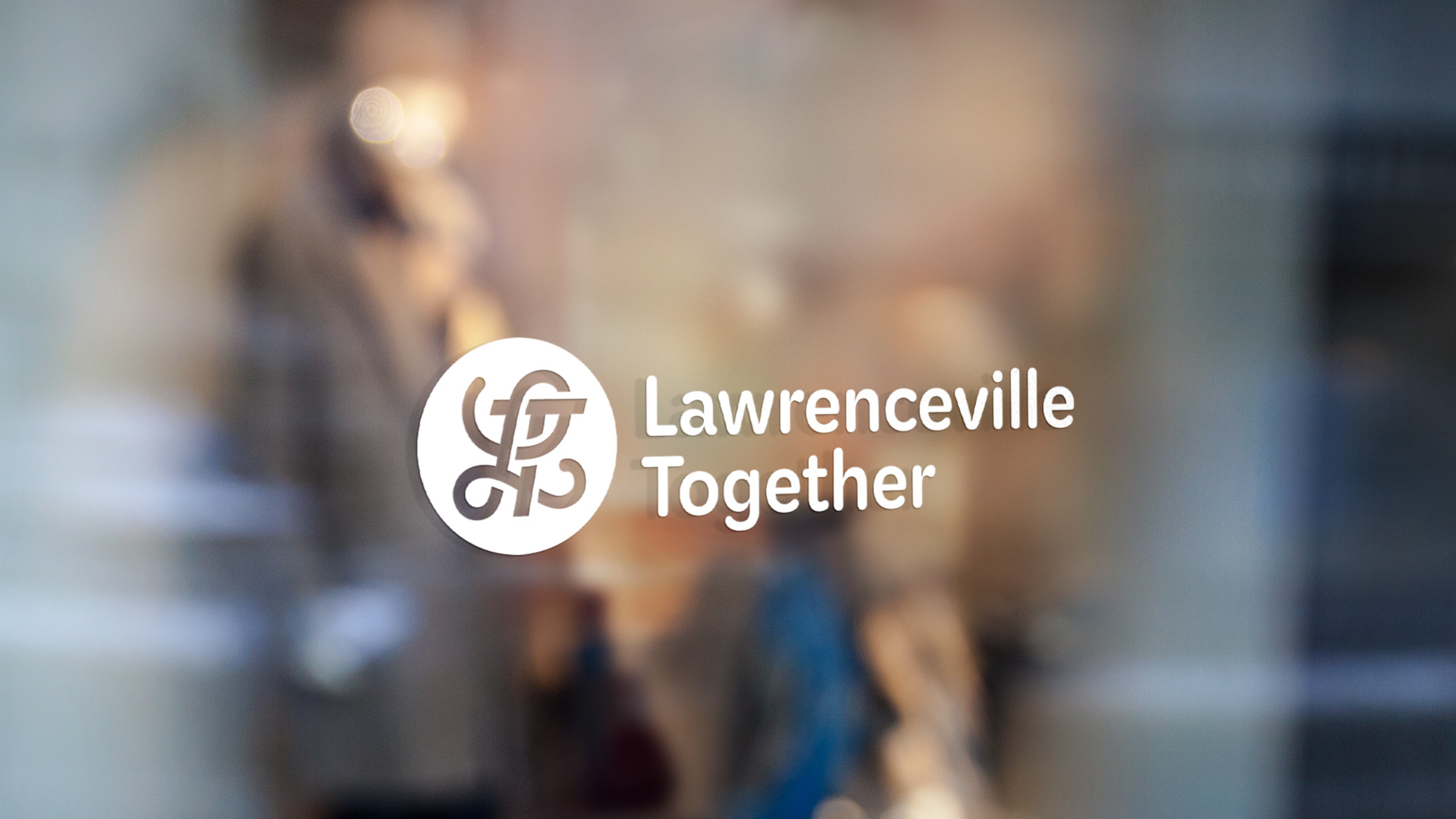
Leveraging insights that emerged from the strategy, W|W understood that the visual identity and logo for Lawrenceville Together should feel rooted in the neighborhood while also communicating action, momentum, progress, accessibility, and a contemporary point of view. The new logo also needed to help center people rather than simply depict the physical neighborhood. The resulting monogram uses a stylized letter L that connects to Lawrenceville's architectural heritage and history, while the letter T introduces a more contemporary form and a sense of forward movement. Together, the two letters become a single, unified mark.
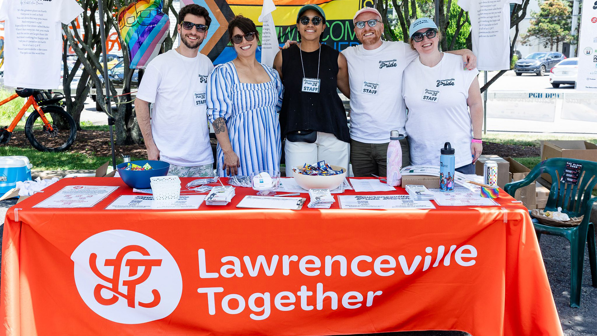
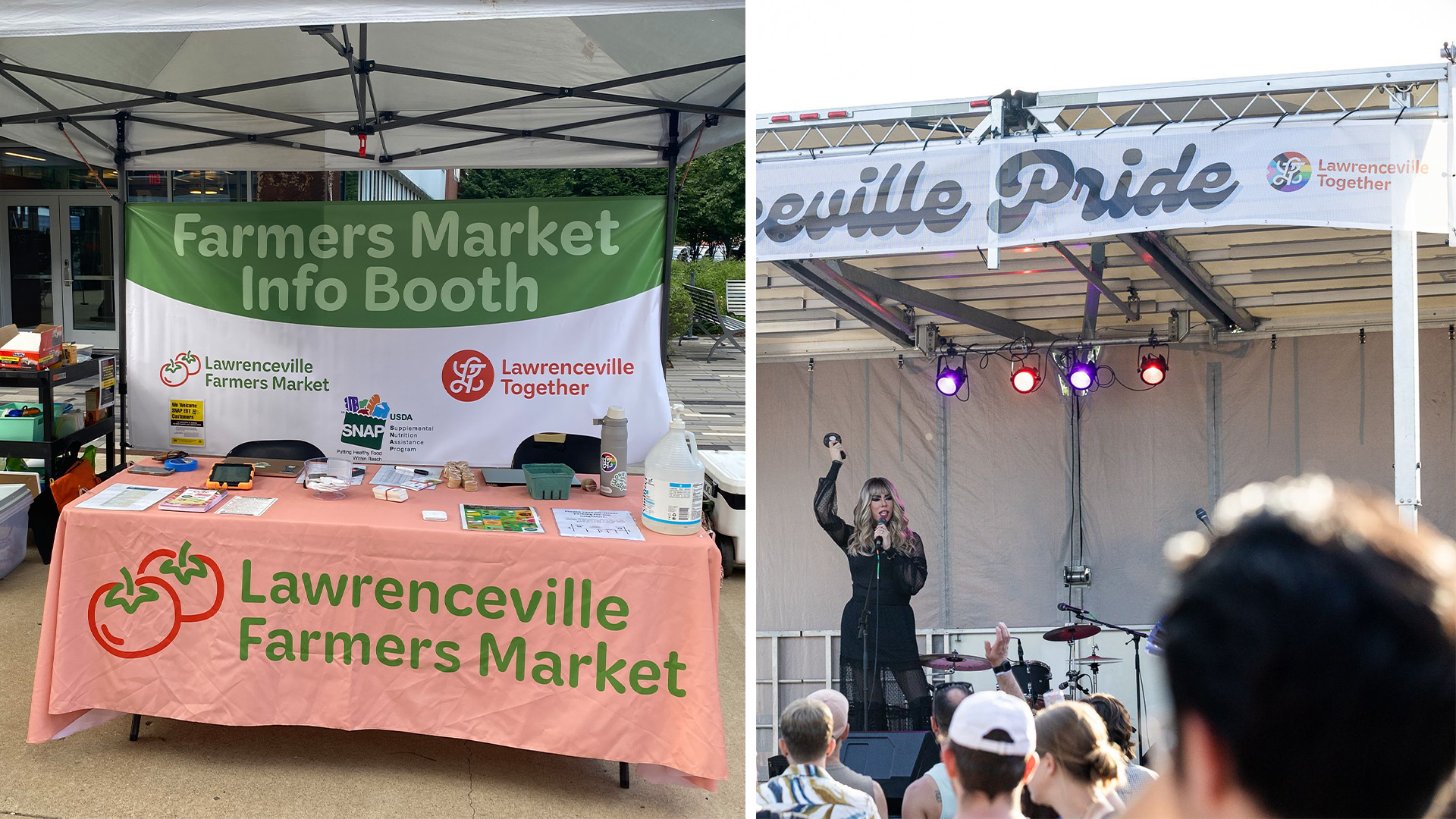
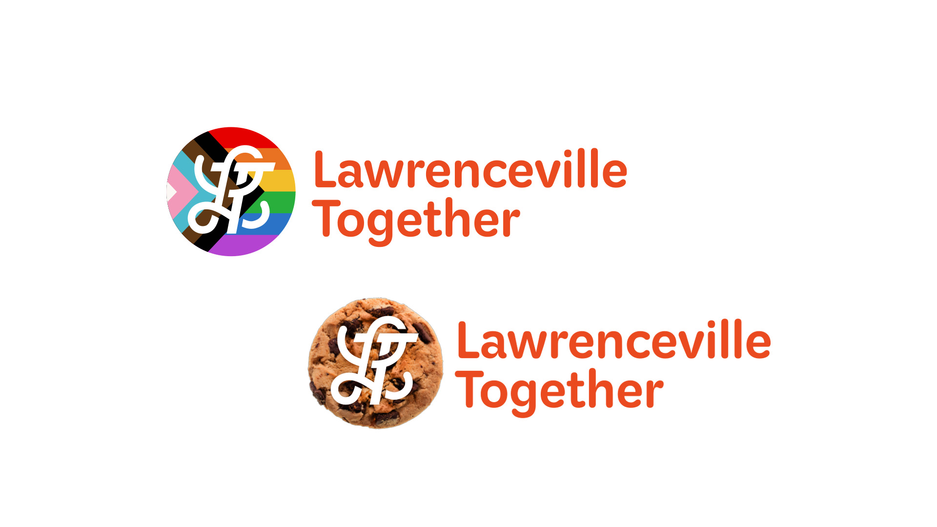
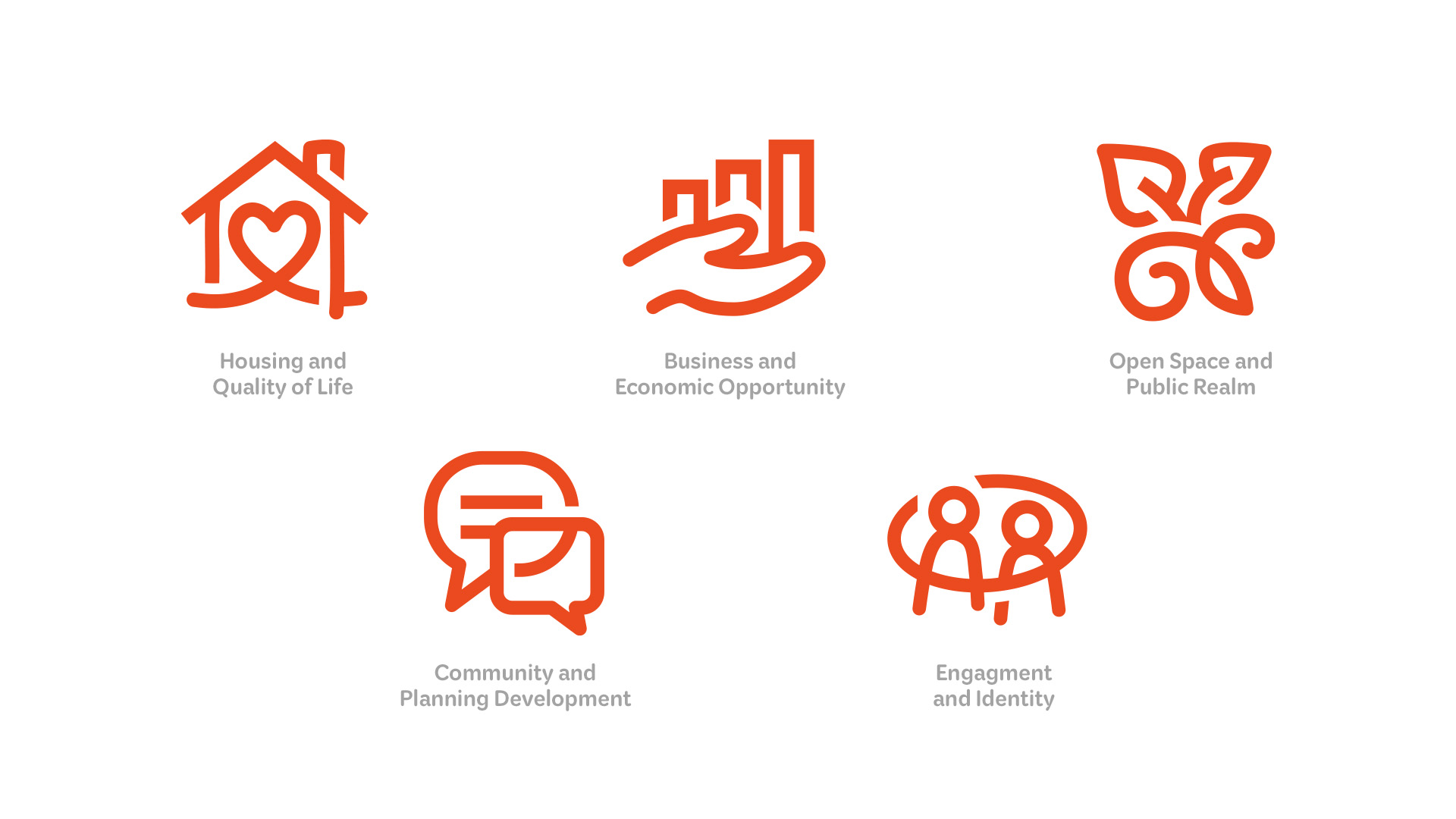
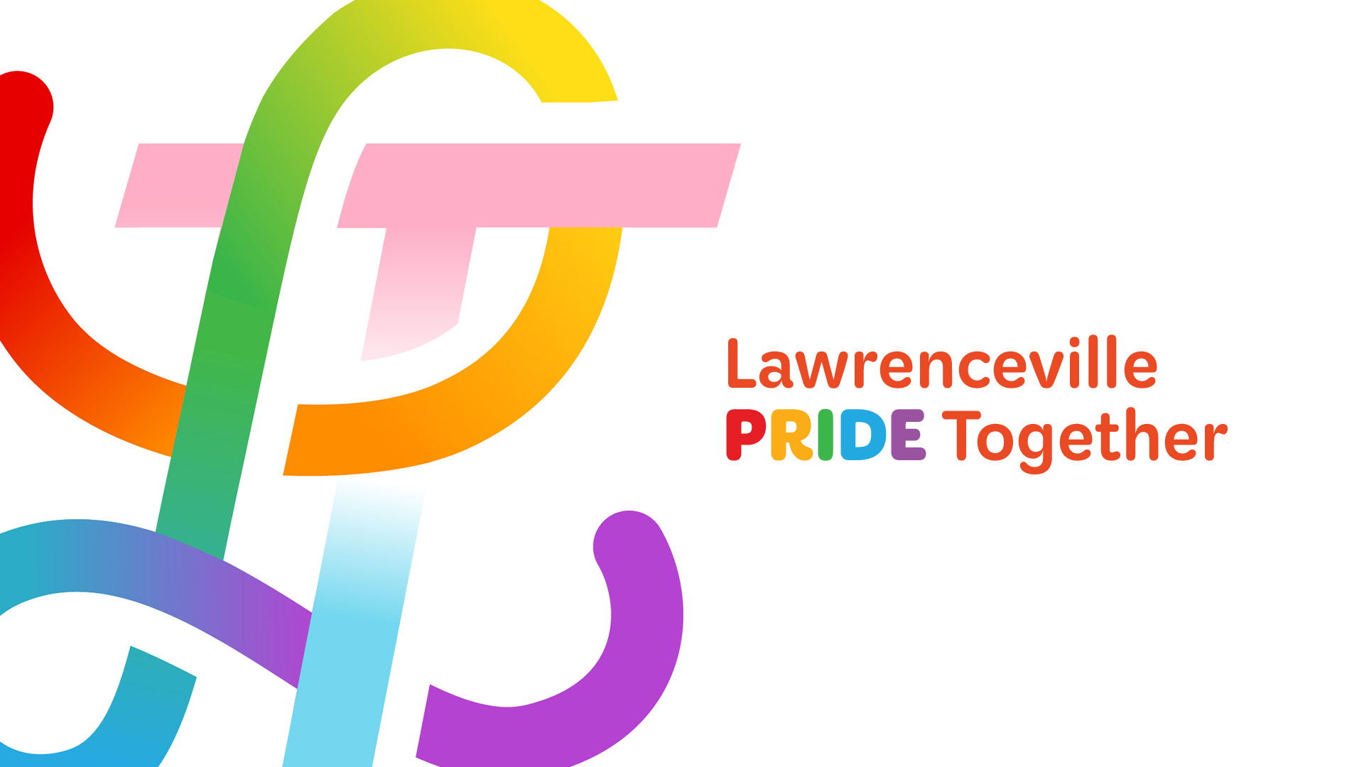
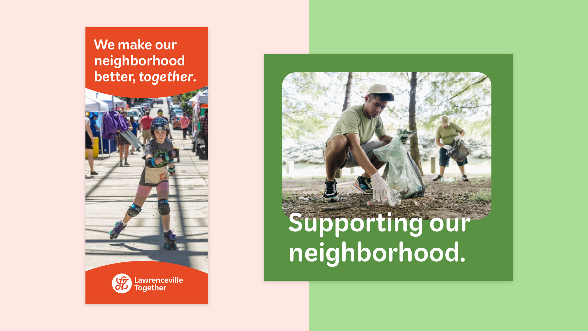
The Lawrenceville Together style guide includes a robust graphic toolkit that extends the core logo into a brand character, with fun applications for signature events Cookie Tour and Pride Day, as well as the Farmer's Market. A supergraphic treatment adds visual intrigue to layouts, and a custom icon system supports the organization's key programming areas.
DIGITAL CONNECTOR
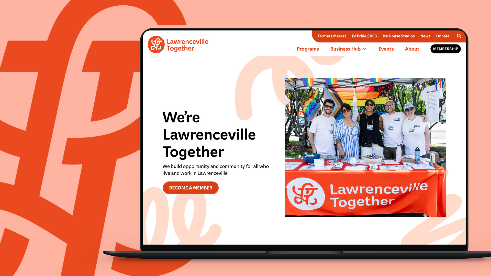
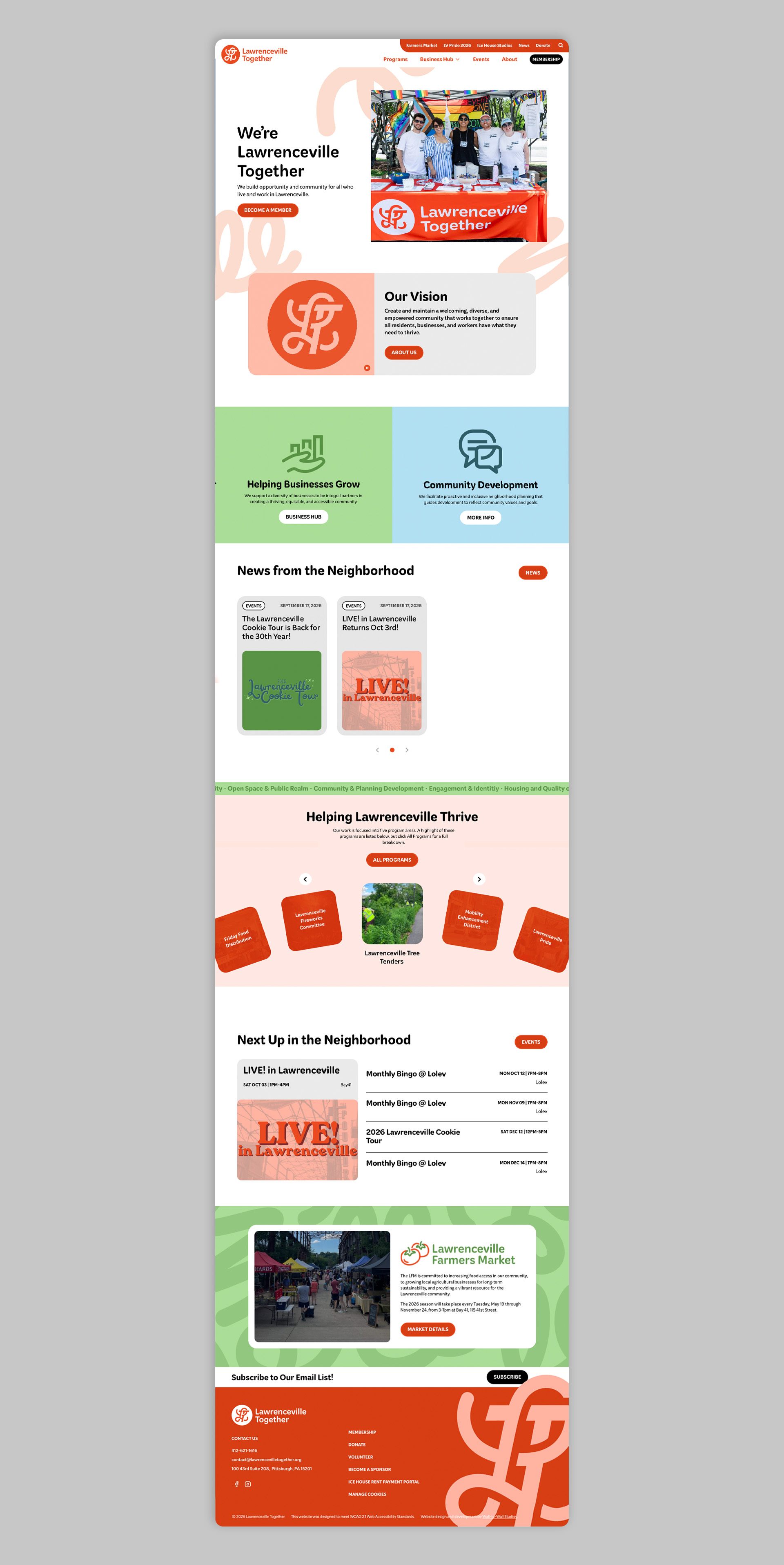
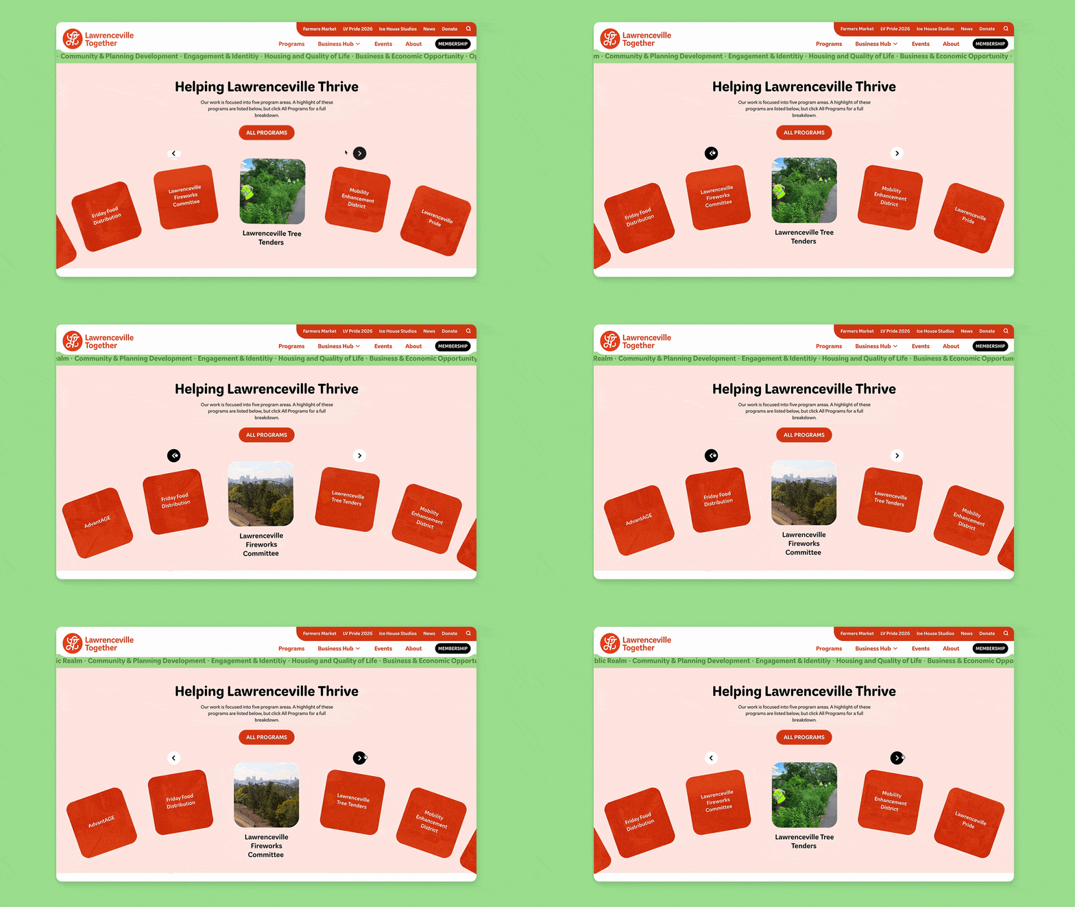
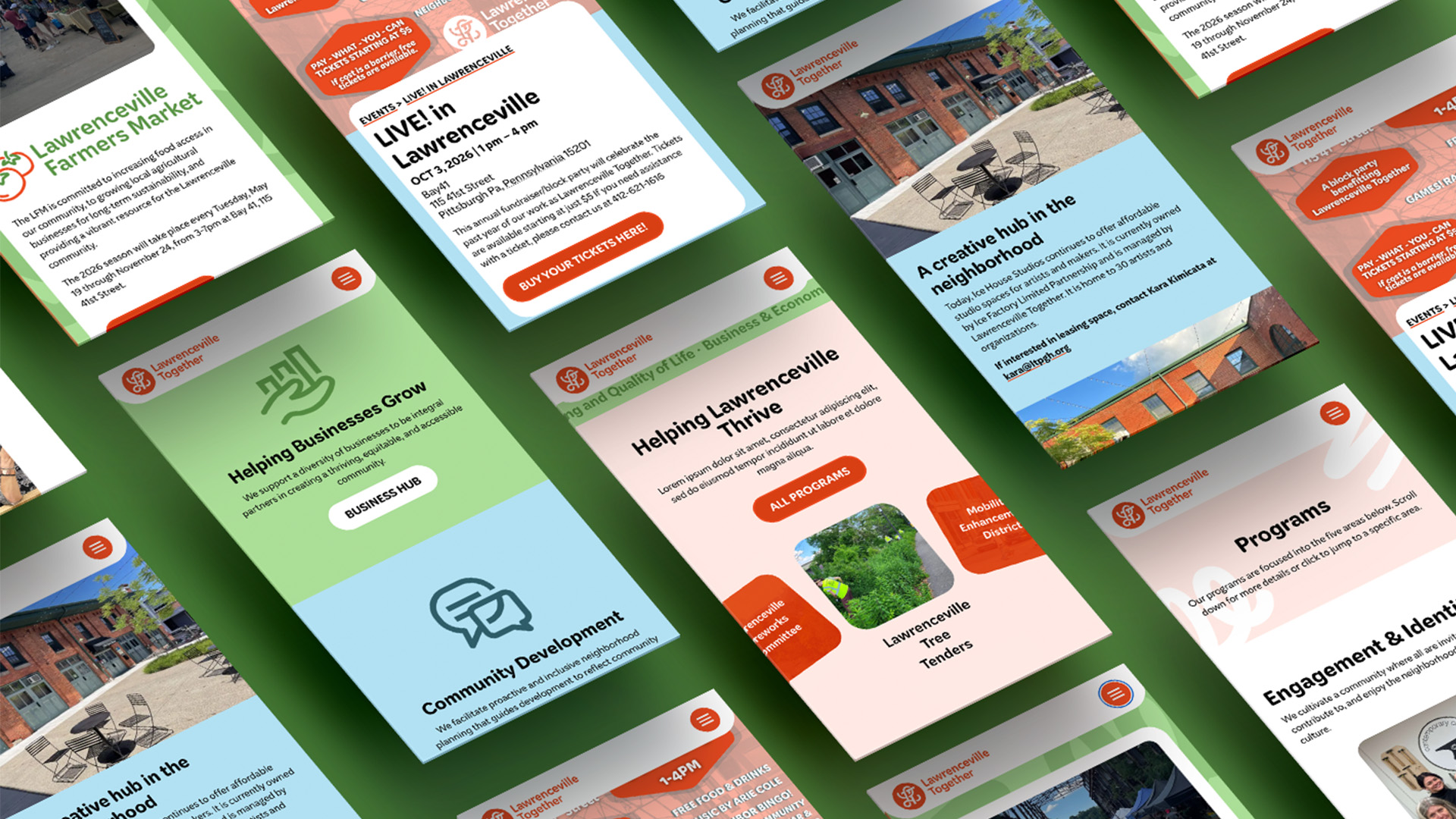
The new website, designed & developed by W|W, organizes Lawrenceville Together around the things people need to understand and do. Business support, community development, programs, events, membership, news, volunteering, donations, and other paths are all surfaced within the experience. A key finding from the upfront workshop and strategy was that Lawrenceville Together should function as a hub and connector for residents, businesses, and partners. The website provides that connective tissue digitally.
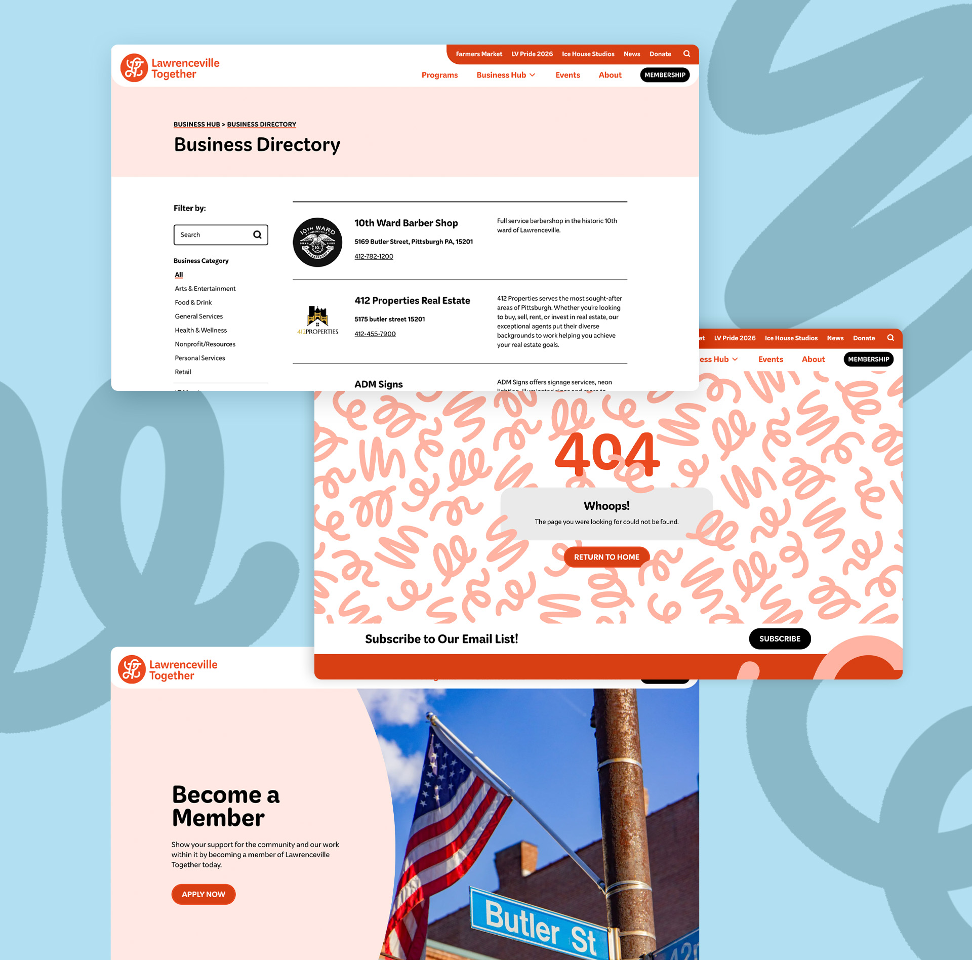
The Lawrenceville Together website is a custom WordPress experience with robust functionality (business directory, news/blog, event calendar, and more) to support those important connections.