
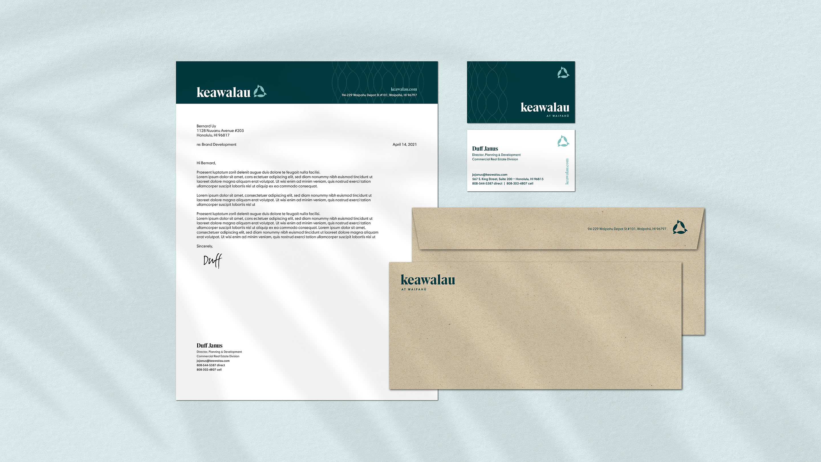
KEAWALAU
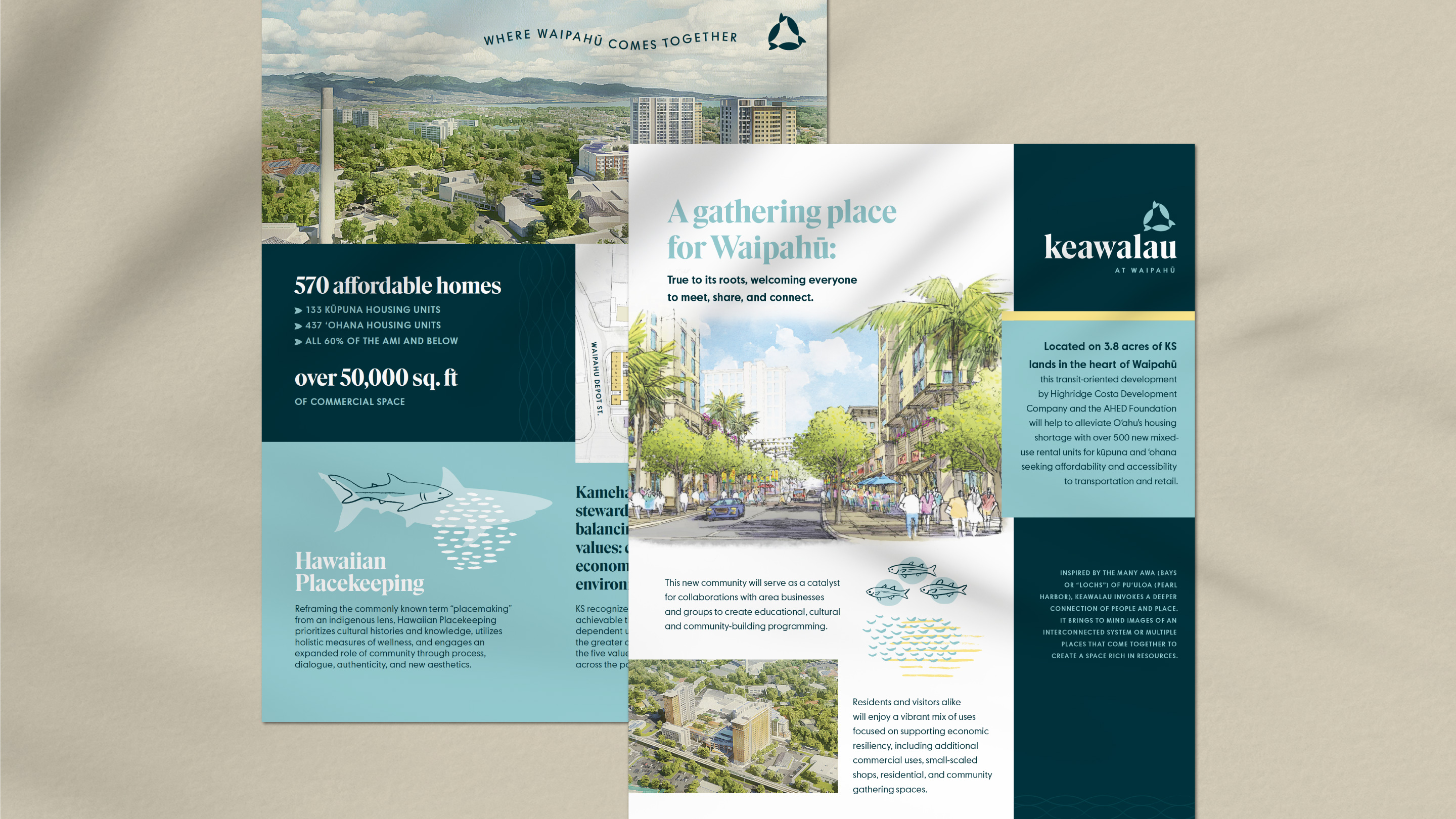
A gathering place for Waipahū
A planned 3.8 acre mixed-use development in Waipahu along O‘ahu's upcoming rail line (steps from the Pouhala Rail Station), Keawalau at Waipahu will include affordable and senior housing, along with a variety of retail outlets.
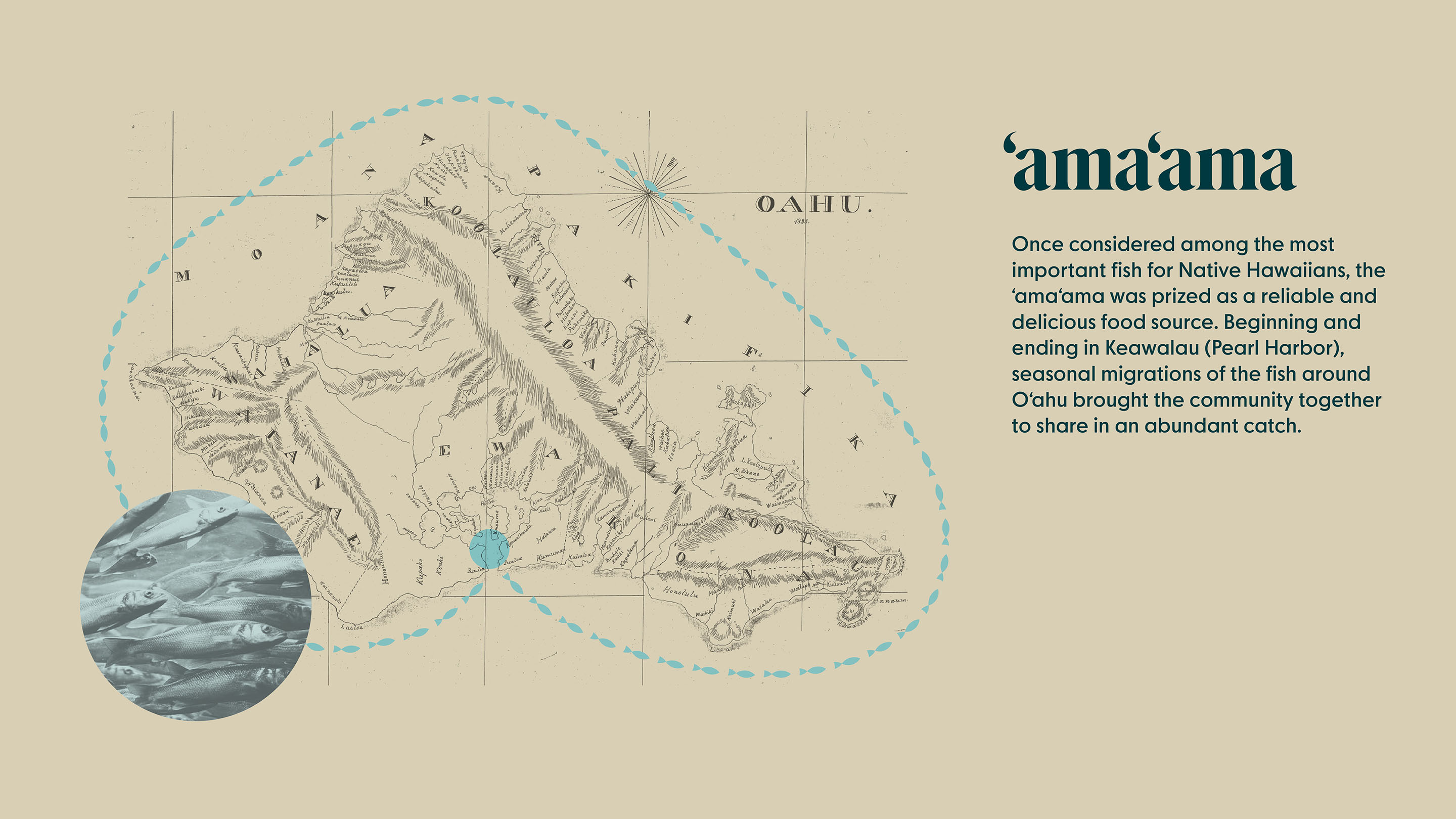
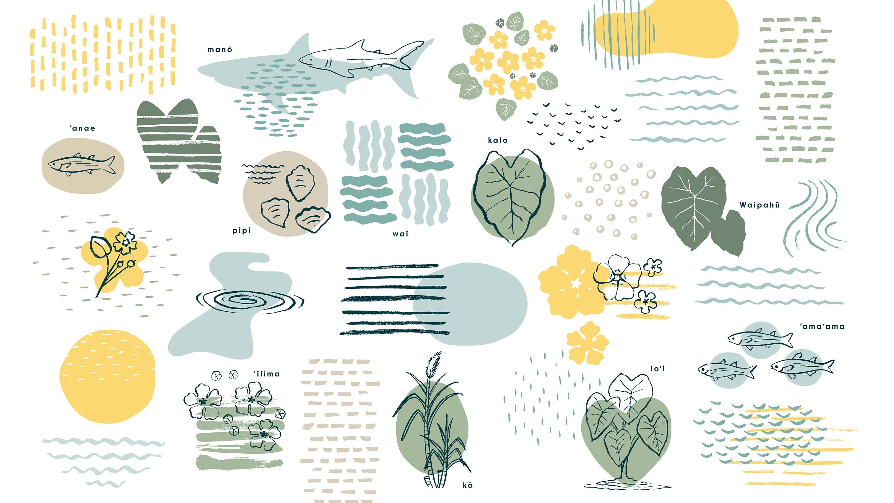
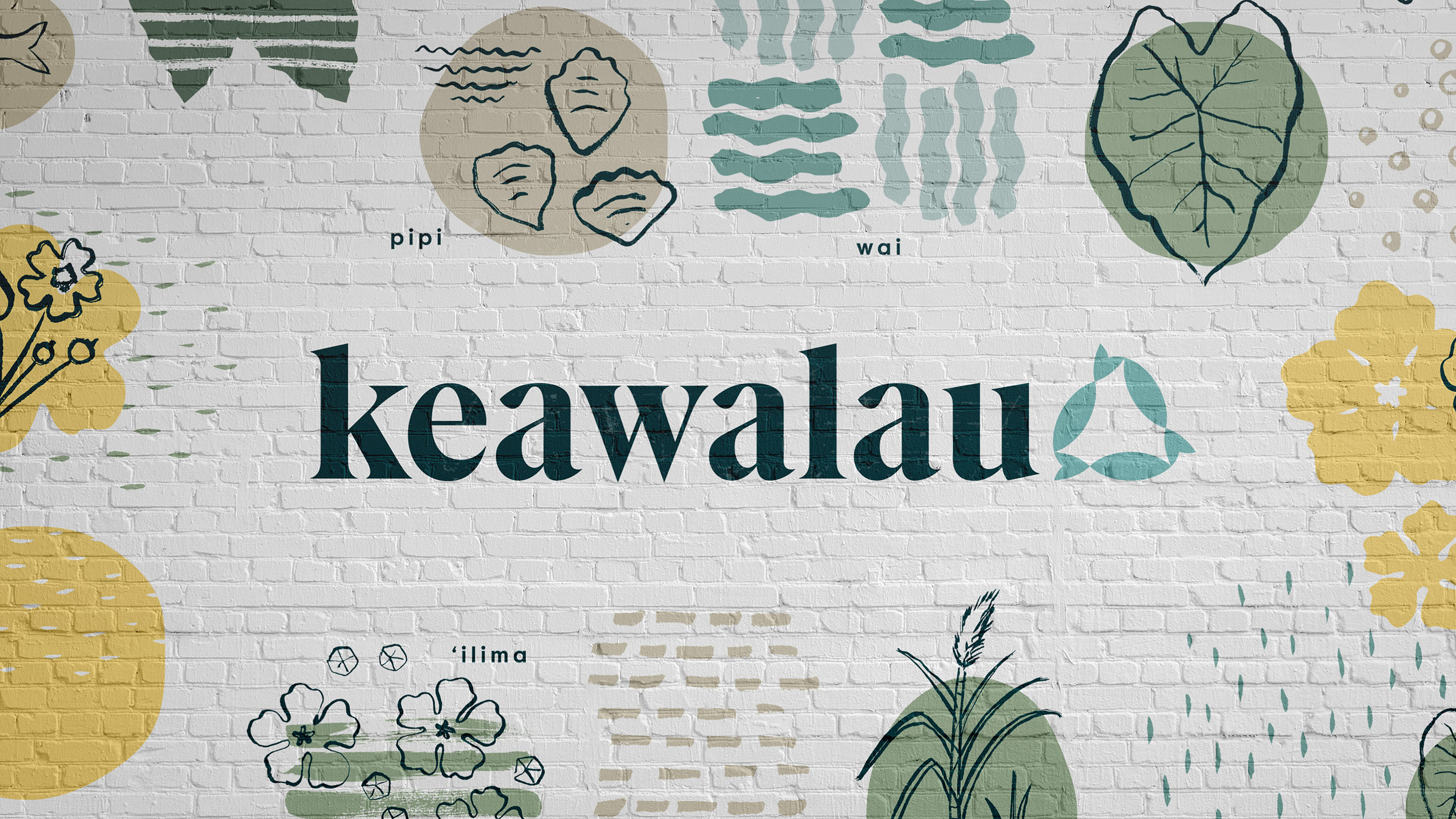
After conducting a brand audit and proposing a number of possible names for the Kamehameha Schools development, W|W set to work designing a brand identity that would connect to the rich history of the area. Many legends from this place centered around the abundant sea life once found in the lochs of Keawalau (Pearl Harbor). The logo and brand illustrations incorporate elements of these stories, from the ‘ama‘ama fish, to ‘ilima flowers, sharks, and once plentiful oysters.
A NEW TOWN CENTER
The Keawalau logo mark is an abstract representation of ‘ama’ama (mullet) fish circling the island of O‘ahu. The tails of the fish also represent kalo (taro) leaves. Together, these elements signify the abundance that Keawalau offers to all of the island’s residents.
The brand pattern consists of hand drawn lines that evoke fish scales or nets. The modulating size of the curves signifies the life cycle of the ‘ama‘ama fish as it matures throughout its journey around the island.


Live, Work and Thrive
Keawalau is envisioned as a transit-oriented community that, once completed, will offer a diverse mix of neighborhood retail and businesses and community gathering spaces. With over 500 new affordable kūpuna (senior) and ʻohana (family) rental housing units being planned, Keawalau will bring to Waipahu a neighborhood that will create opportunities for kama‘āina (locals) to live, work and thrive.
Learn more about the project at www.keawalau.com