ISLAND SLIPPER
Made by hand, for feet
Island Slipper is a Honolulu-based footwear company known for slippers (not flip flops!). The brand prides itself on quality materials, unique prints, and handmaking their slippers in Hawaii.
Founded in 1946, Island Slipper has become a coveted fashion brand with a strong fanbase in Japan. An expressed project challenge was to duplicate that success outside of Japan and build a strong following amongst locals and US mainland visitors.
SLIPPER EXPERTS
W|W completed a brand audit to clarify and focus the company’s brand positioning and strategy with an eye toward connecting with its local audience, communicating value as a premium product, and standing out as leaders in a crowded market.
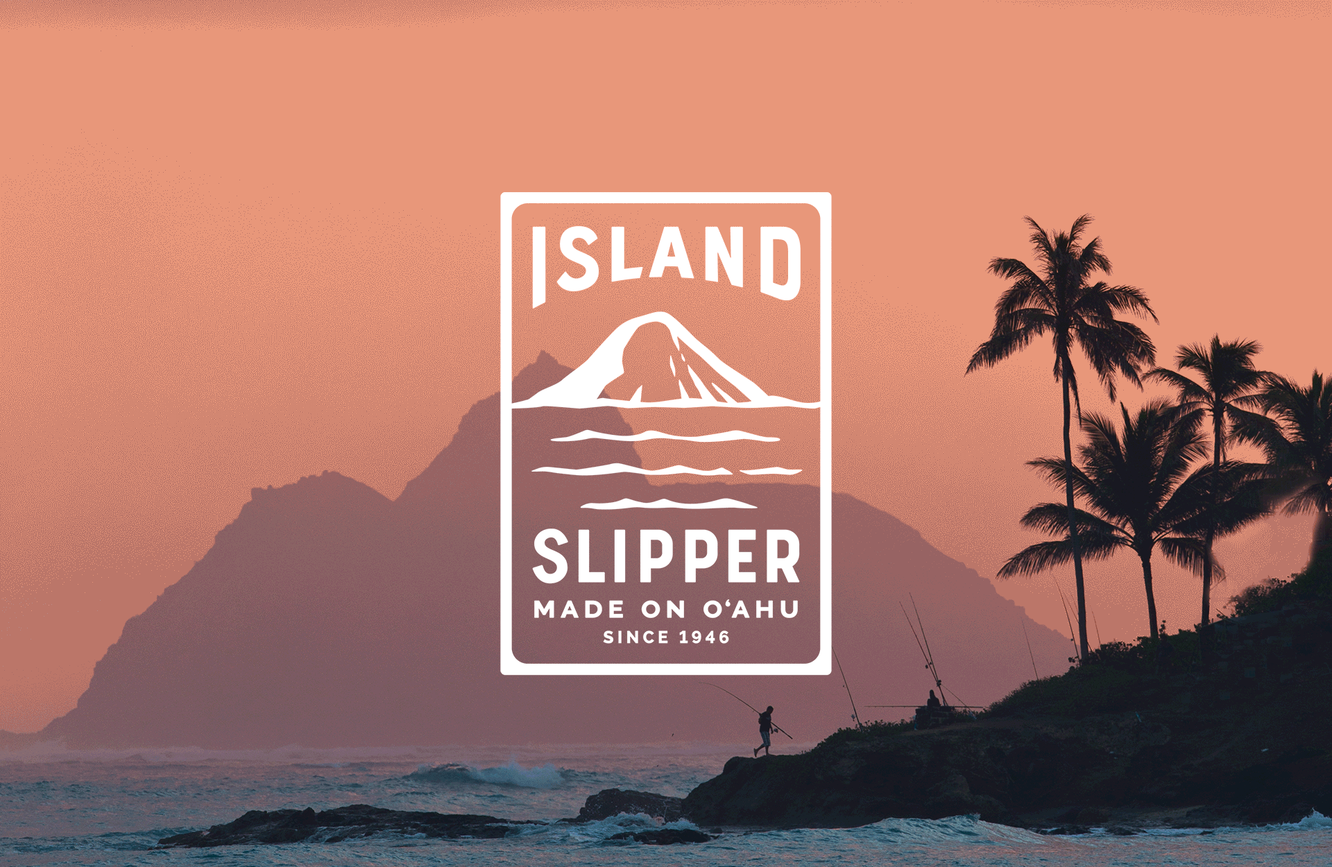
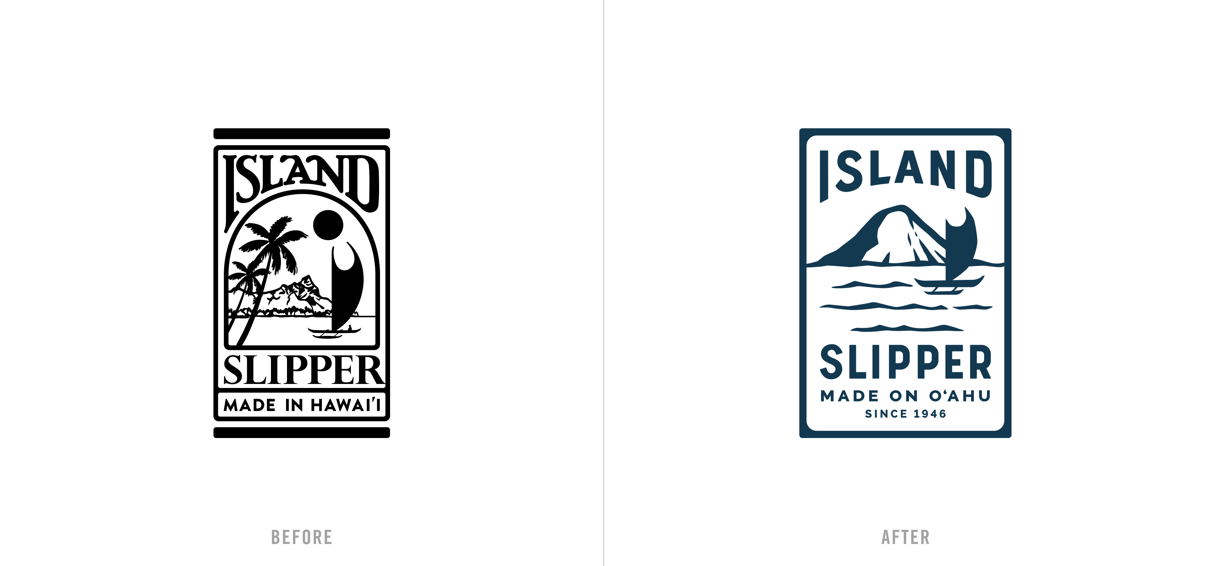
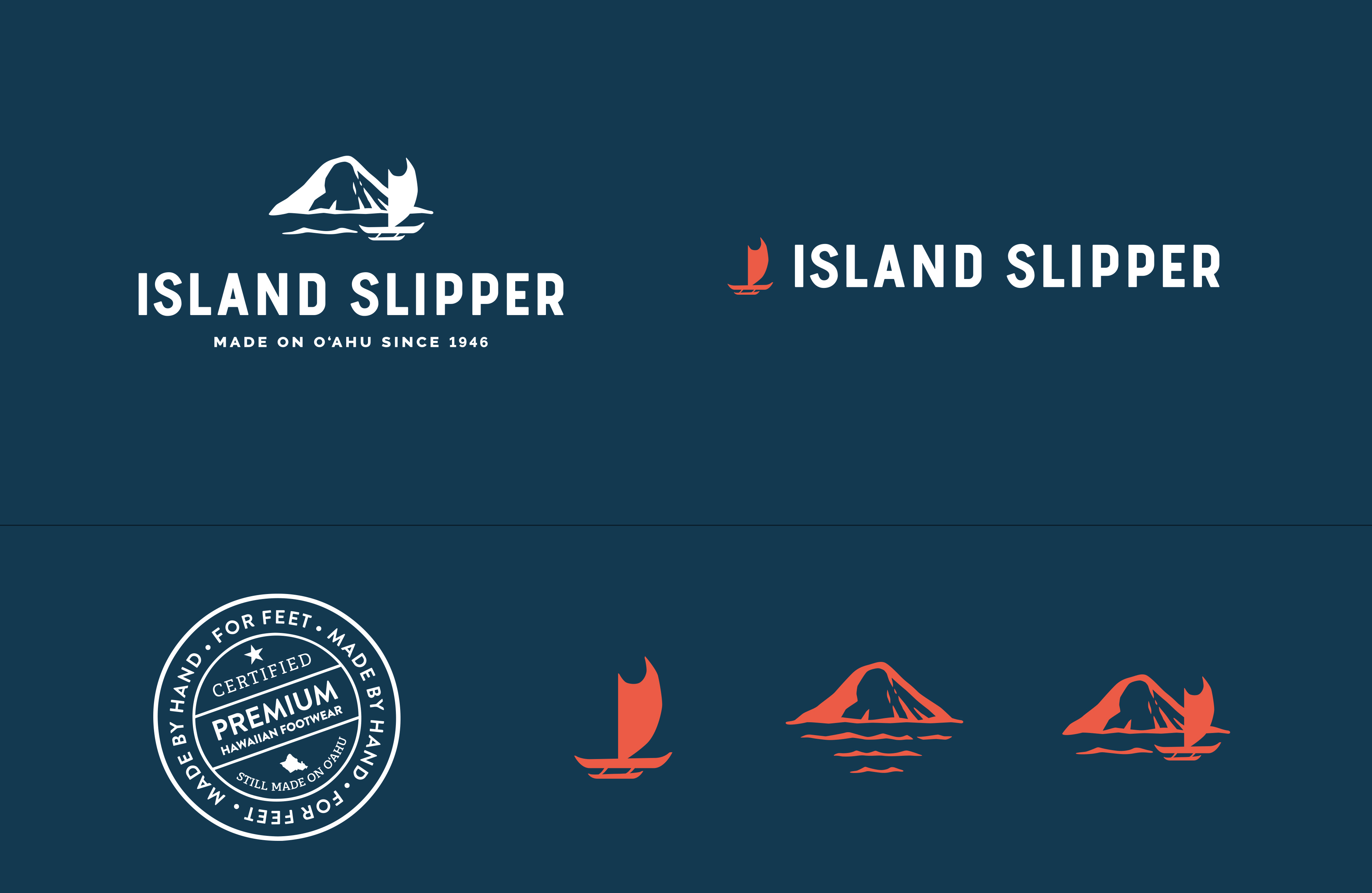
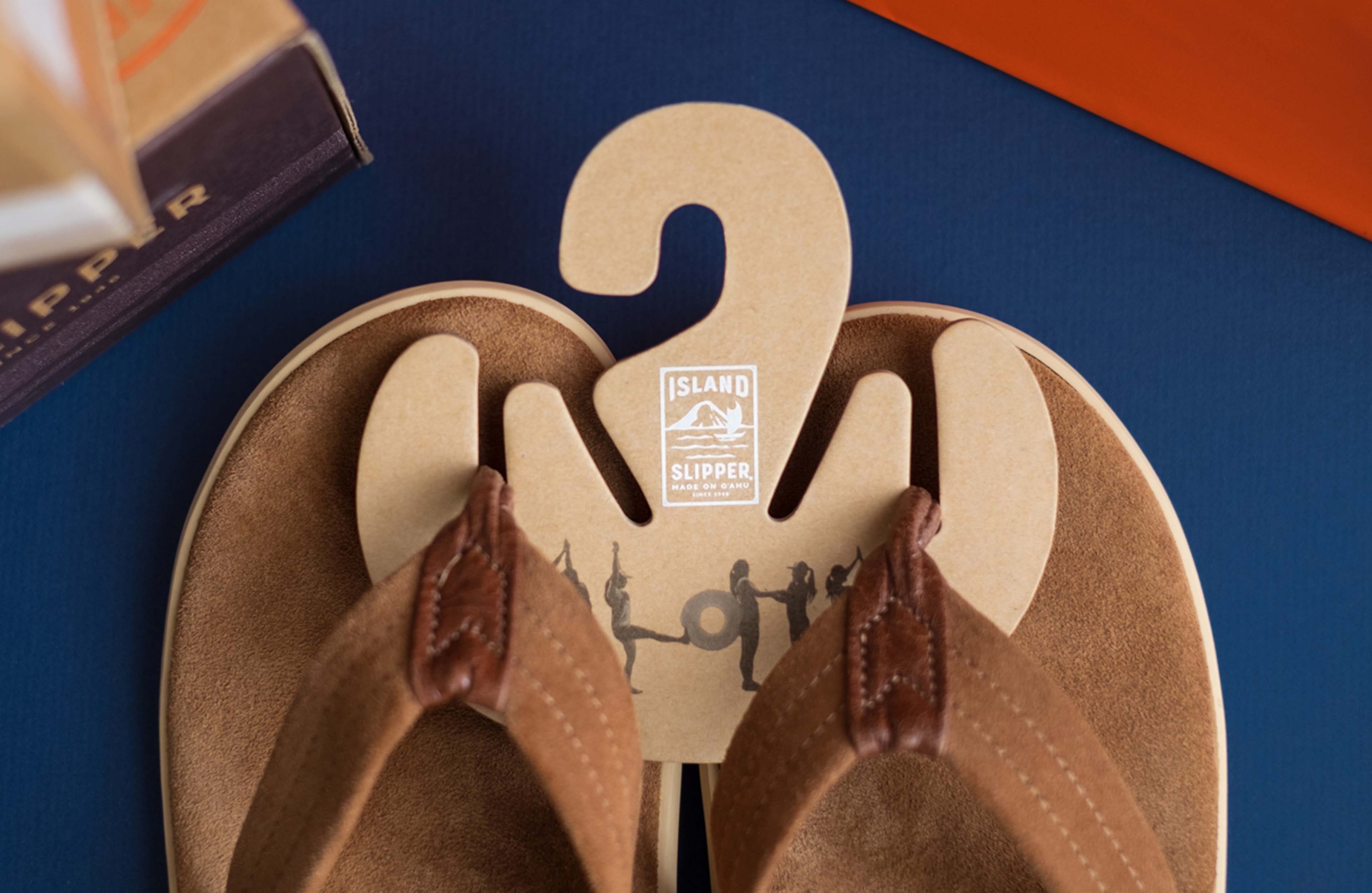
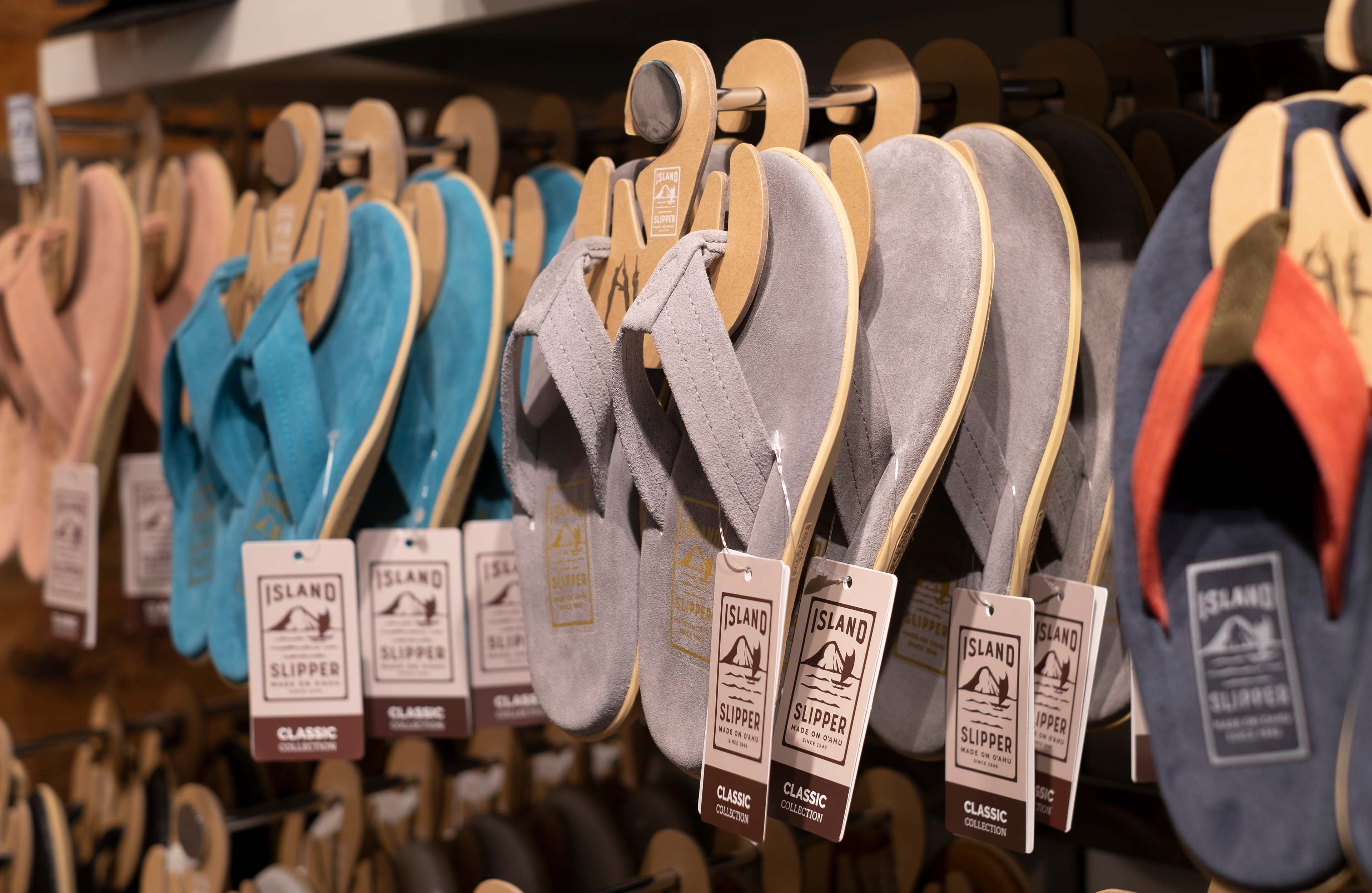
The refreshed brand aims for a balance between evolution and revolution. The new logo draws inspiration from past Island Slipper logos while simplifying and modernizing many of the elements into a more cohesive and legible mark. A bold new color palette and streamlined visual elements elevate the brand to reflect the premium product offerings. W|W also designed a suite of secondary logos and icons for use across Island Slipper’s various brand applications.
WEBSITE REDESIGN
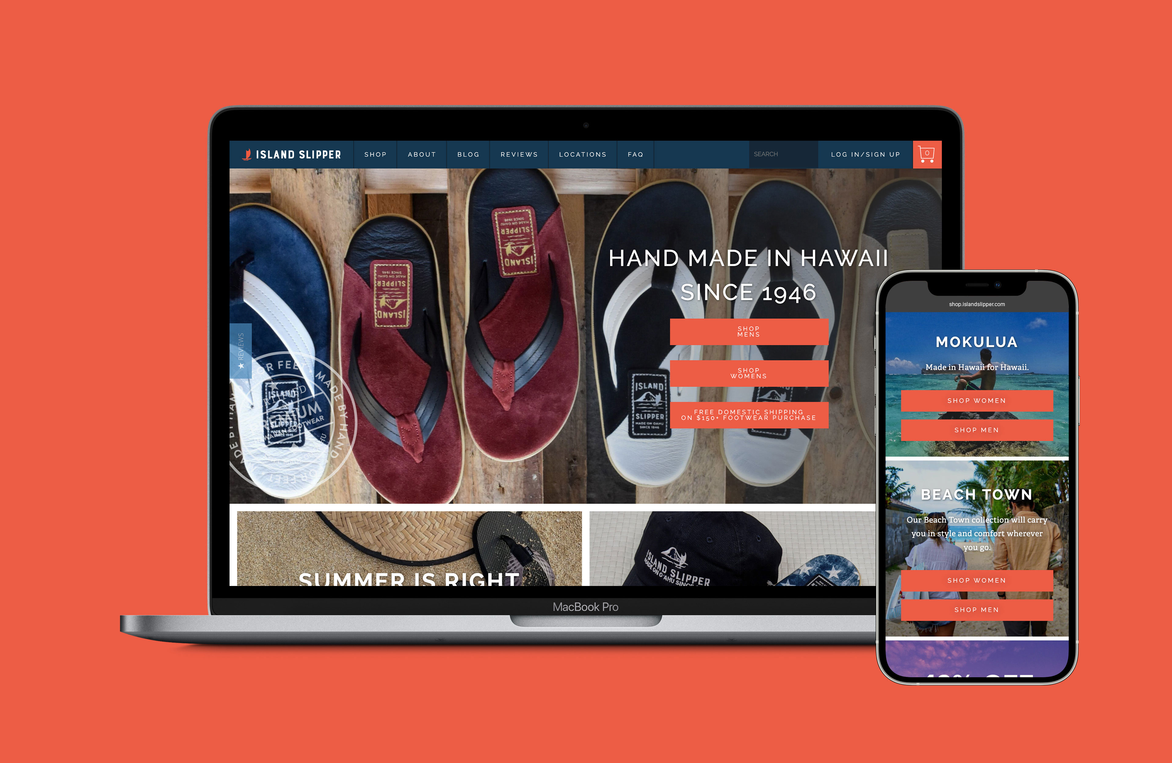
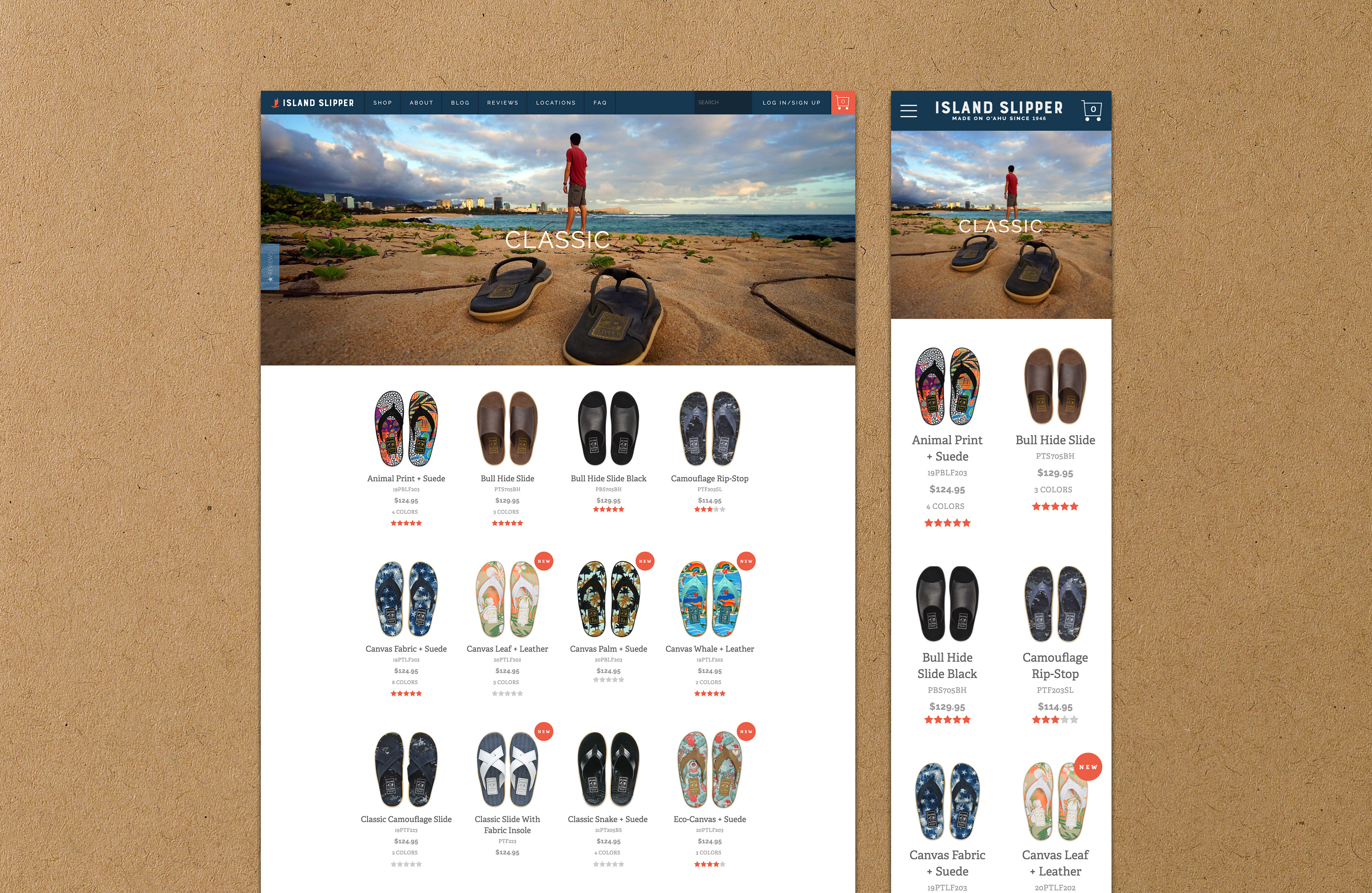
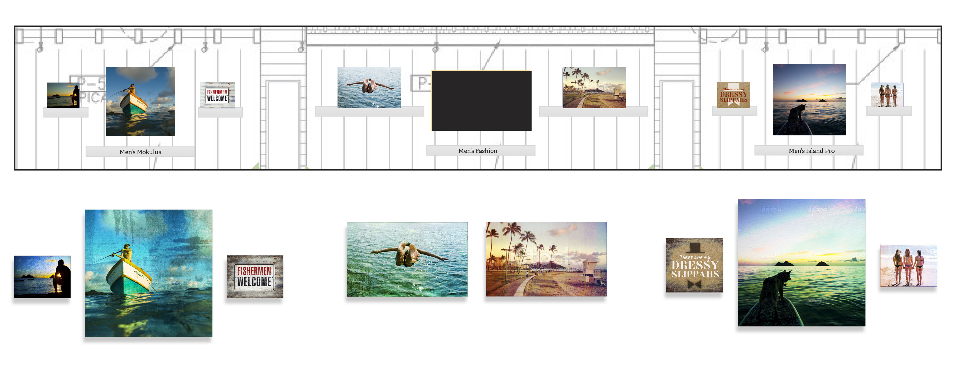
The previous website had been designed more as an About Us brochure than a sales vehicle. While it was possible to shop on the site, the e-commerce pages were buried and nomenclature was not intuitive, organizing products by numbers and codes rather than easy-to-distinguish names. W|W helped streamline product categories as part of simpler shop navigation and a better user experience.
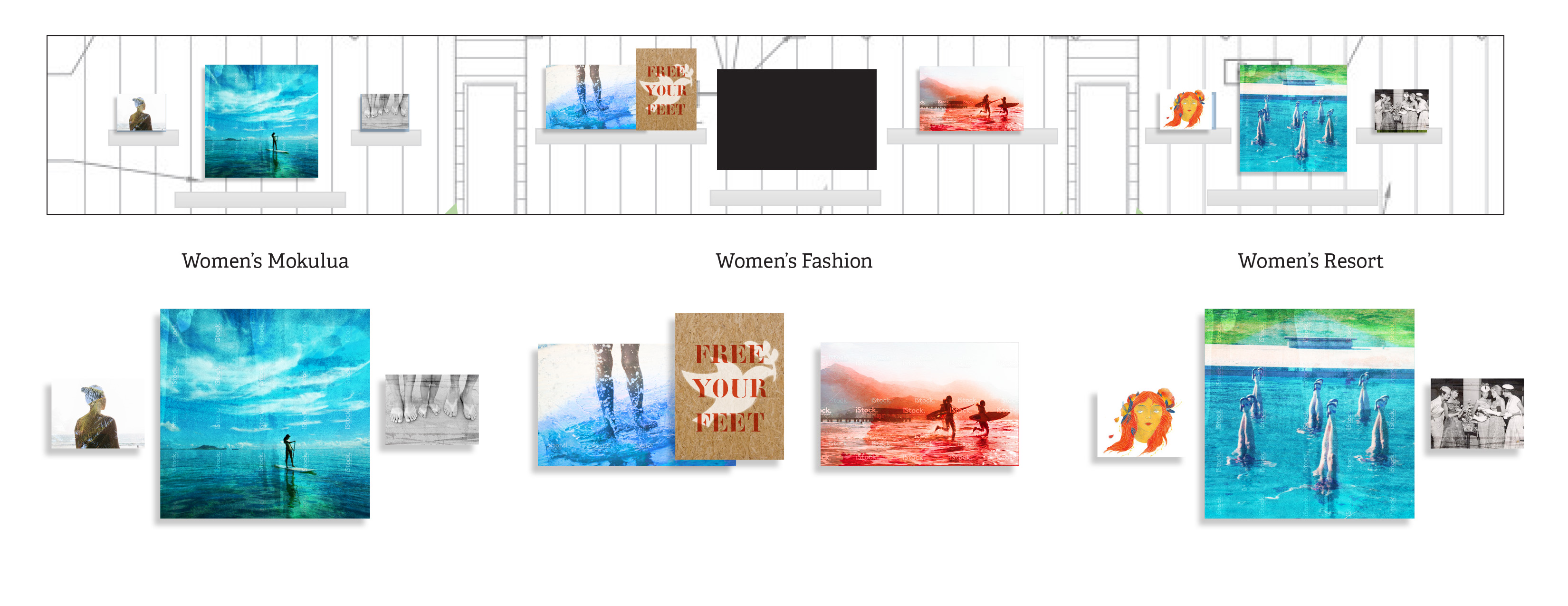
W|W applied the revised brand standards to deliver a more visual, retail-first layout. Built around product and local lifestyle photography, the new website funnels traffic more directly to the product types that appeal to them.
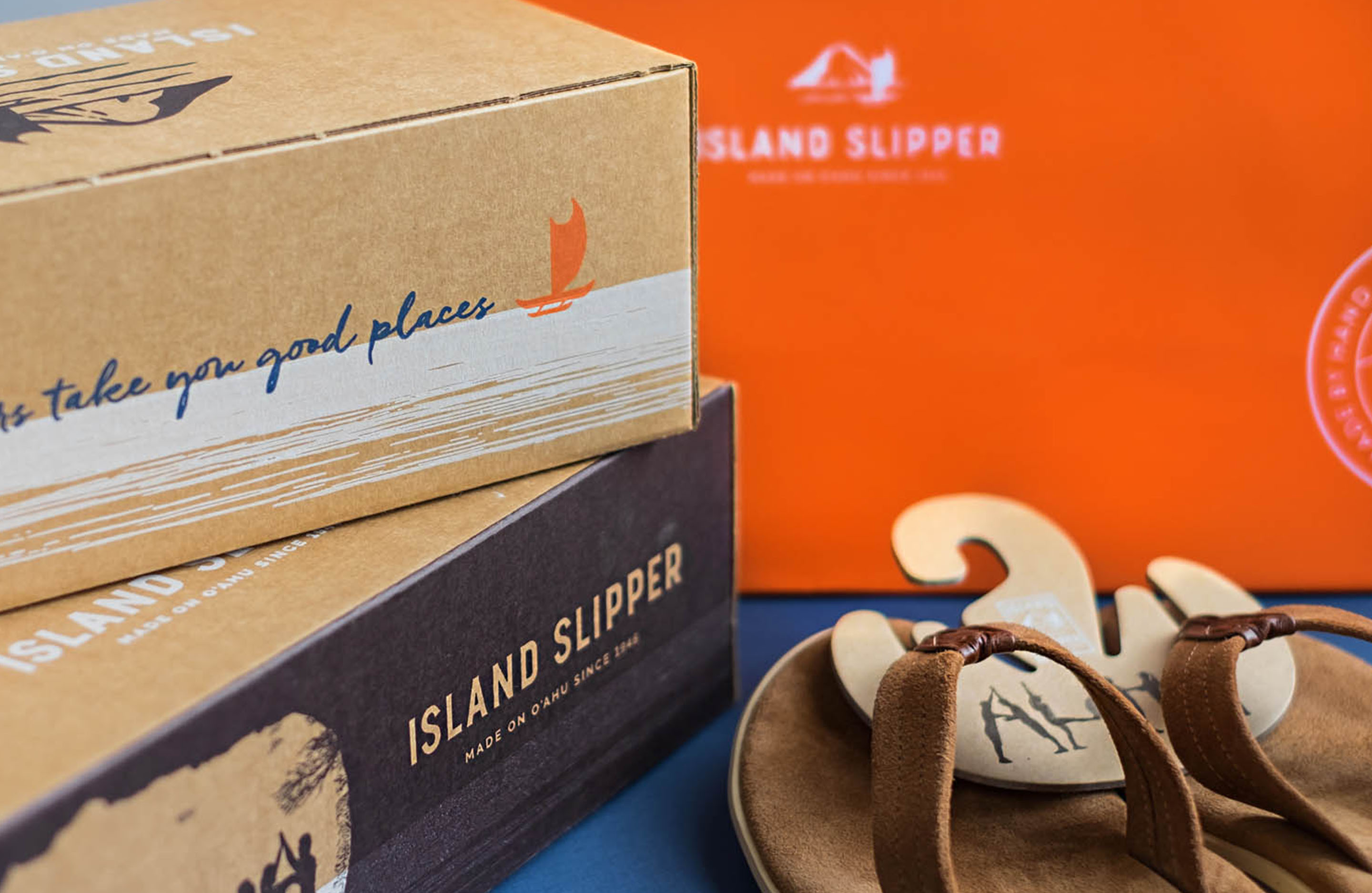
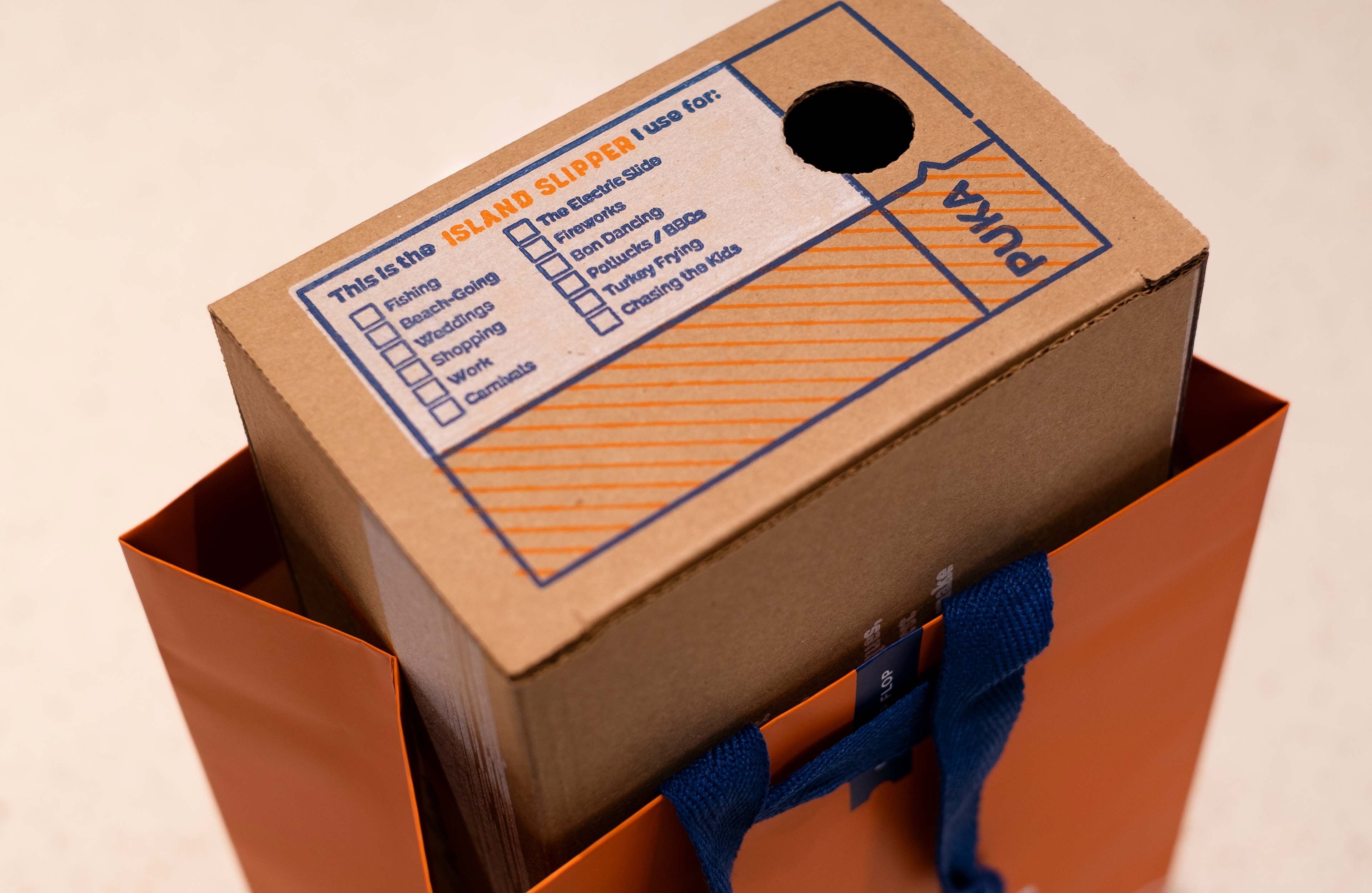
PACKAGING
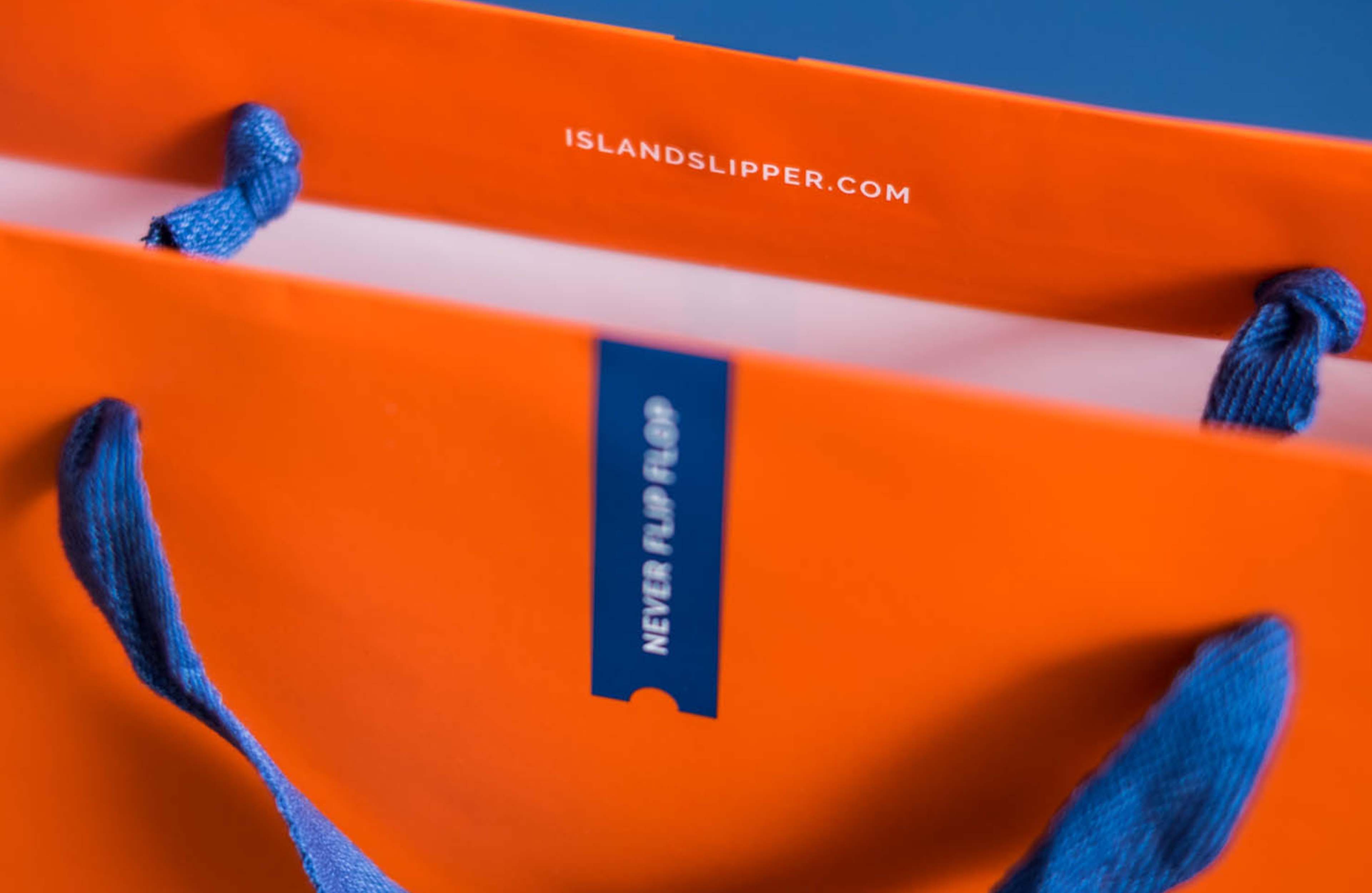
W|W applied the visual branding and graphics to packaging, focusing on the core brand palette with a maximized brand voice. The natural kraft color was leveraged on many pieces, with the notable exception of the retail bag. The bright orange bags toted by shoppers become eye-catching ads in retail environments.
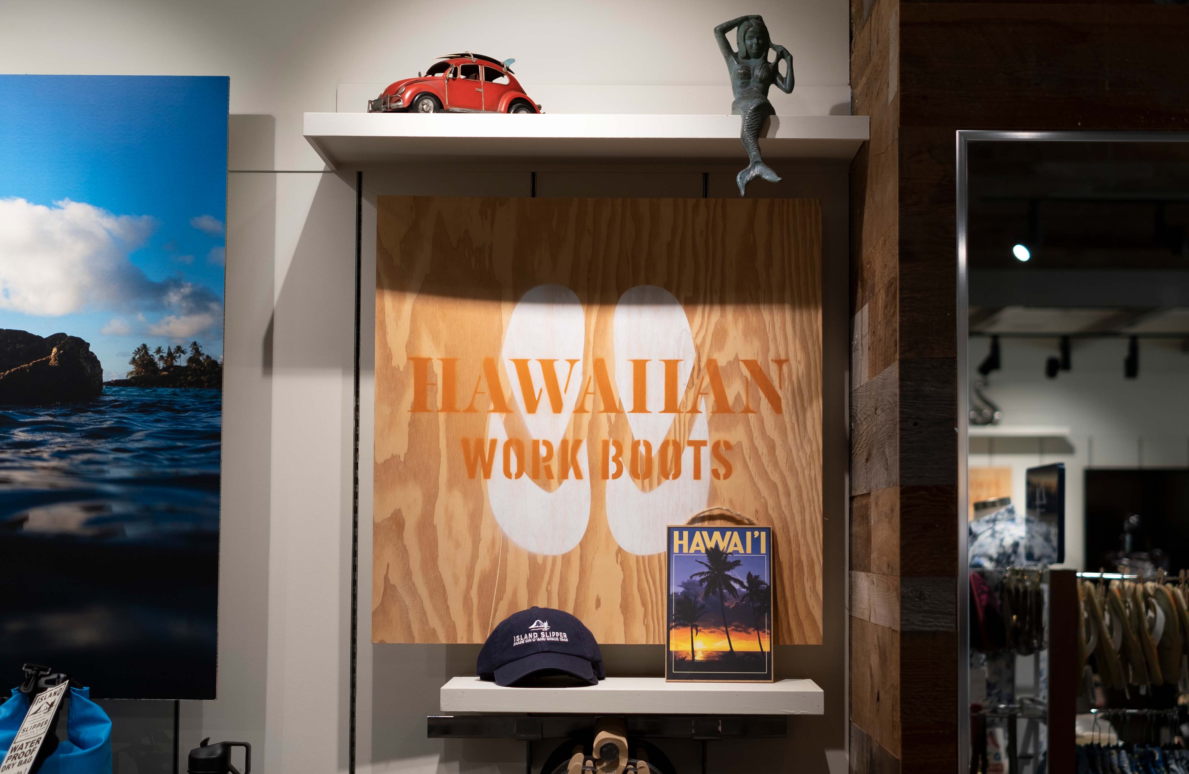
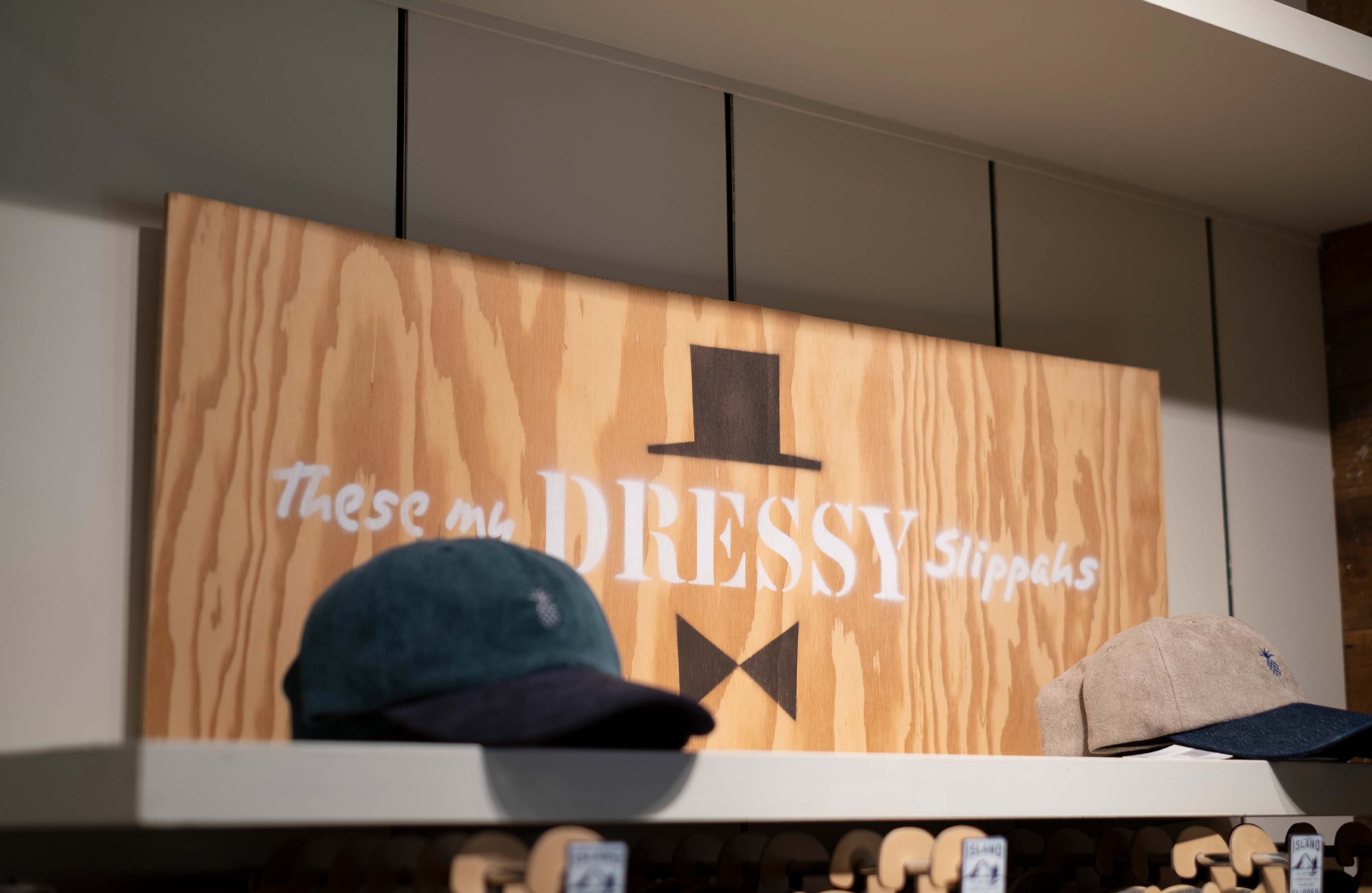
STORE INTERIORS
As part of the project scope, W|W advised on how to apply photography and graphics to a new store to give it a more contemporary and urban vibe than previous locations and to help distinguish between "departments". W|W supplemented lifestyle photography with custom-stenciled signage containing fun statements that illustrate the elevated status and expanded role of slippers here in Hawaii.
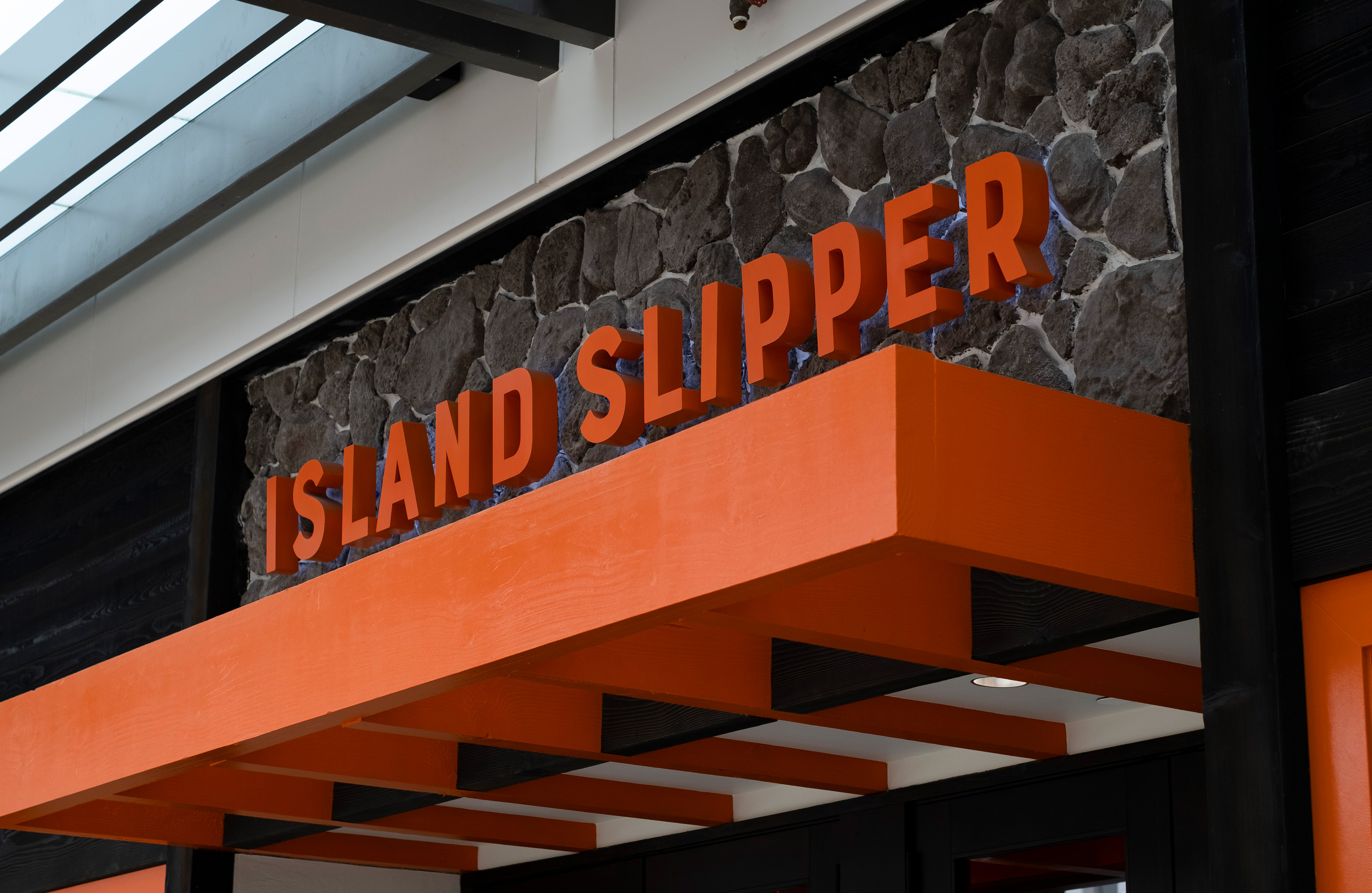
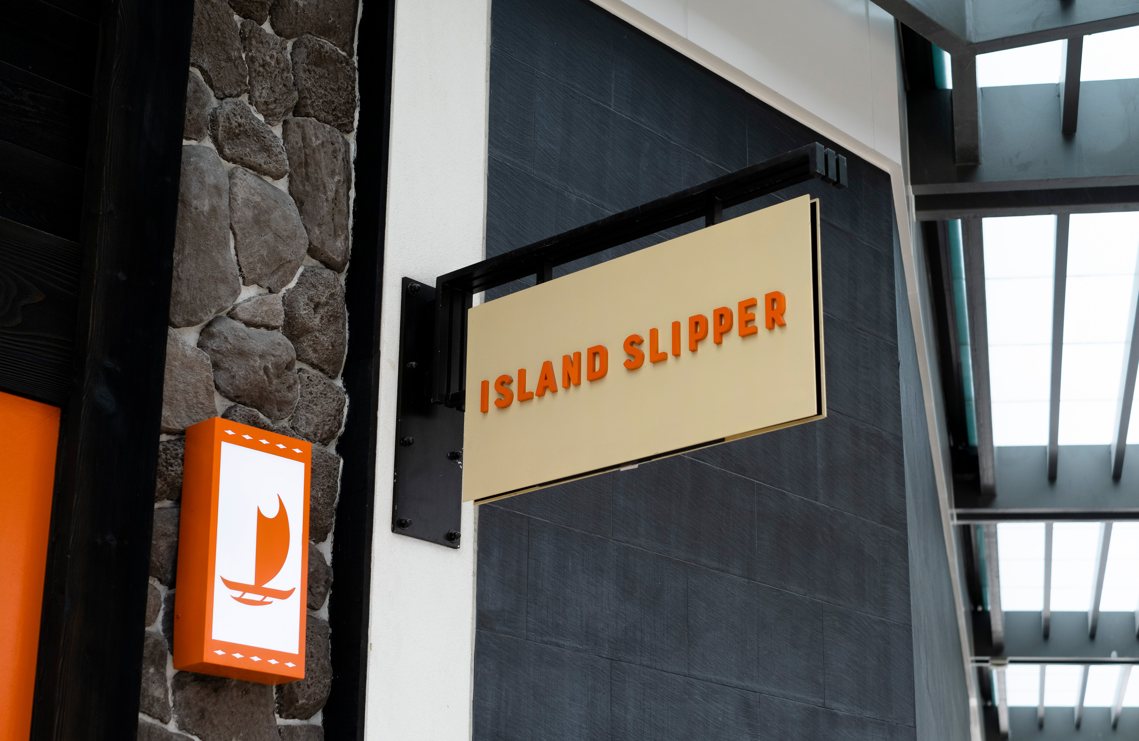
SIGNAGE
Finally, W|W applied a clean, minimal style to exterior graphics, prioritizing visibility by letting the logotype shine as dimensional, pin-mounted, back-lit letters. Different brand colors were utilized at different stores to give each their own distinct vibes that were best suited to the audiences in those neighborhoods.
![[Hero Signage Image]](/media/W1siZiIsIjIwMjEvMTIvMDgvZHFicnFseW5uX1NMUF9TdG9yZV9SSEMuanBnIl1d/SLP-Store_RHC.jpg)