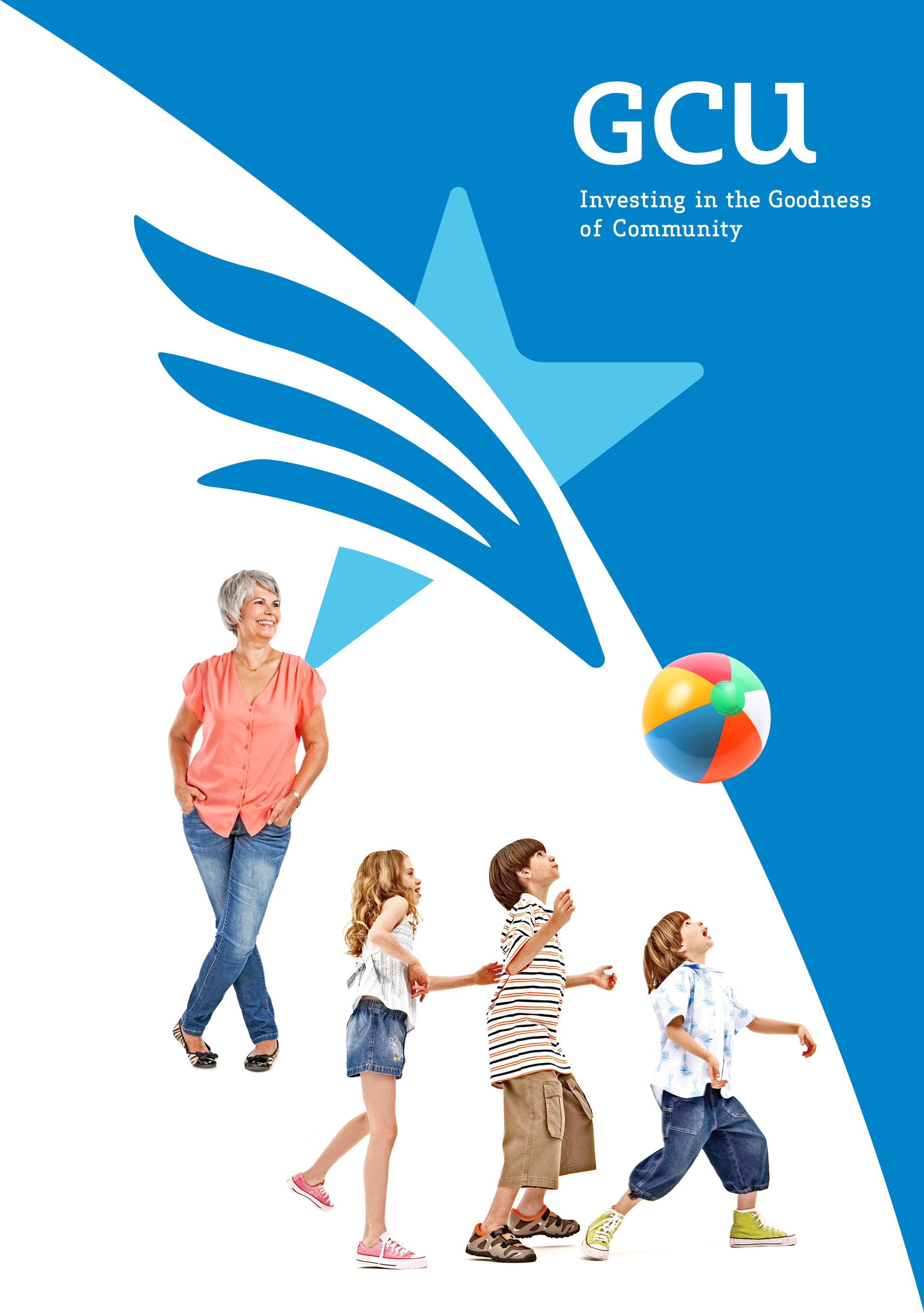
GCU
INVESTING IN THE GOODNESS OF COMMUNITY
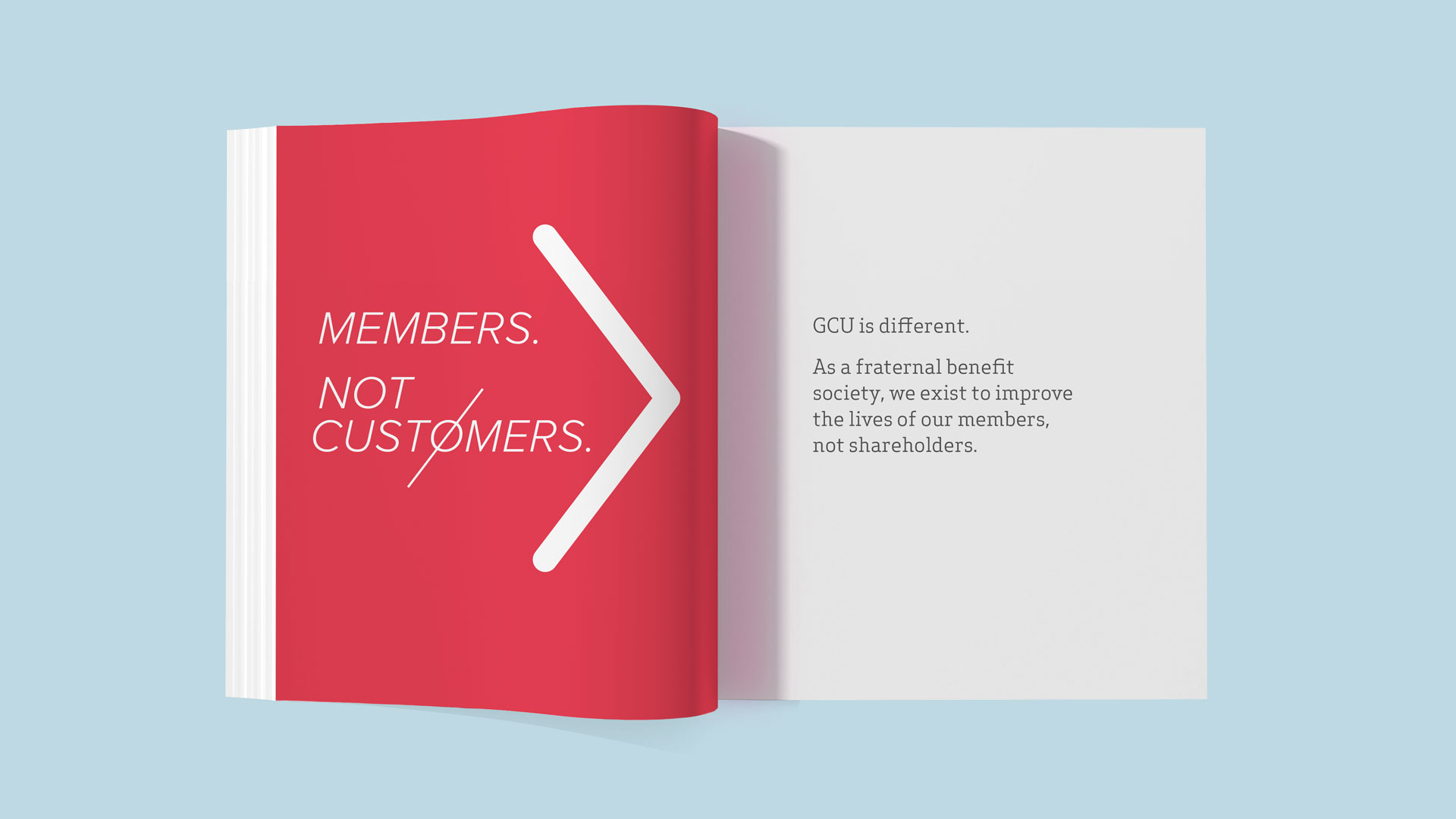
Founded in 1892 by 14 independent lodges associated with the Greek Catholic Church, GCU is a fraternal benefit society that provides members with competitive insurance and annuity products. Operating as a not-for-profit life insurance business, GCU funds social activities, community involvement opportunities, and other benefits for its members. Despite a healthy business with more than $1.5 billion in assets, GCU recognized that a disconnect existed between its fiscal and fraternal sides, and commissioned W|W to help the organization bridge that gap. The assignment's expressed objectives were to rebrand GCU in light of changing times, to differentiate it from its competitors, to standardize brand language that would help build an emotional connection with members while creating a preference for GCU among qualified consumers of life insurance and annuity products—as well as those looking for a sense of community and belonging through a fraternal benefit society.
The comprehensive collaboration with W|W included a research-driven brand platform, integrated rebranding, new website and implementation support.

BRAND PLATFORM
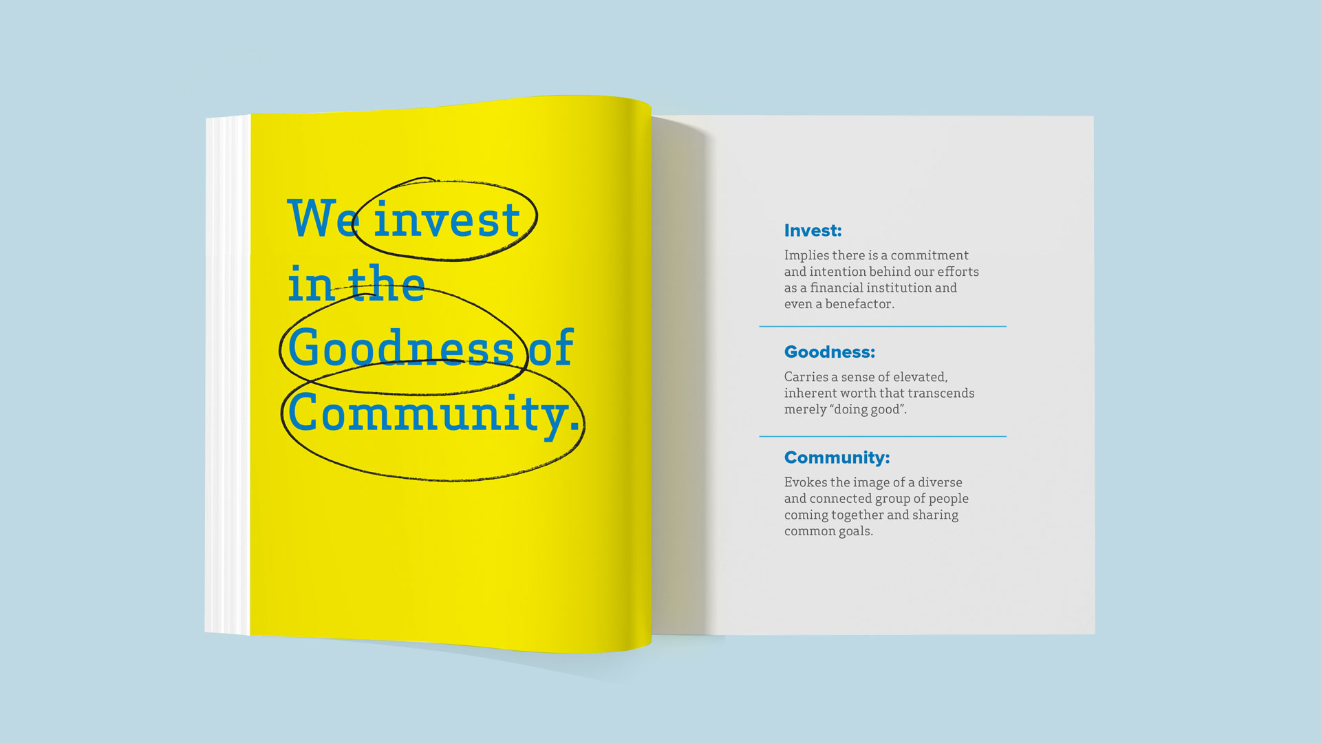
In order to develop a strong foundation from which to base the initiative, W|W executed a research-driven brand strategy. Working with longstanding partner Ideas in Focus, a consumer insights advisory agency, W|W evaluated the competitive landscape, audited existing marketing materials, conducted in-depth interviews with internal and external stakeholders and deployed an online survey. The insights that emerged from the research and audit informed the GCU Brand Platform (brand promise, positioning, personas, messaging, tagline, themes and overall narrative). Now, armed with an understanding behind the behavior and attitudinal motivations of primary personas, clarity of intent and organizational alignment beyond a common purpose, GCU was poised to bring this refreshed brand to life.
VISUAL IDENTITY
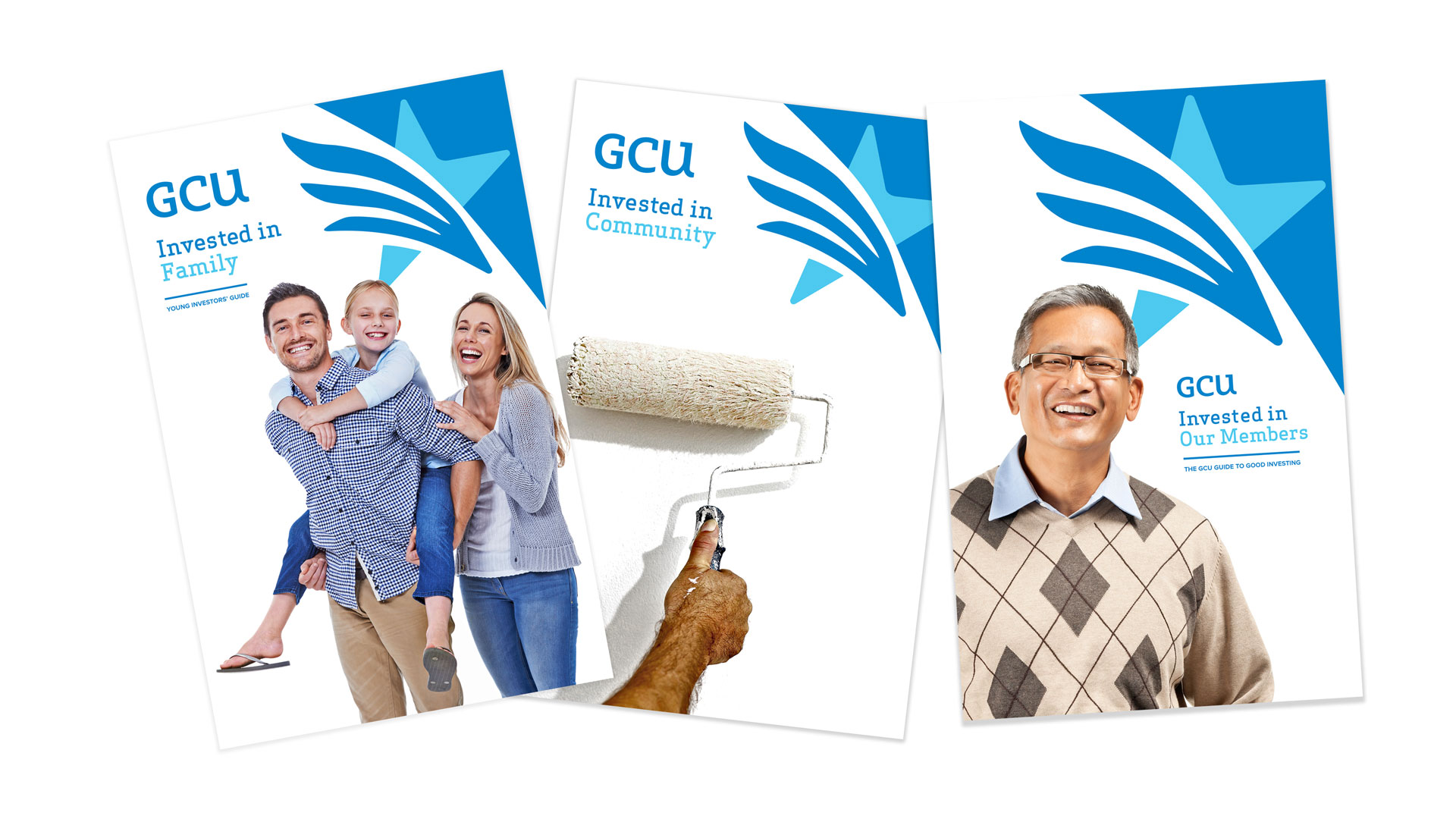
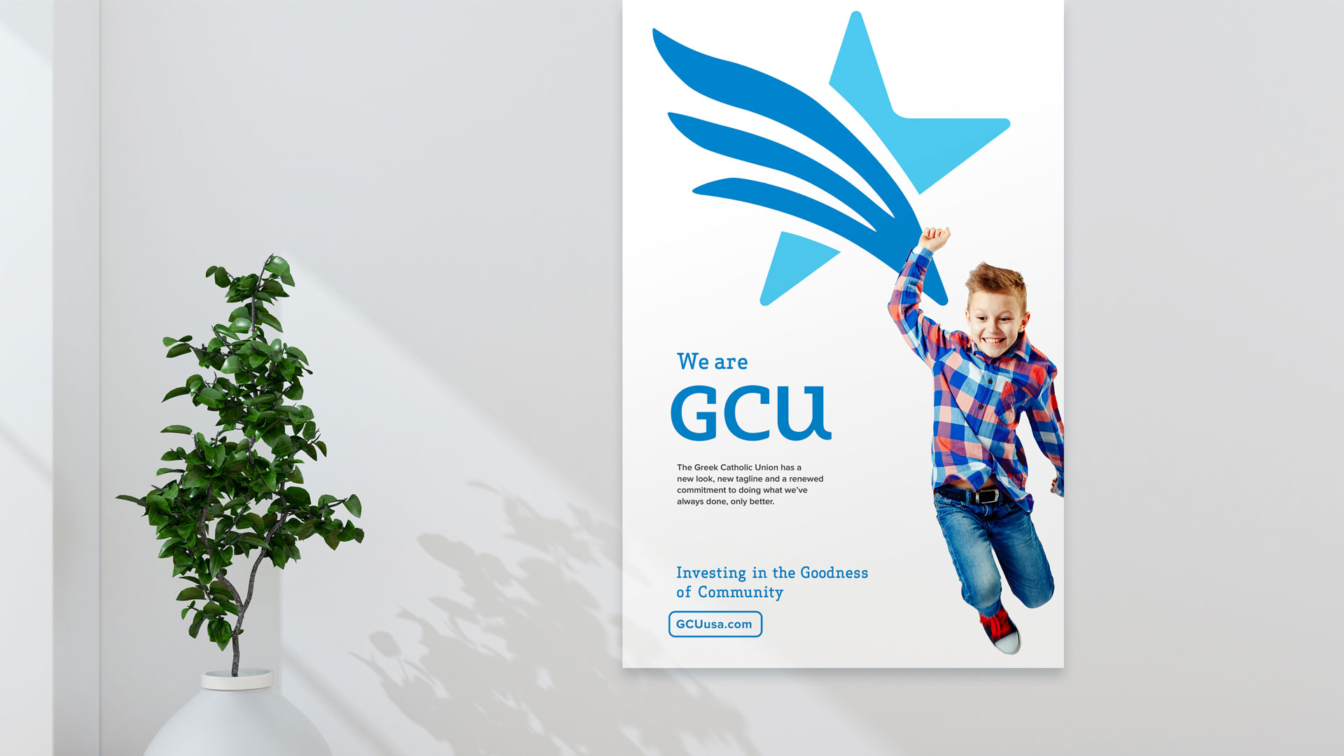
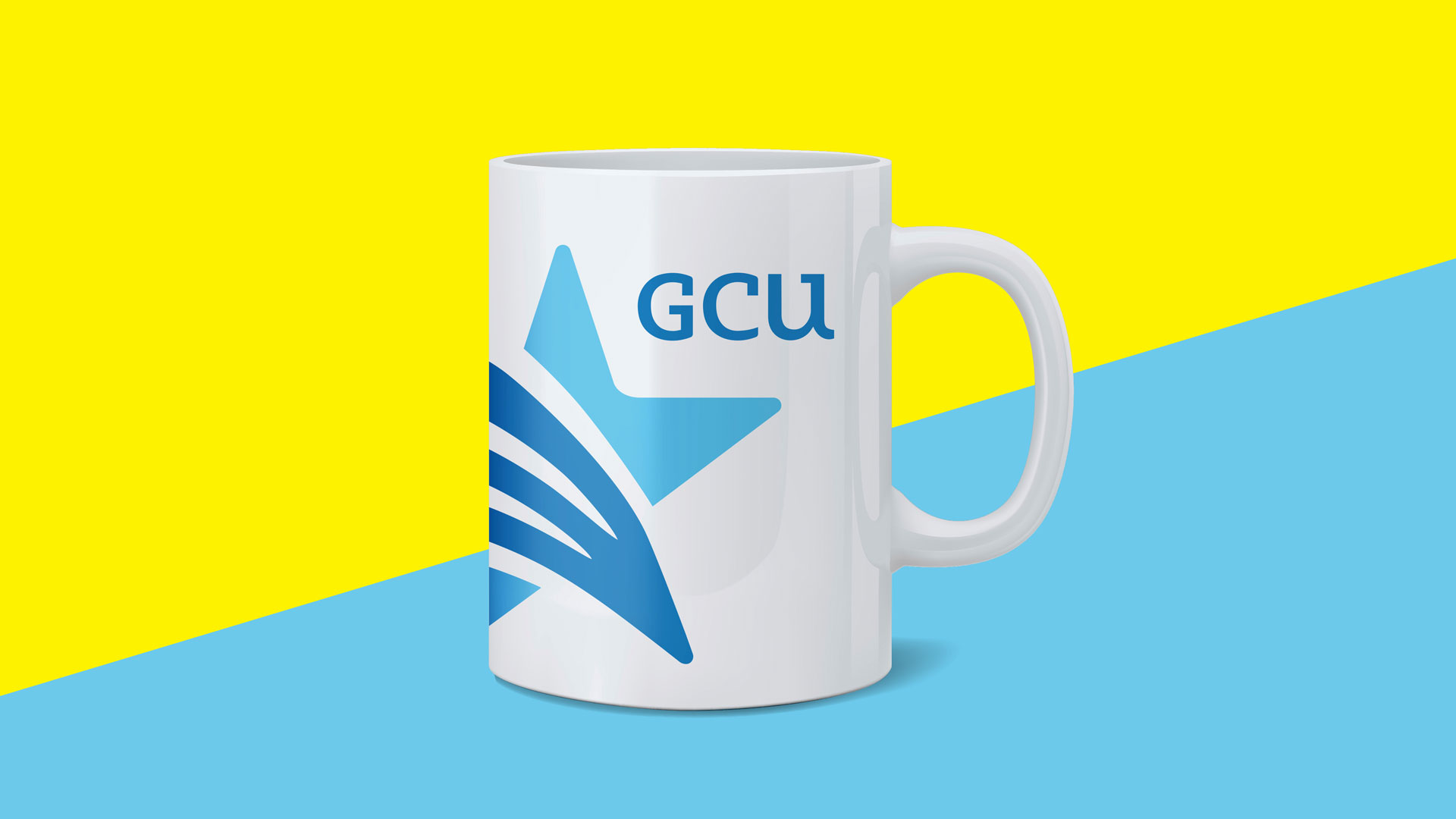
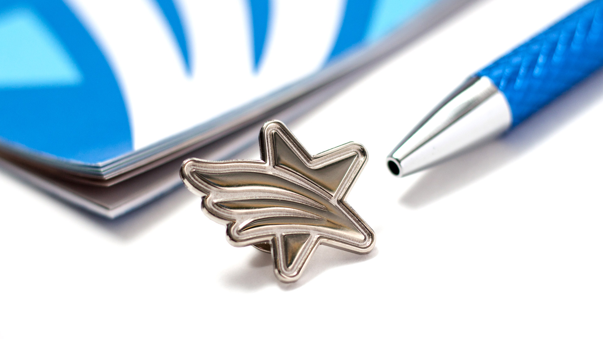
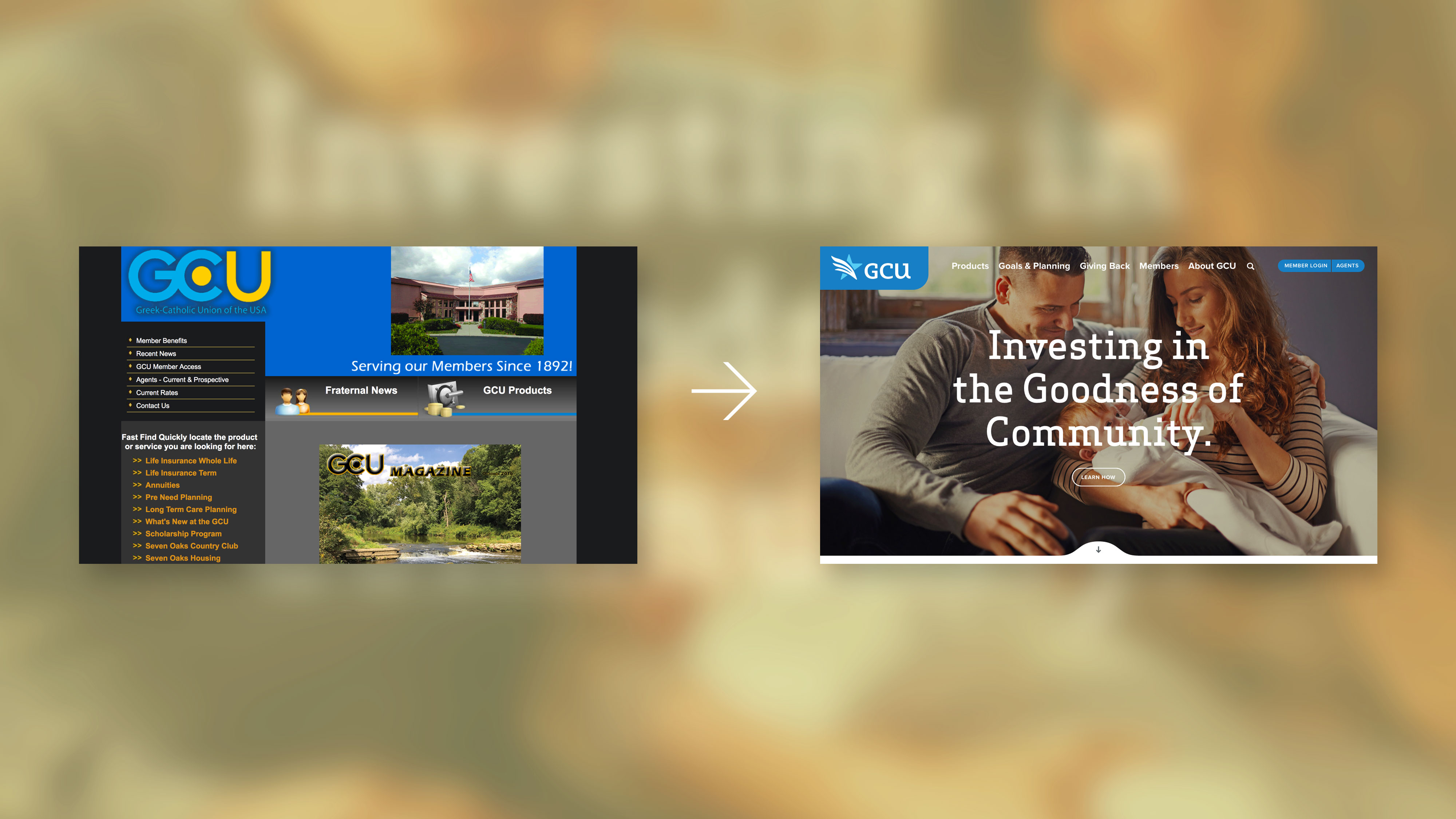
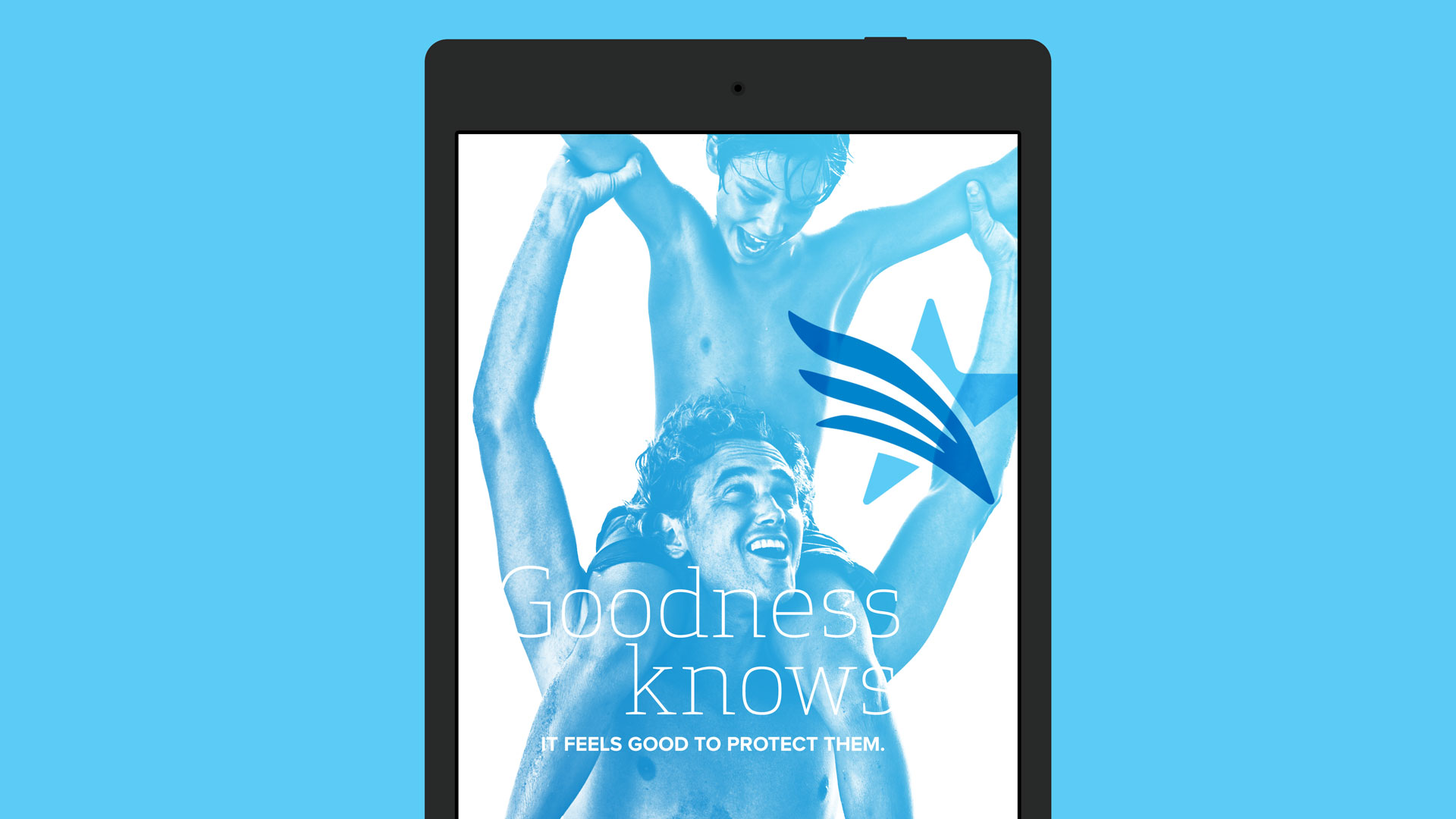
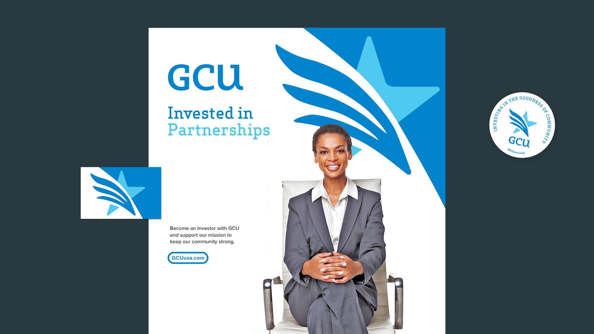
The new GCU logo takes its cues from the organization’s rich history. The primary components of the visual identity, the star and eagle, are recurring elements from early Greek (Byzantine) Catholic culture. The abstract, yet familiar, icons contained in the new logo provide an authentic connection to GCU’s history while conveying a fresh sense of confident energy. The visual identity is intended to symbolize security, strength, longevity and righteousness, all core attributes of the GCU brand. W|W introduced new stylized letterforms for GCU to help reposition the organization as contemporary.

GRAPHIC TOOLKIT
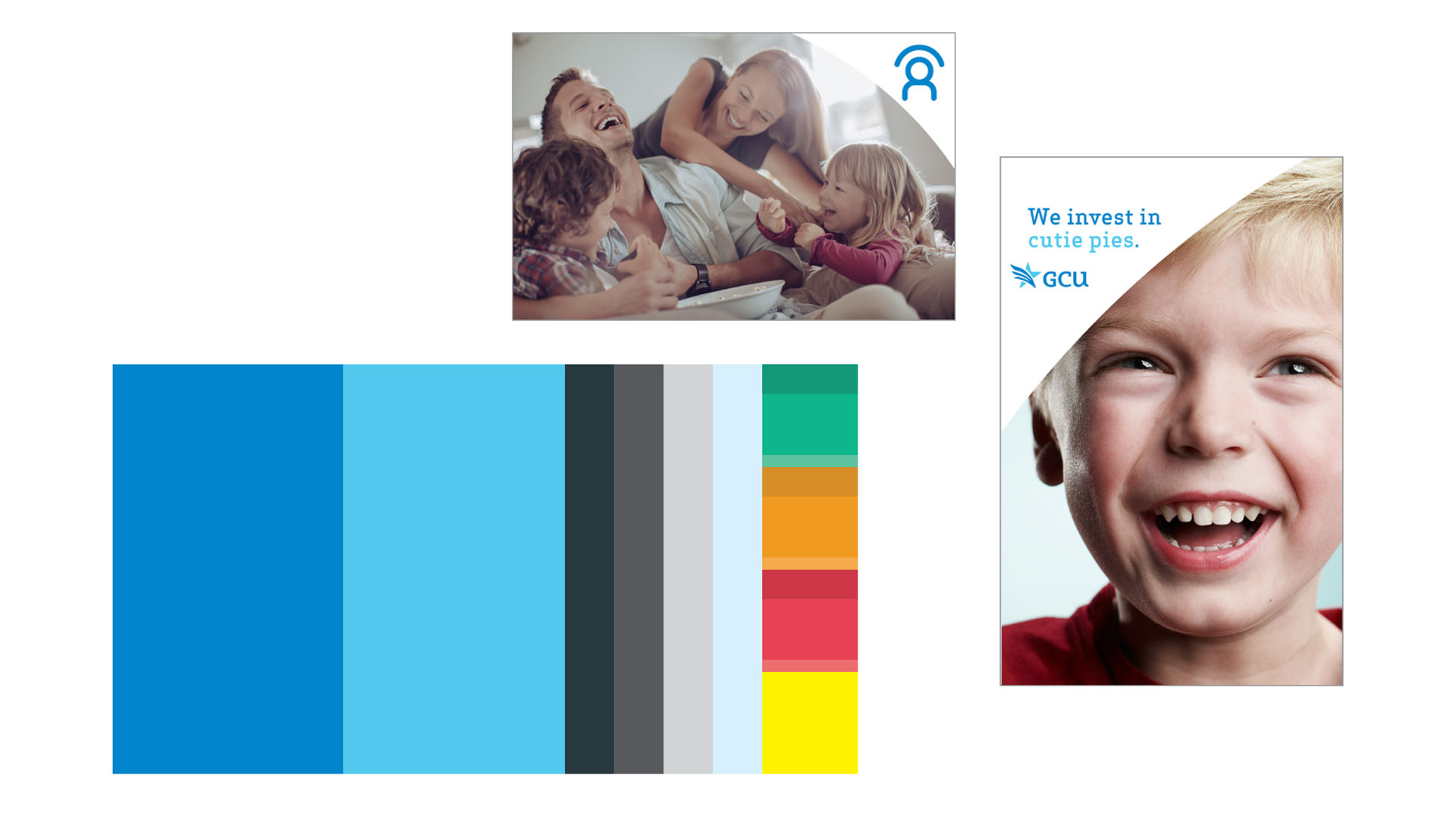
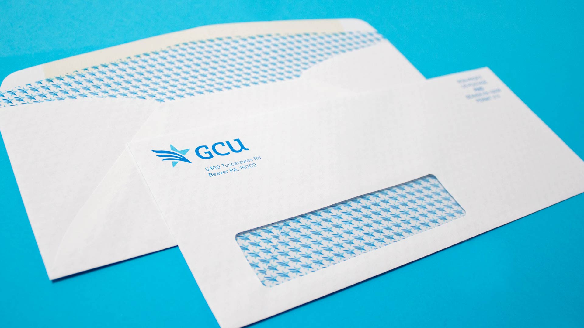
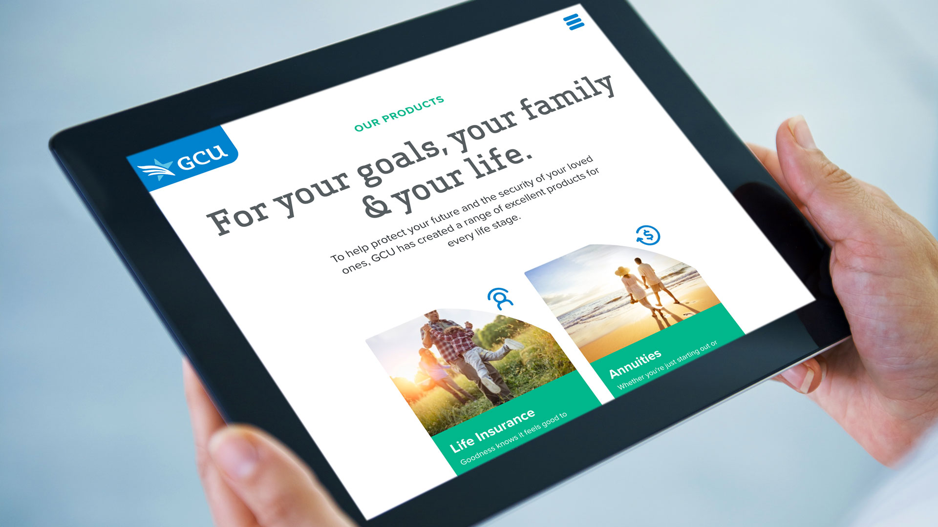
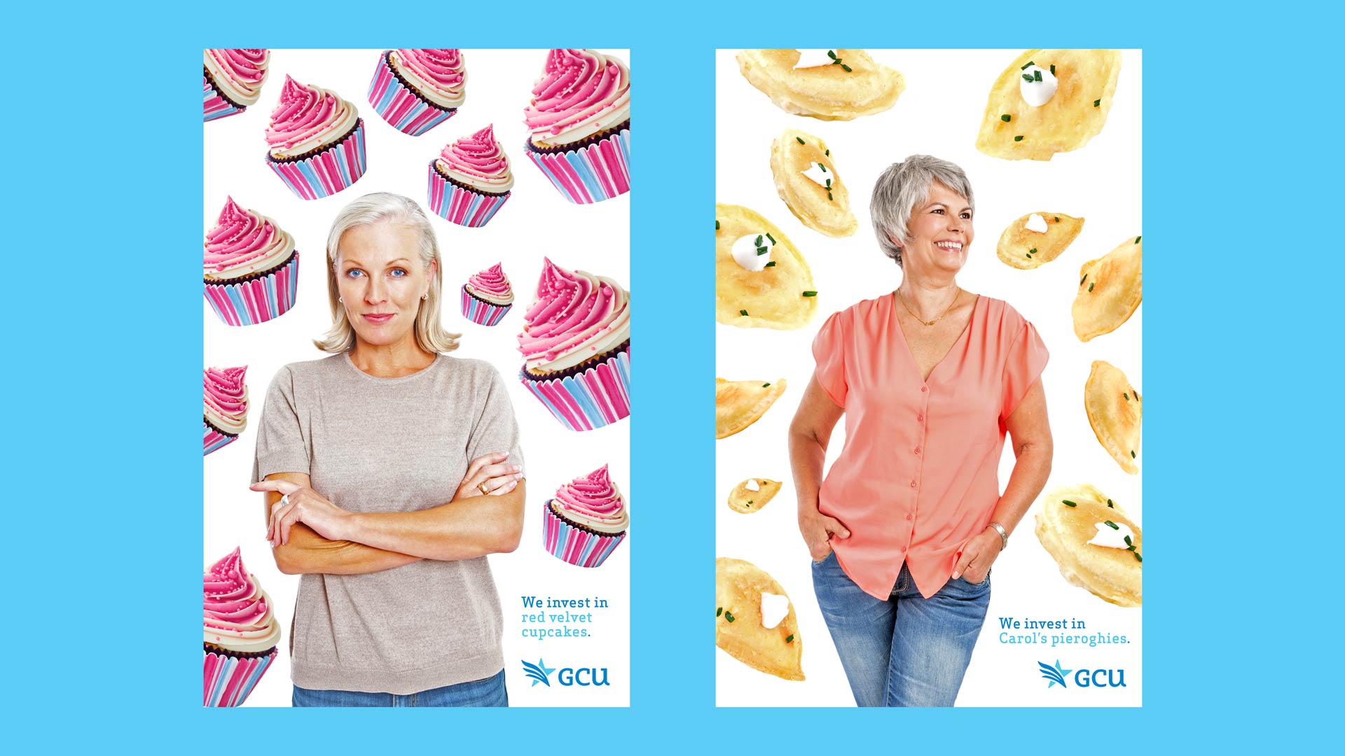
With the new GCU logo as the starting point, W|W created a set of graphic assets to help build the visual story of the refreshed brand. Those items included a logo pattern that could be used as a background texture and the “arc of the star”, a swooping graphic device with flexibility to be integrated across mediums. Two hues of blue were selected as the primary brand colors, recognizing that blue symbolizes loyalty, strength, wisdom, faith, and trust. An extended color palette, custom icons, type treatment for headlines and a photography style round-out the toolkit.

ON-BOARDING & LAUNCH
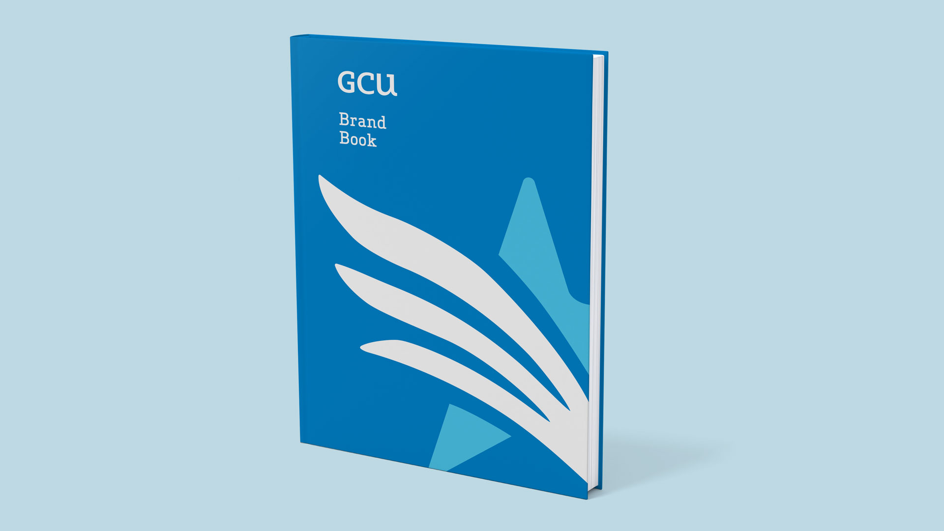
Successful organizational transformation relies on cultural alignment behind the repositioned brand framework. To help on-board the existing internal stakeholders and train new employees, W|W produced the Brand Handbook, Brand Microsite, and companion Brand Video that reinforce GCU’s promise of investing in the goodness of community. GCU's marketing team leveraged these materials as the new branding was unveiled during an employee luncheon at the headquarters. View the GCU Brand Launch Microsite.


DIGITAL
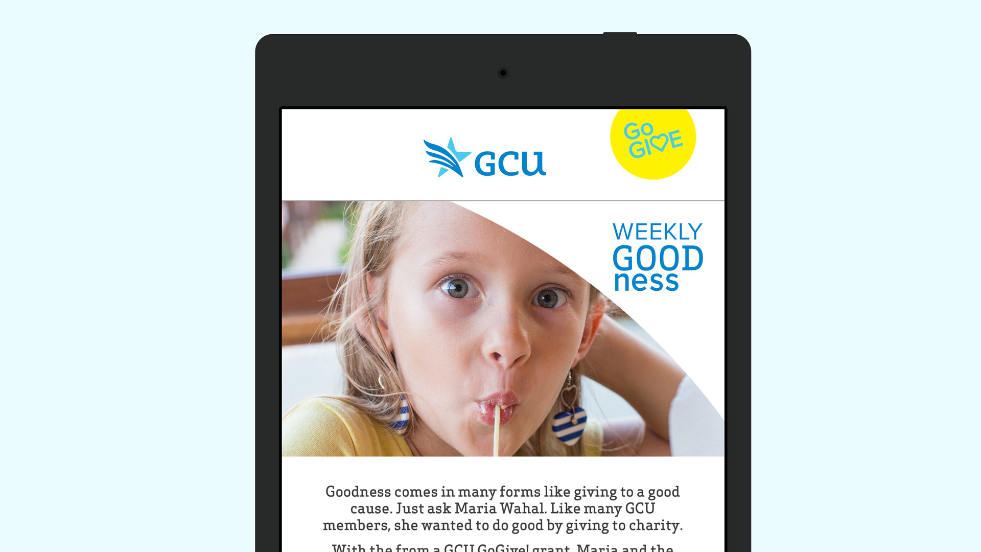
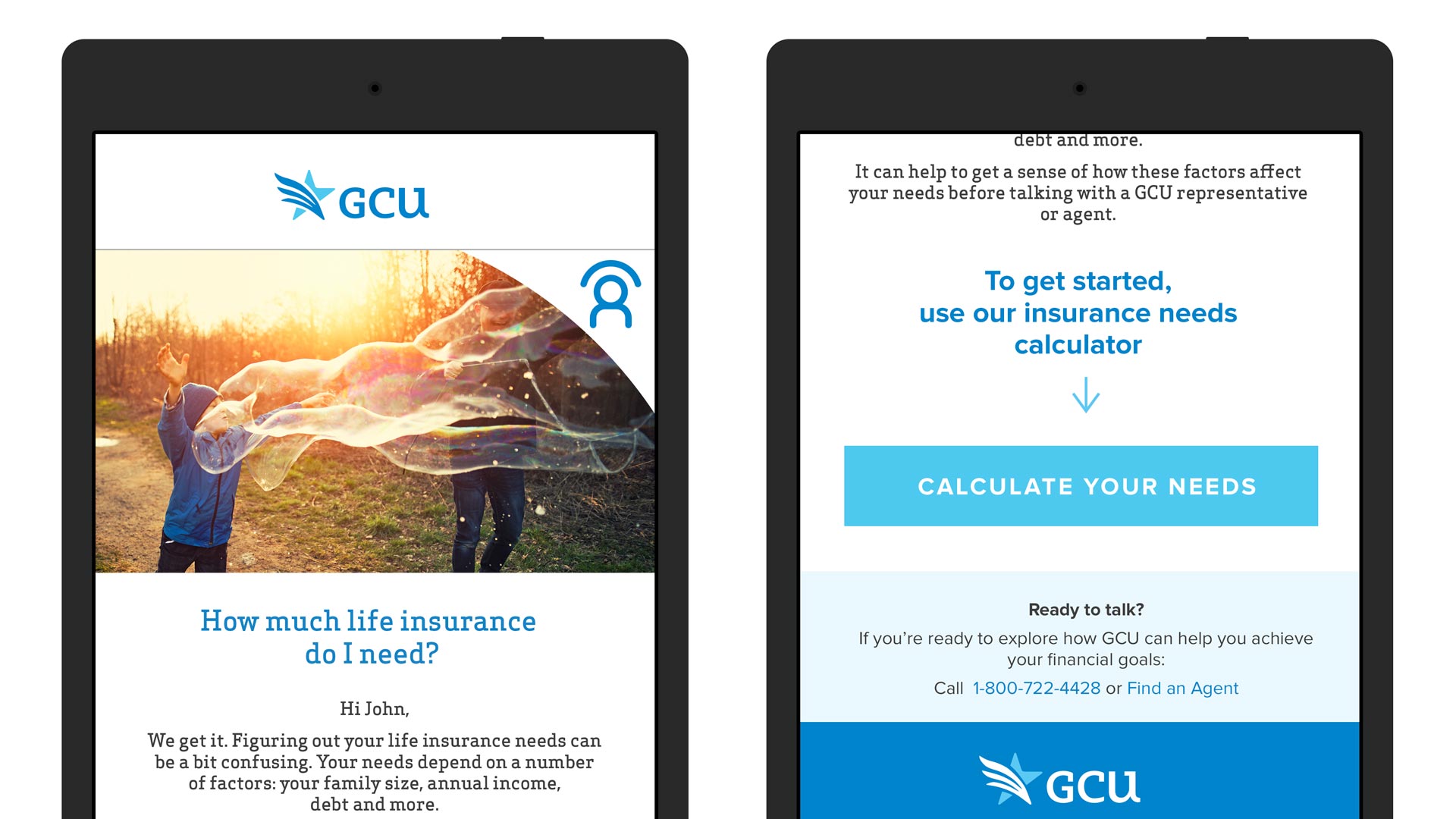
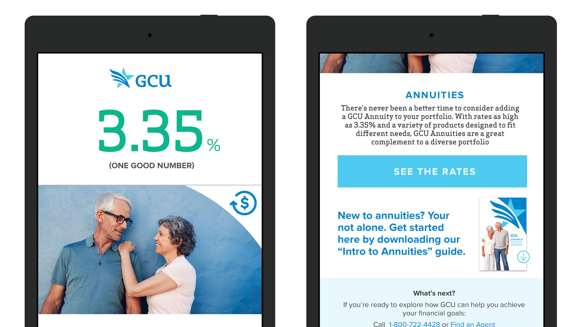
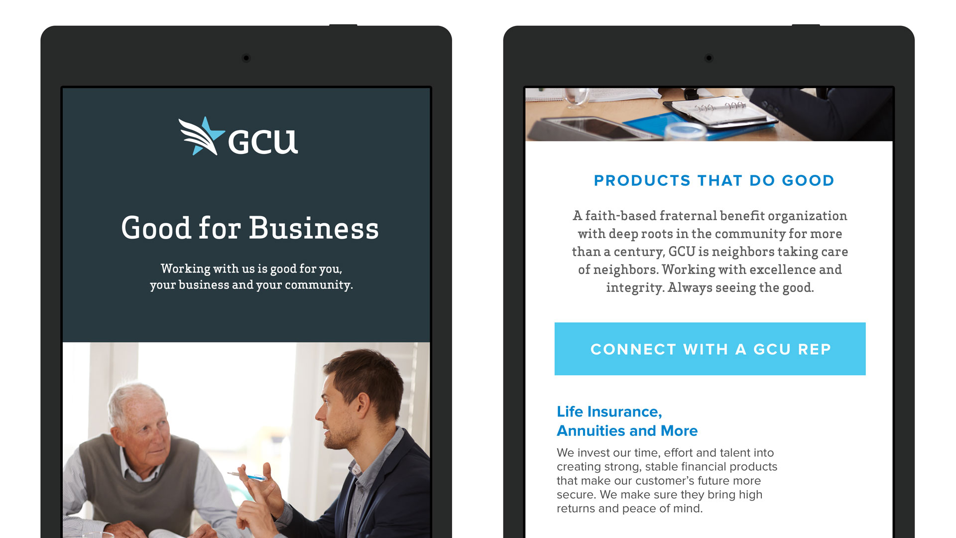
In addition to executing a comprehensive redesign of the GCU website, W|W also helped the organization mobilize a proactive digital marketing strategy that includes e-communications in Mailchimp, a social media framework, and more. The GCU website, designed by W|W was powered by BlokBlok CMS, a Ruby on Rails + JavaScript content management system with custom integrations to Sugar CRM, a third-party customer relationship management system. The enhanced web presence better supports GCU’s business goals by providing financial advisors with access to the organization’s story and value proposition while improving members’ connection to the fraternal side.

MARKETING COLLATERAL
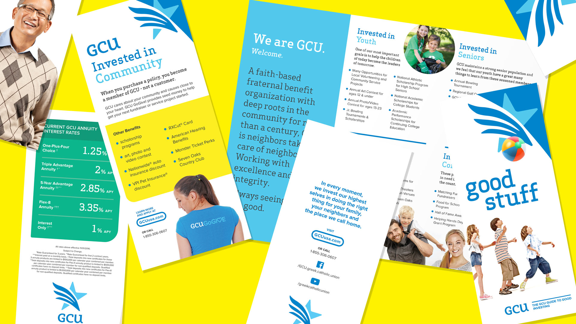
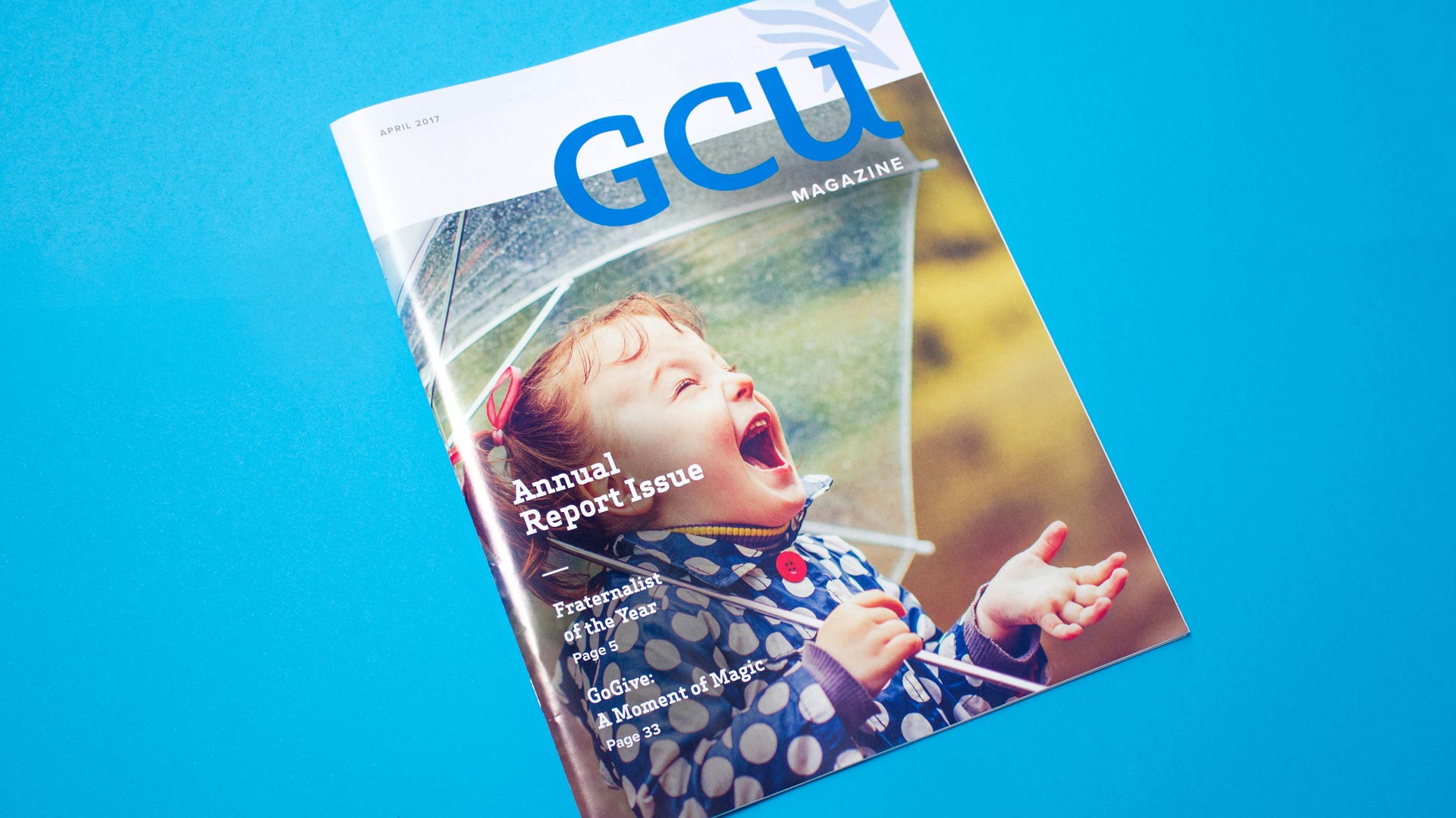
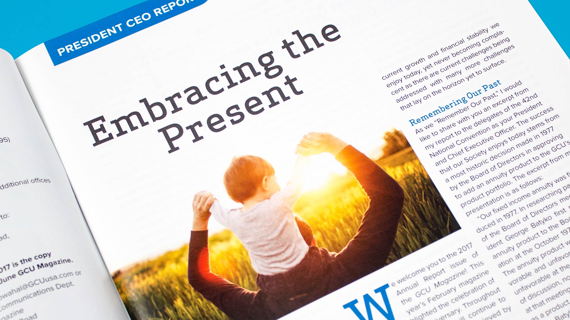
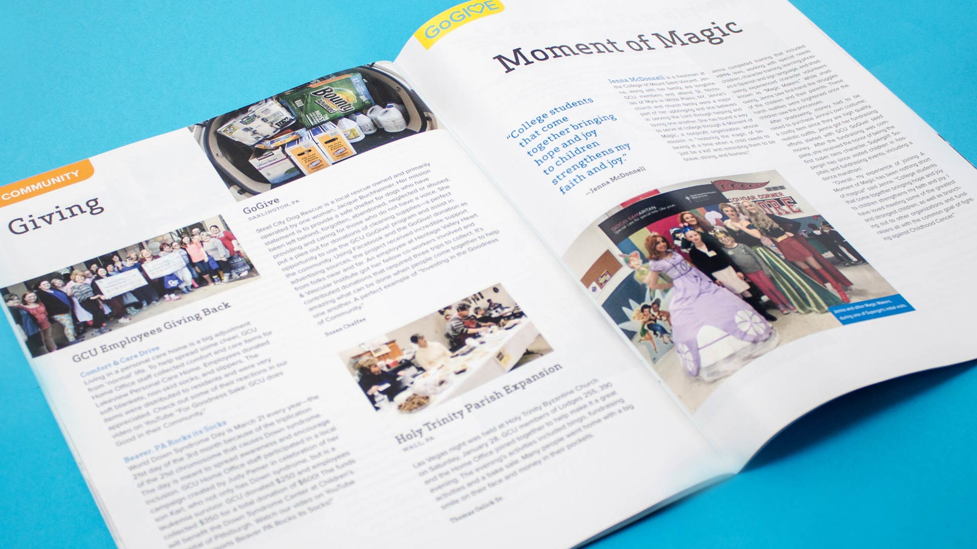
The suite of marketing collateral includes both updated pieces and new components that all embrace the new GCU branding. With the stationery system incorporating the “arc of the star” from the graphic toolbox, the other pieces leverage persona-specific messaging and content, collectively delivering an integrated set of cohesive brand signals. W|W also completed a redesign of the GCU Magazine, with the new layout working harder to share the special member stories and engaging readers to enhance affinity relationships with the organization.

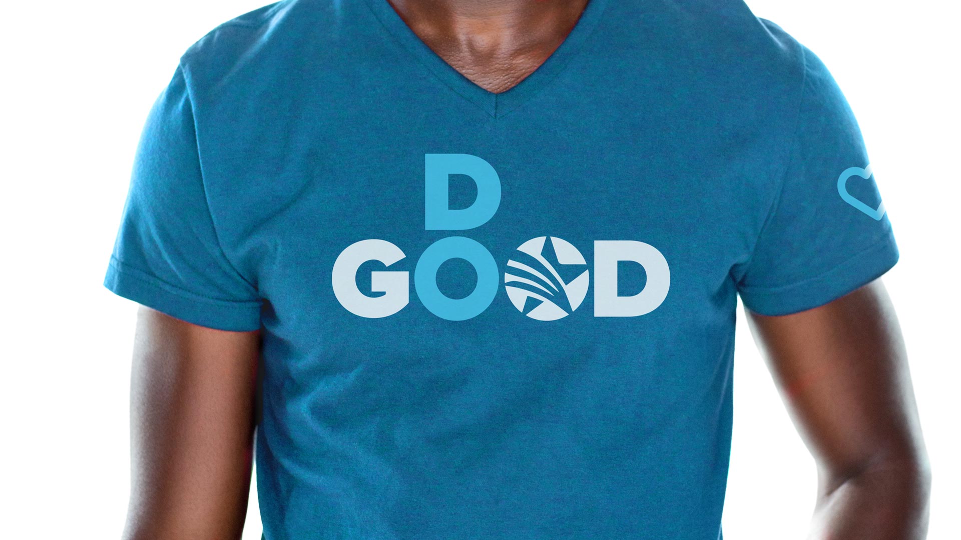
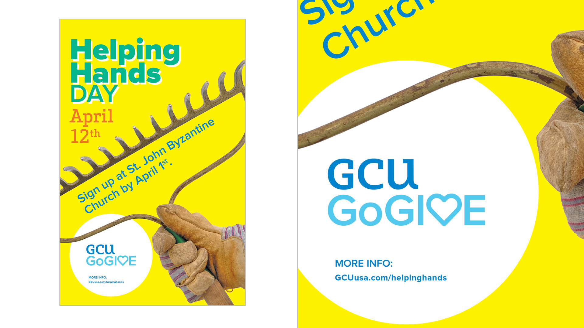
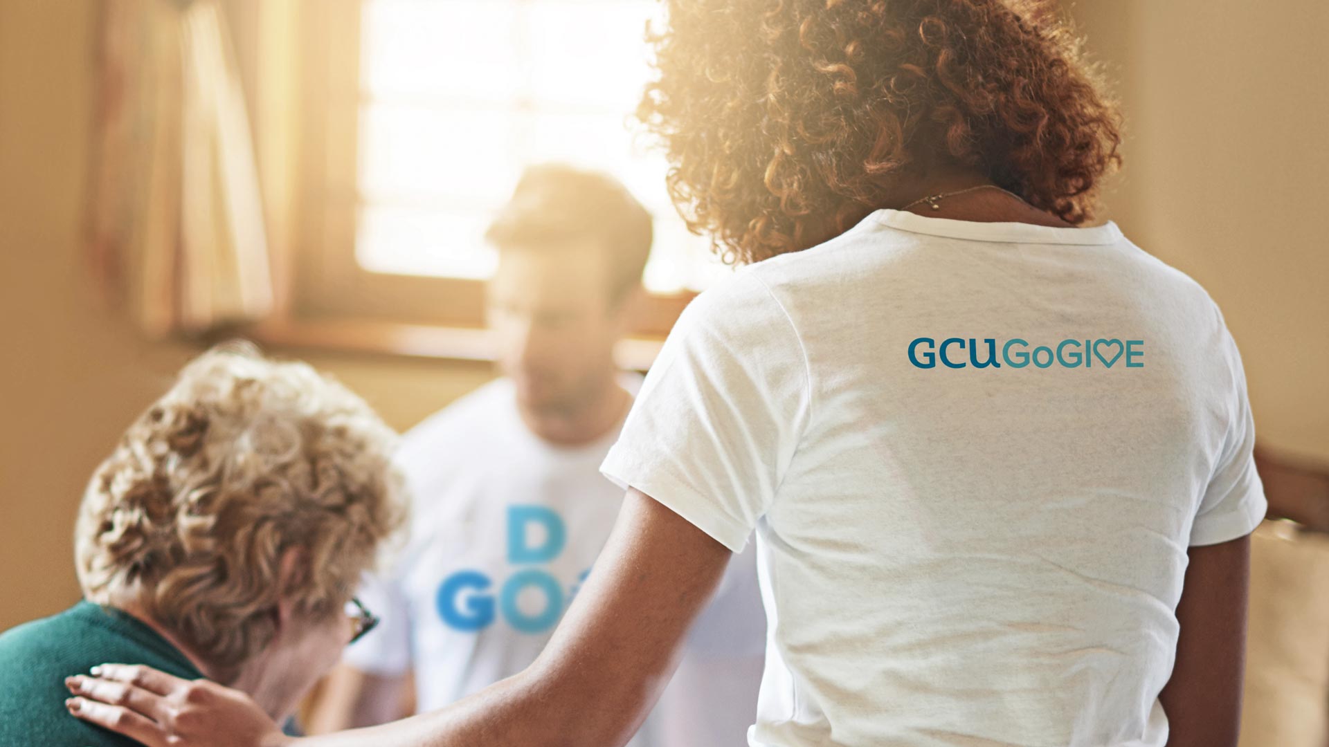
GO GIVE
As GCU developed GoGive, a seed investment program that provides members with support for charitable causes, W|W designed a complementary identity and suite of marketing materials, communication tools and merchandising to help jumpstart the initiative.