CROSSROADS FOUNDATION
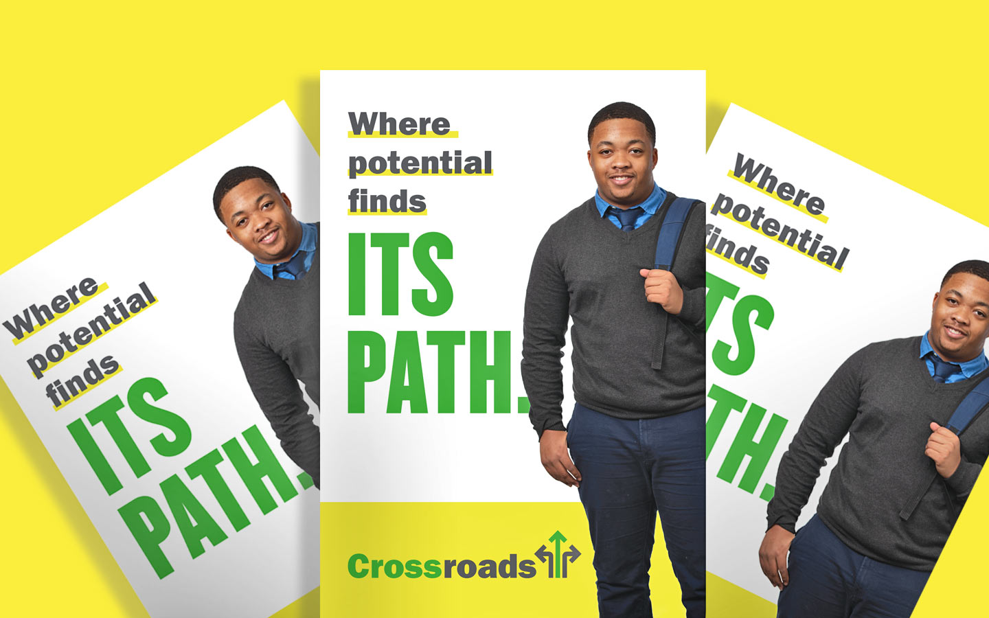
WHERE POTENTIAL FINDS ITS PATH
A regional non-profit organization, Crossroads Foundation transforms the futures of high-potential, underserved students by unlocking a quality Catholic high school education. W|W was hired to develop a research-driven strategic brand platform that would help differentiate Crossroads, standardize language and create a preference for the organization among prospective families and donors. The realignment led by W|W included an adjustment to the primary, public-facing name, a comprehensive visual rebranding (identity system/logo, integrated design & brand guide) a communications plan, a tactical marketing strategy, and a new website. Crossroads, where potential finds its path.


A NEW NARRATIVE
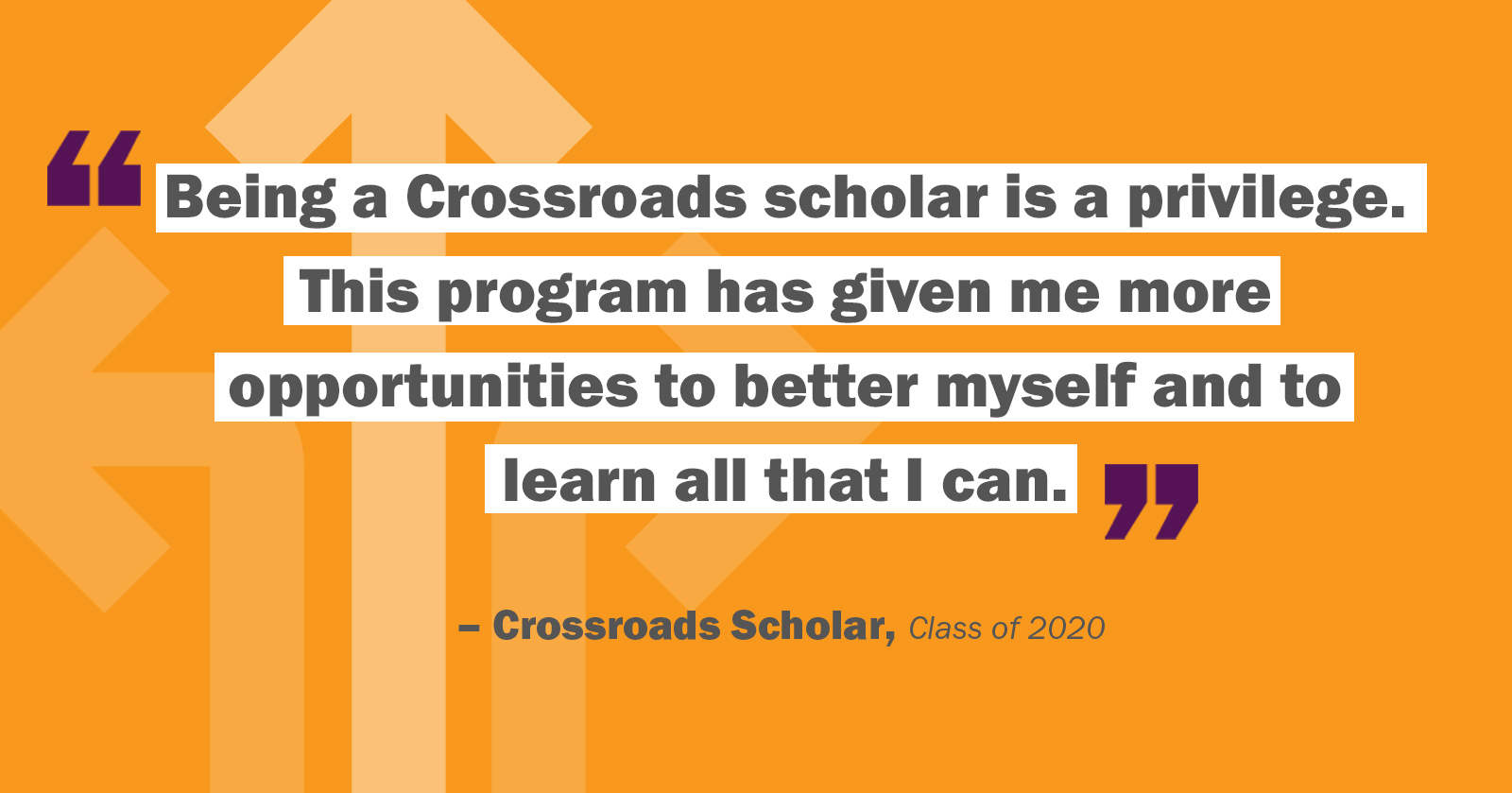
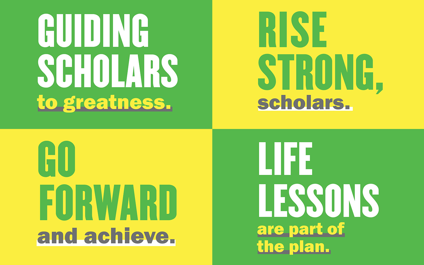
The Crossroads tagline, “Where potential finds its path”, connects back to the brand promise of helping bright kids rise strong while evoking the image of a journey, inherent in the name “Crossroads.” The tagline also reinforces the importance of scholar potential and signals optimism, empowerment and aspiration. This new powerful narrative has layers of meaning that start a conversation.
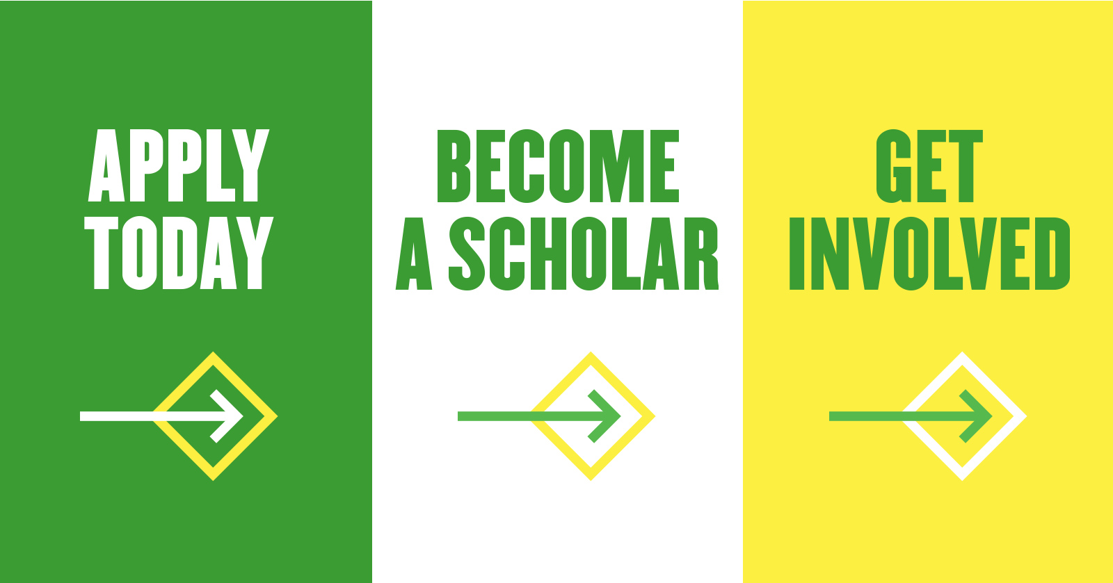
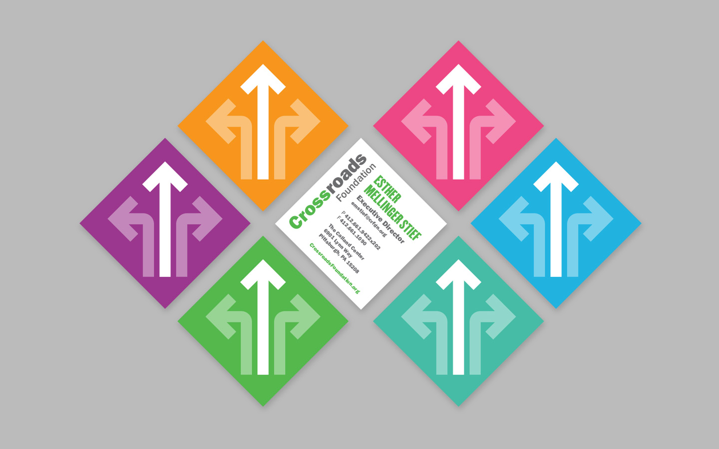
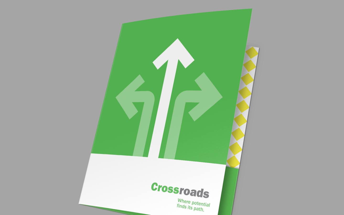
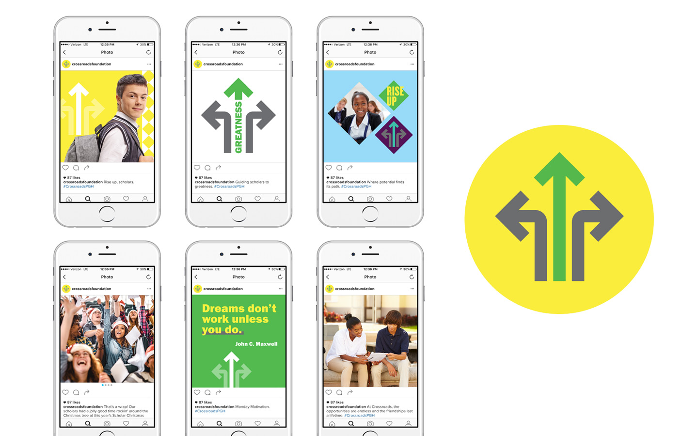
The logomark is formed by the 3 arrows housed inside an implied diamond shape, with the arrows referencing how Crossroads helps its students to rise up at this crucial intersection in their lives. The arrows also subtly hint at the shape of a cross as a nod to Crossroads' connection to Catholic education.


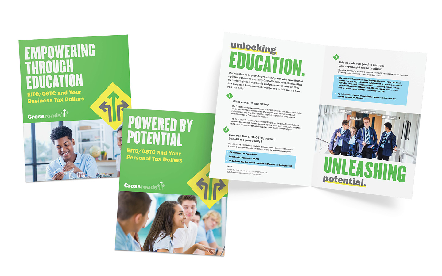
UNLOCKING EDUCATION
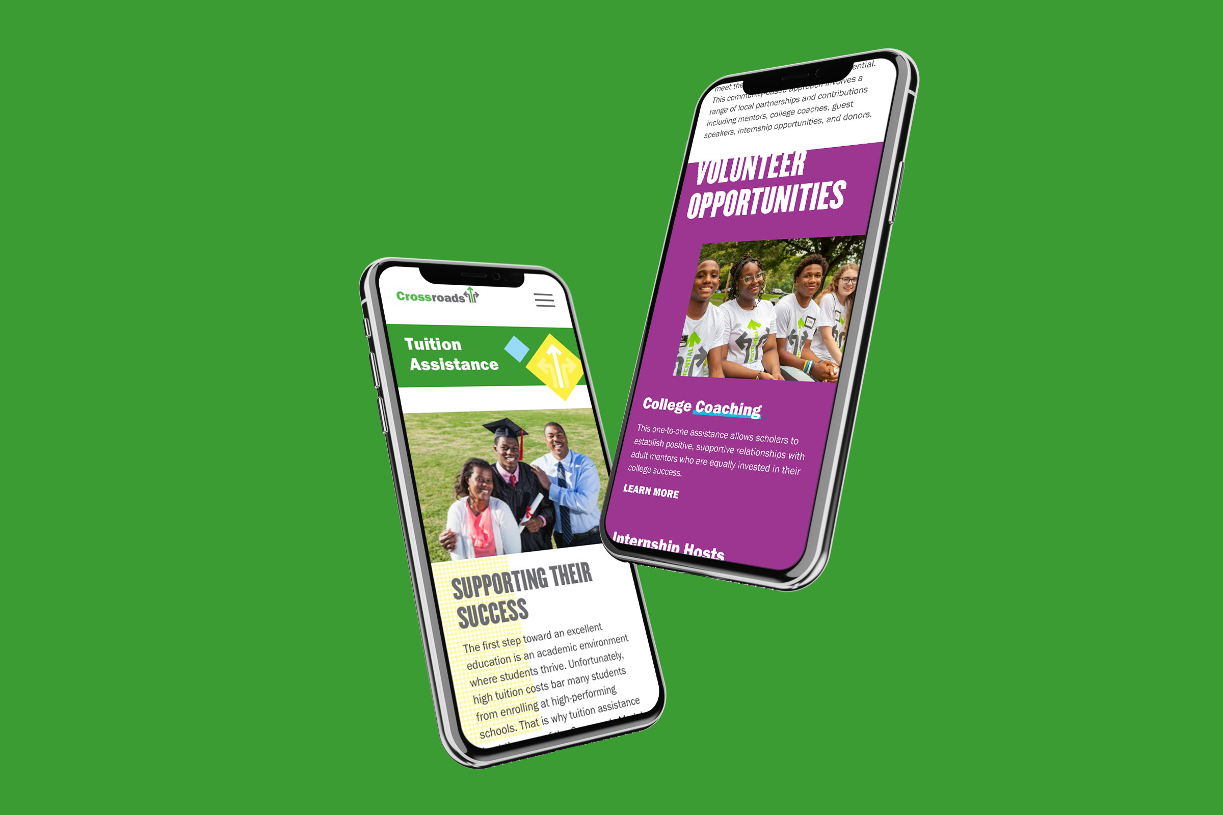
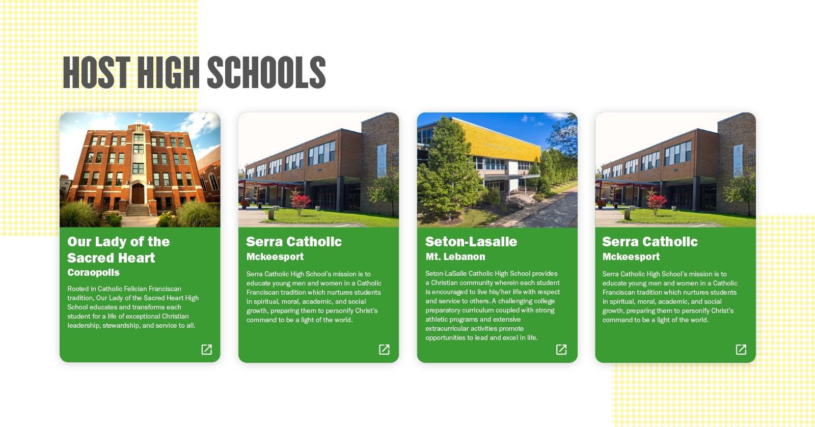
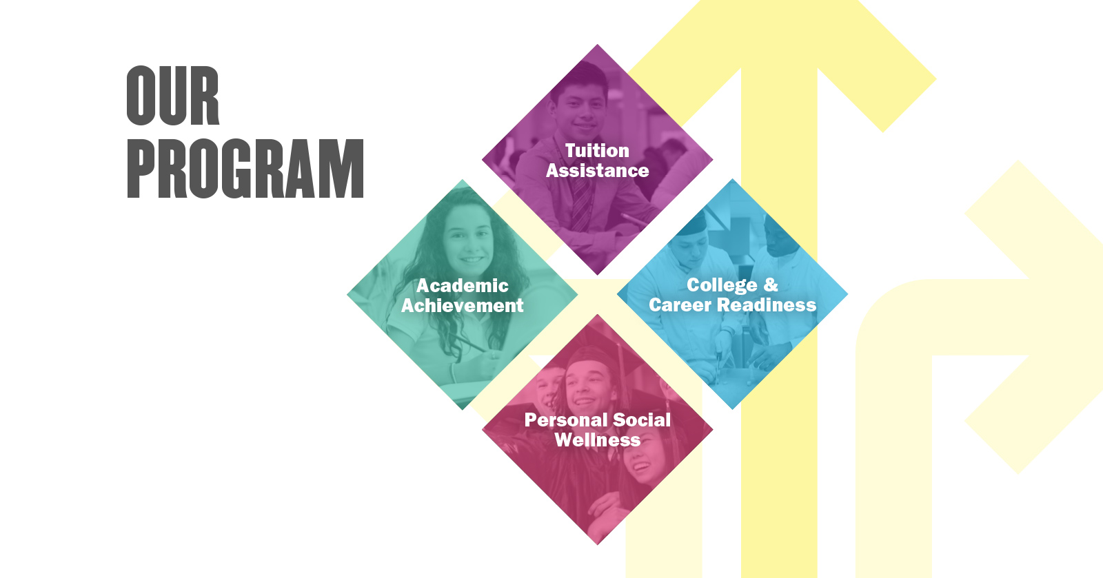
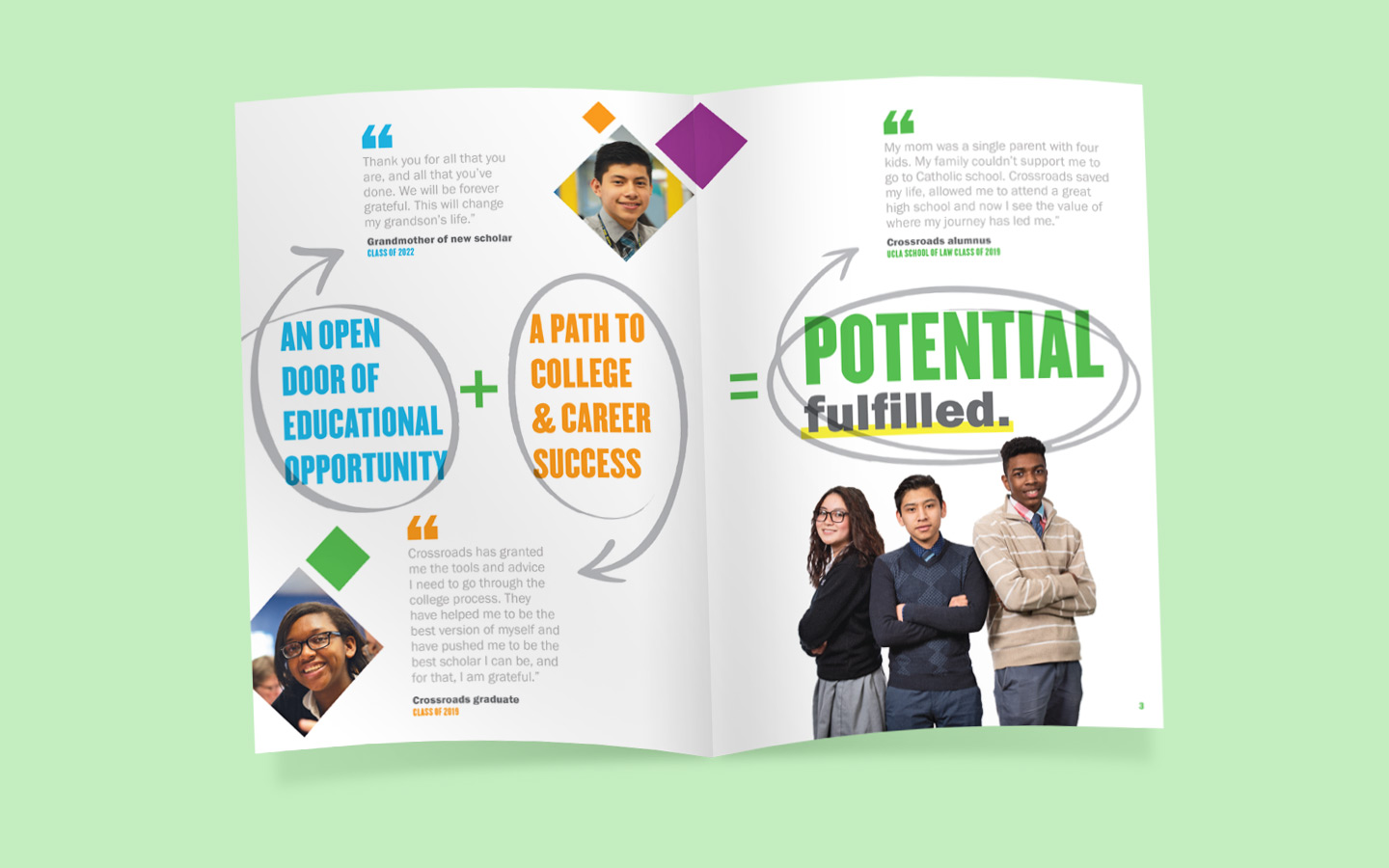
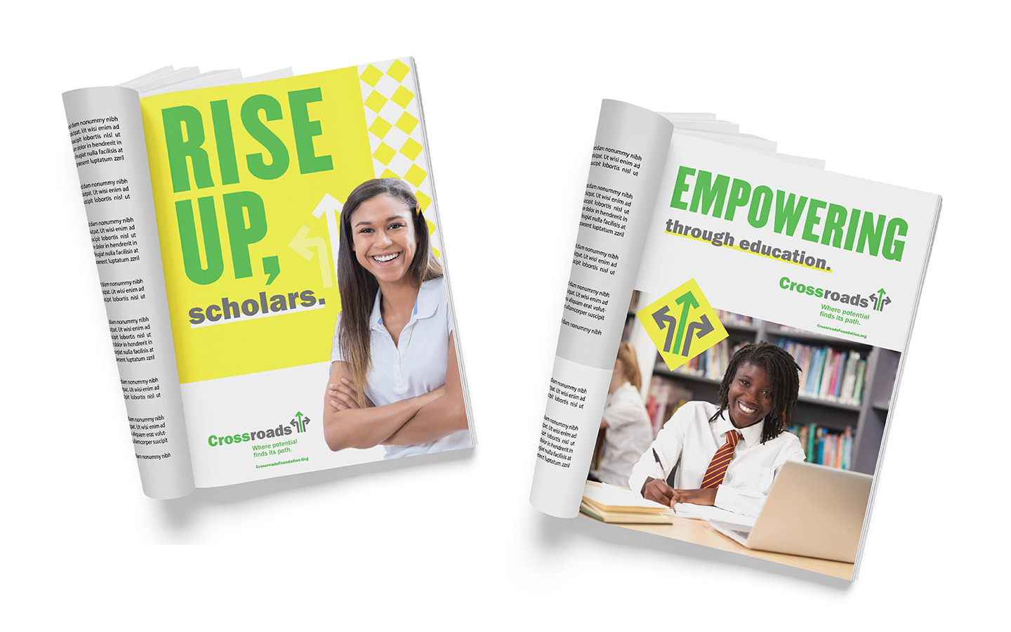
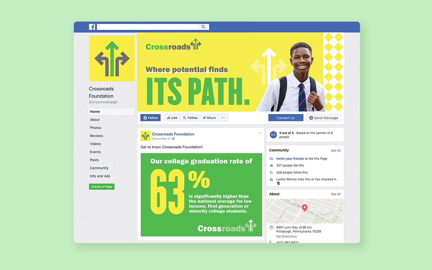
The integrated rebranding helped align Crossroads marketing with its mission to provide promising youth with limited access to a quality Catholic high school education by nurturing their academic and personal growth so they may succeed in college and in life. In addition to art directing a custom photo shoot that accurately captures the essence of Crossroads scholars, W|W created a design system for donor-focused collateral, recruitment & awareness advertising, newsletter and the organization's physical space.


NAVIGATING THE DIGITAL INTERSECTION
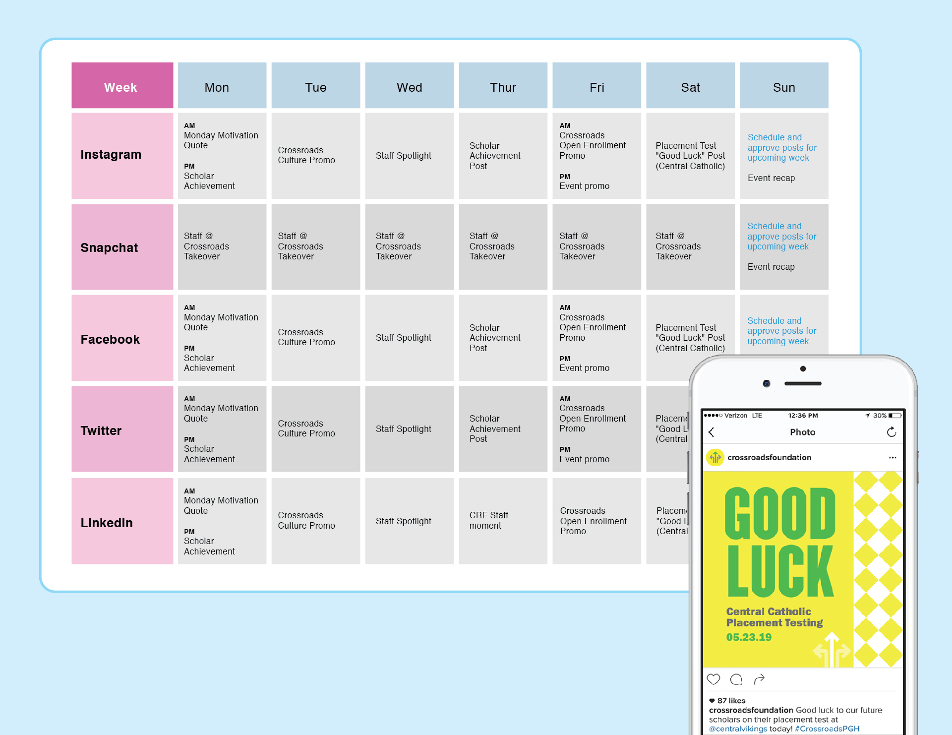
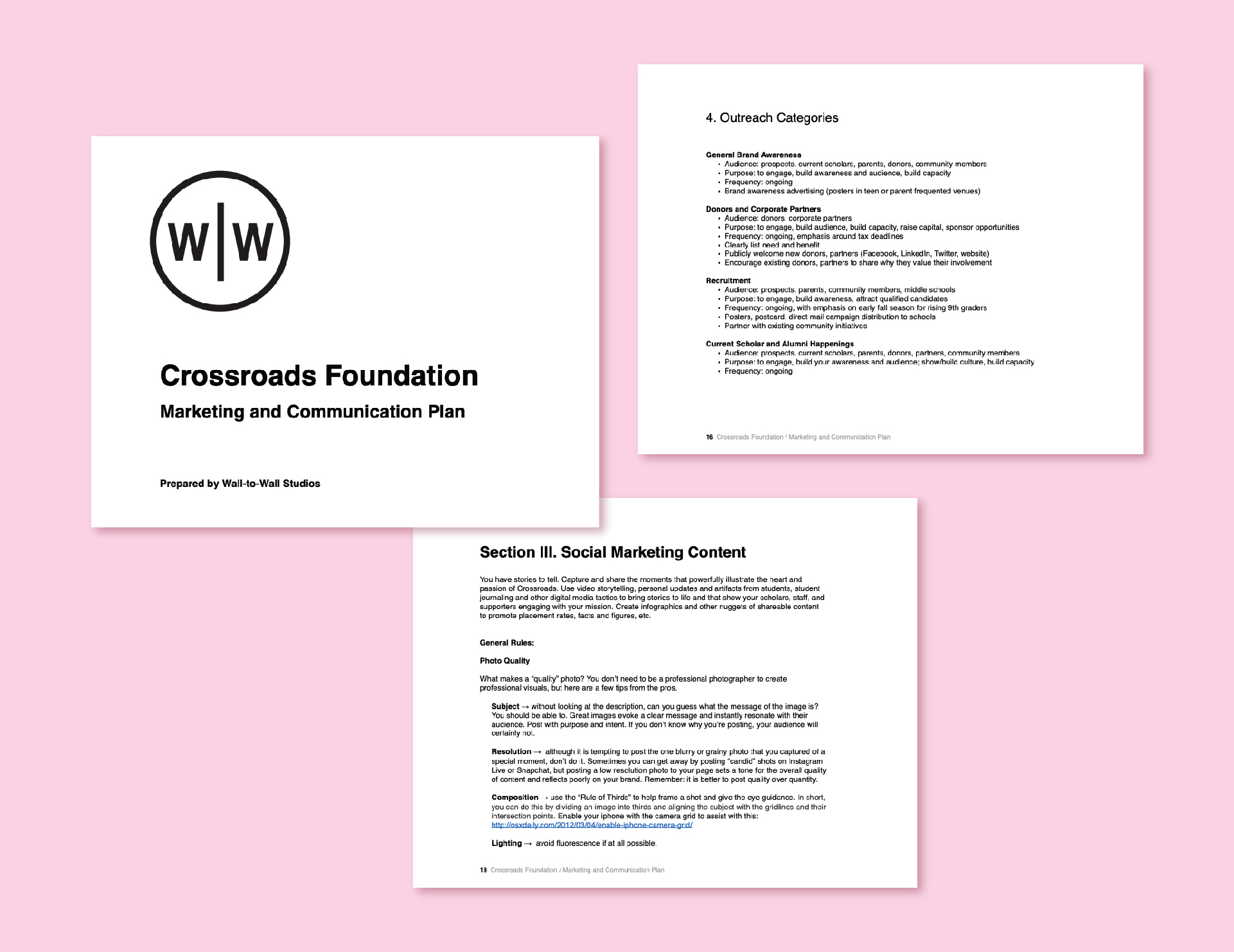
A key deliverable from W|W was the development of the Crossroads' Marketing & Communications Plan, the roadmap detailing the necessary actions required to achieve the established objectives. The Plan considered a 12-month calendar and covered all marketing channels & touch-points with a particularly deep-dive into digital marketing. The recommended messaging framework from the brand platform was applied across all tactics and channels. The granularity of the Plan included social media communications by day, week and month with suggested content, hashtags, @mentions and supporting media. W|W also provided Crossroads with best practice guidelines to help the internal team effectively manage ongoing marketing activities.

CREATING PATHWAYS FOR SUCCESS
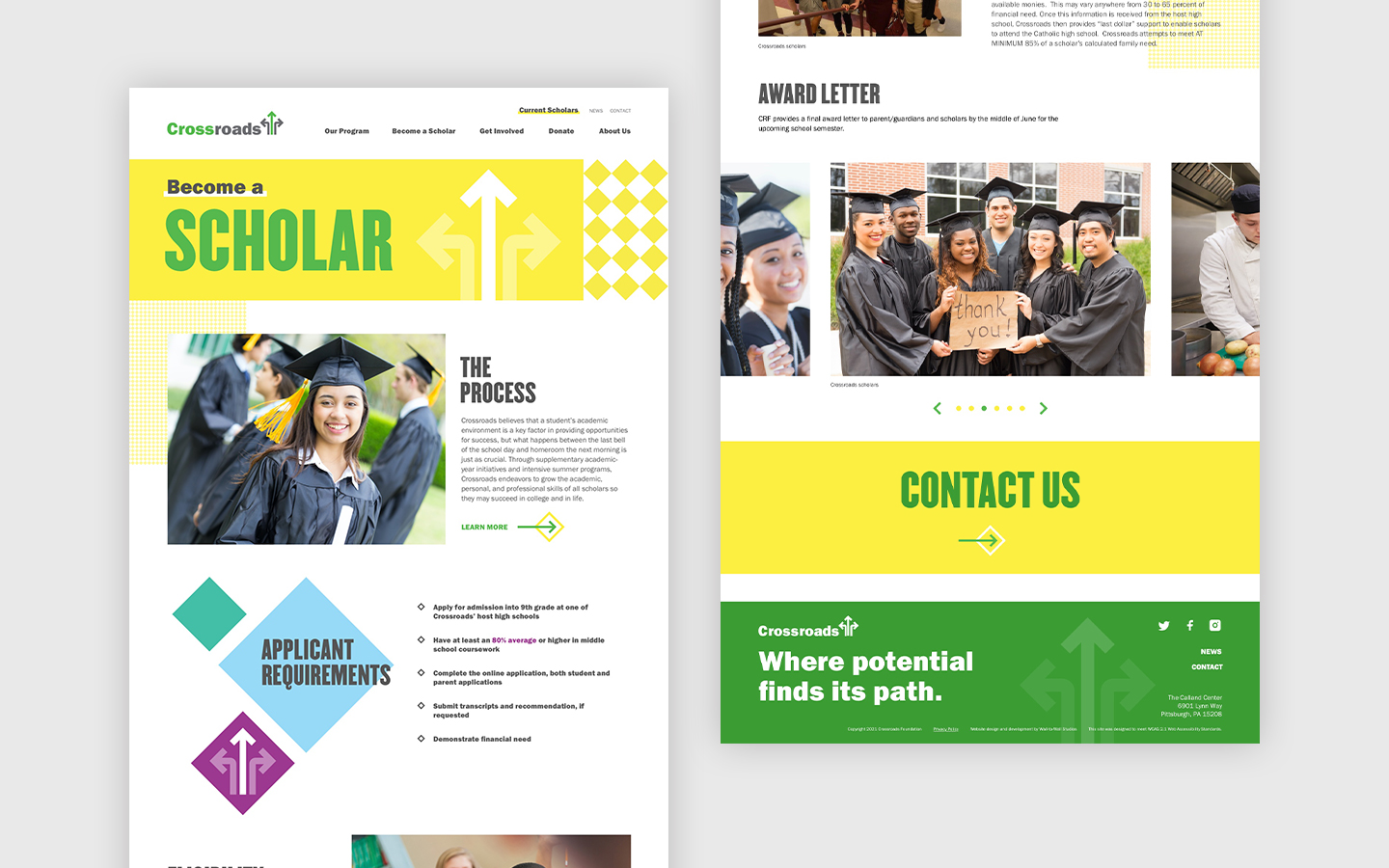
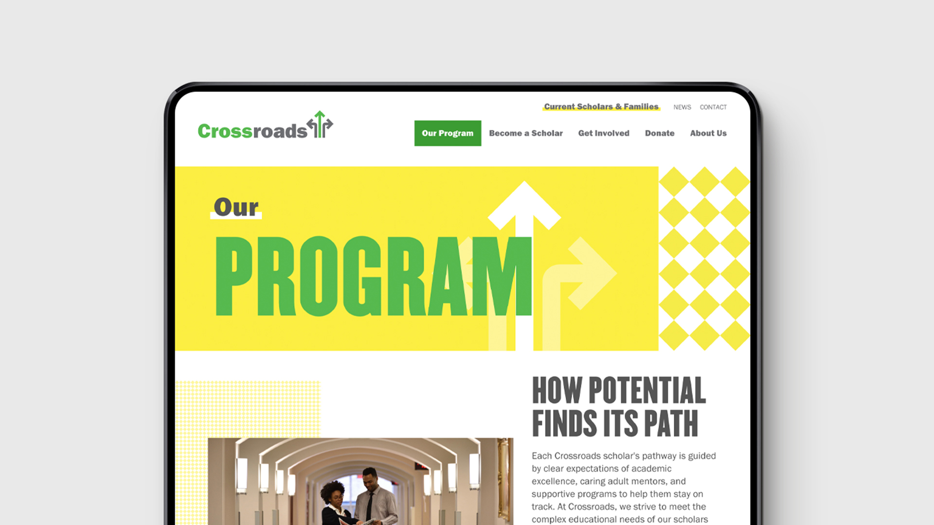
Once the formative rebranding work was implemented, Crossroads commissioned W|W to redesign its website. This collaboration started with an audit of the existing platform to identify areas of opportunity to better connect with target audiences in support of organizational goals. As current students and their families are a primary user group for the website, W|W created a new section with content organized by grade level that delivers an optimized experience. The rest of the website's content was updated to be aligned with the Crossroads brand, ensuring alignment across all touchpoints. The new, responsively designed website is powered by BlokBlok CMS, a Ruby on Rails + Javascript content management system.