BEDFORD FALLS FOUNDATION
GIVING HOPE FOR A BRIGHTER FUTURE
The Bedford Falls Foundation is a private family foundation dedicated to expanding opportunity in nursing and human services through education, scholarships, and workforce development. William and Joanne Conway founded the Foundation to support high-economic-need students, the faculty who guide them, and the institutions shaping the next generation of healthcare professionals.
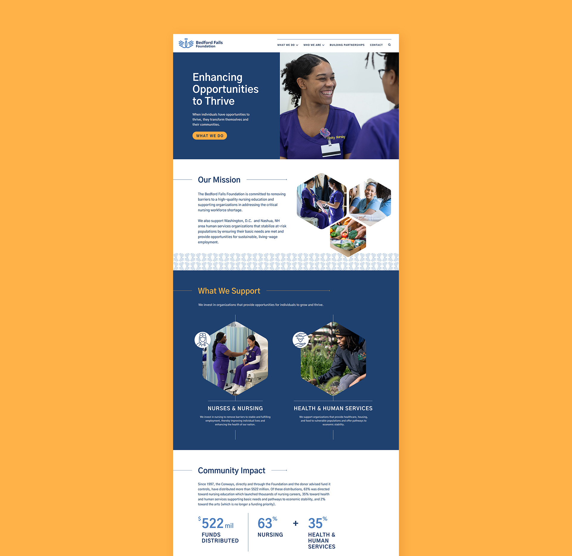
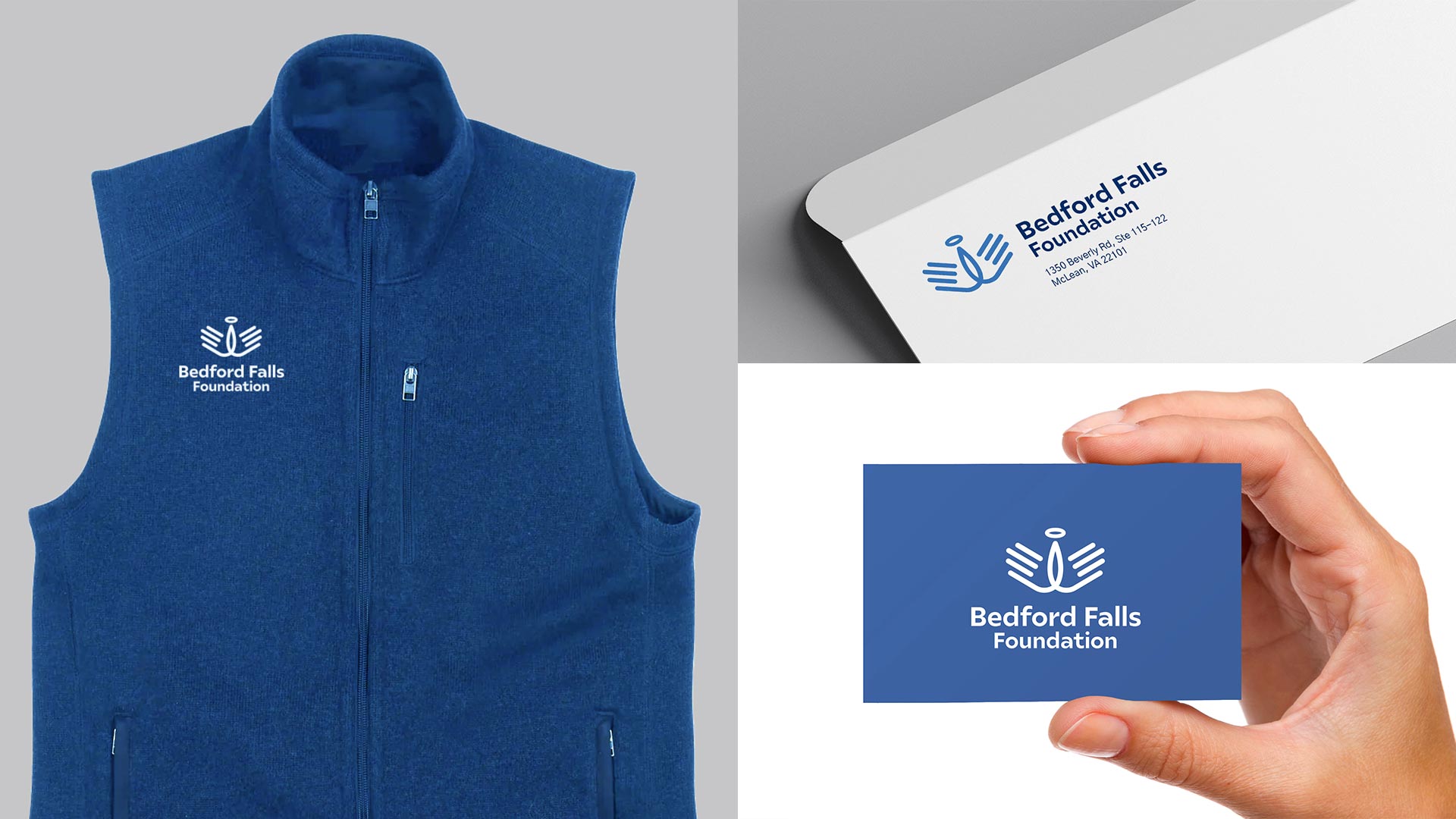
As the foundation grew in visibility and impact, it needed a visual identity and digital presence that could communicate its mission, reflect the humility of the family behind it, and serve as a reliable source of truth. W|W designed and developed the organization's formative branding, which included the creation of the Bedford Falls Foundation visual identity and website to establish a thoughtful, accessible platform for understanding its mission and philanthropic work.

COMMUNICATING WITH CLARITY
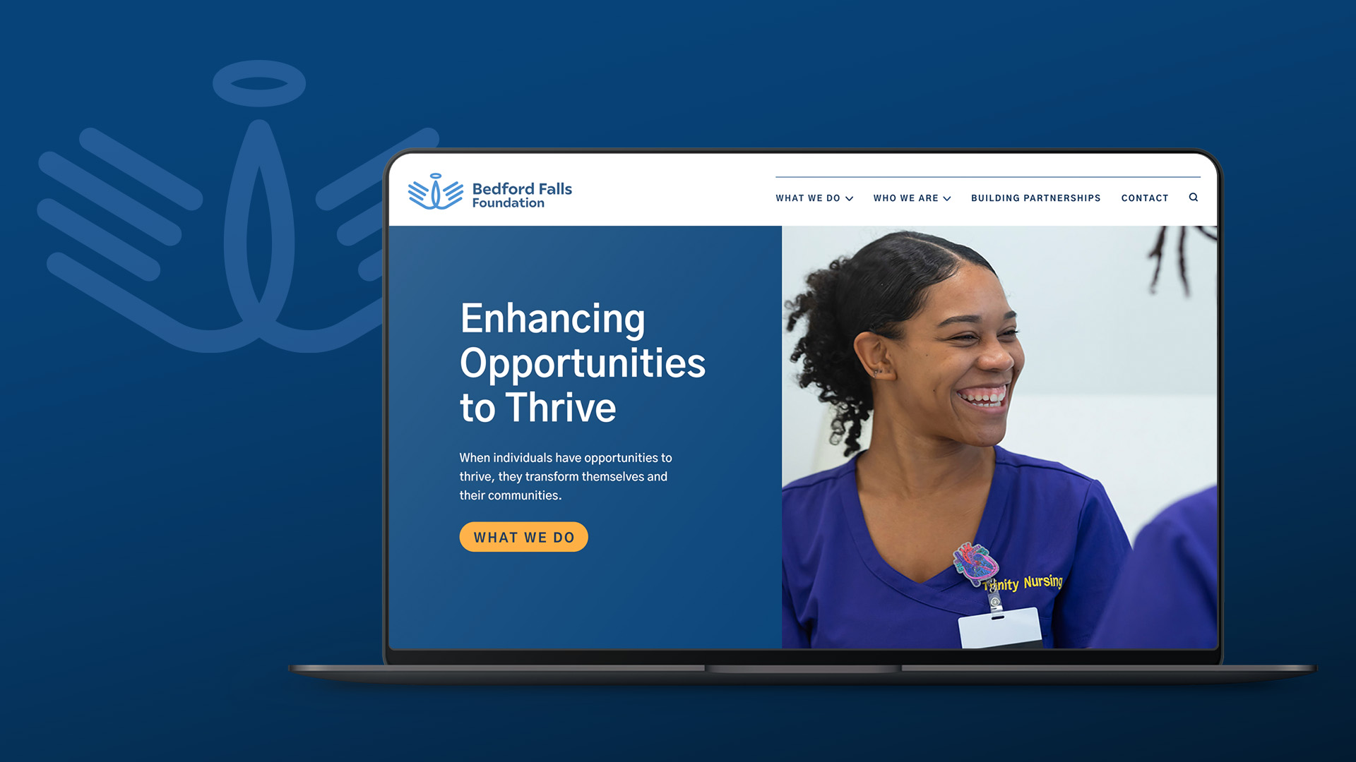
The Foundation’s evolution called for a brand package and website that could communicate not only what it supports, but why and how it approaches giving. To help establish a foundation for the formative work, W|W led the client team through the Brand UnWorkshop, supported by a series of immersion exercises that built clarity and alignment. The new visual identity and website provide Bedford Falls with a clear way to communicate its public narrative, support press relations, and create more informed dialogue with mission-aligned organizations.

TRUST, HUMILITY, ACCESSIBILITY
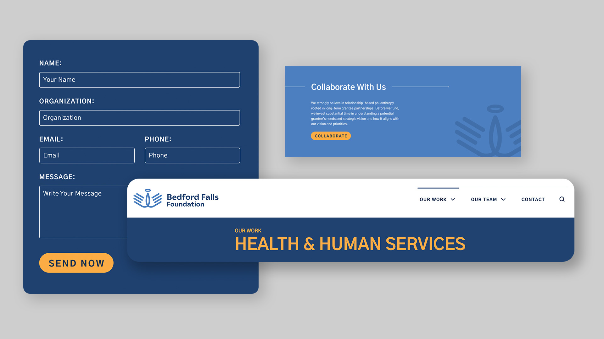
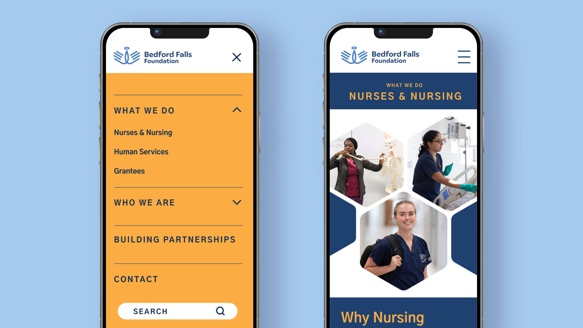
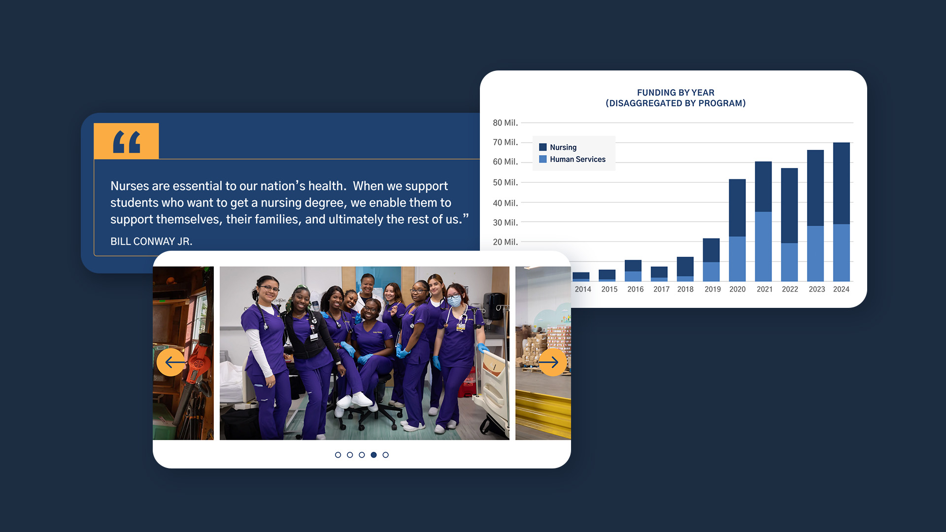
W|W approached the brand identity and website design with a focus on clarity, restraint, and trust. The information architecture was developed to help prospective grantees, media contacts, and peer organizations quickly understand the Foundation’s history, philosophy, and funding priorities. The overall design aesthetic and experience feel credible, generous, and grounded in the character of the family behind the Foundation.
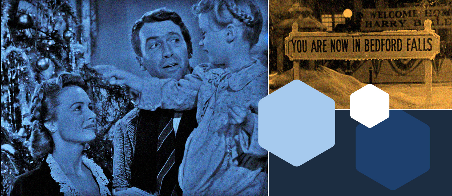
The Foundation's name was influenced by the fictional town in the movie "It’s a Wonderful Life". The visual identity was inspired by the film's famous line, "every time a bell rings, an angel gets its wings," which is also connected to its work with nurses and in human services.

TECH STACK AND INTEGRATION
The Bedford Falls Foundation website was built on Sanity, a flexible headless CMS that provides the client team with control over structured content across the site. A component-based architecture supports website growth as the Foundation's needs change, while keeping content management efficient. W|W implemented a framework aligned with WCAG 2.1 accessibility standards, along with SEO optimization and Google Tag Manager integration to support visibility, usability, and track meaningful engagement over time.